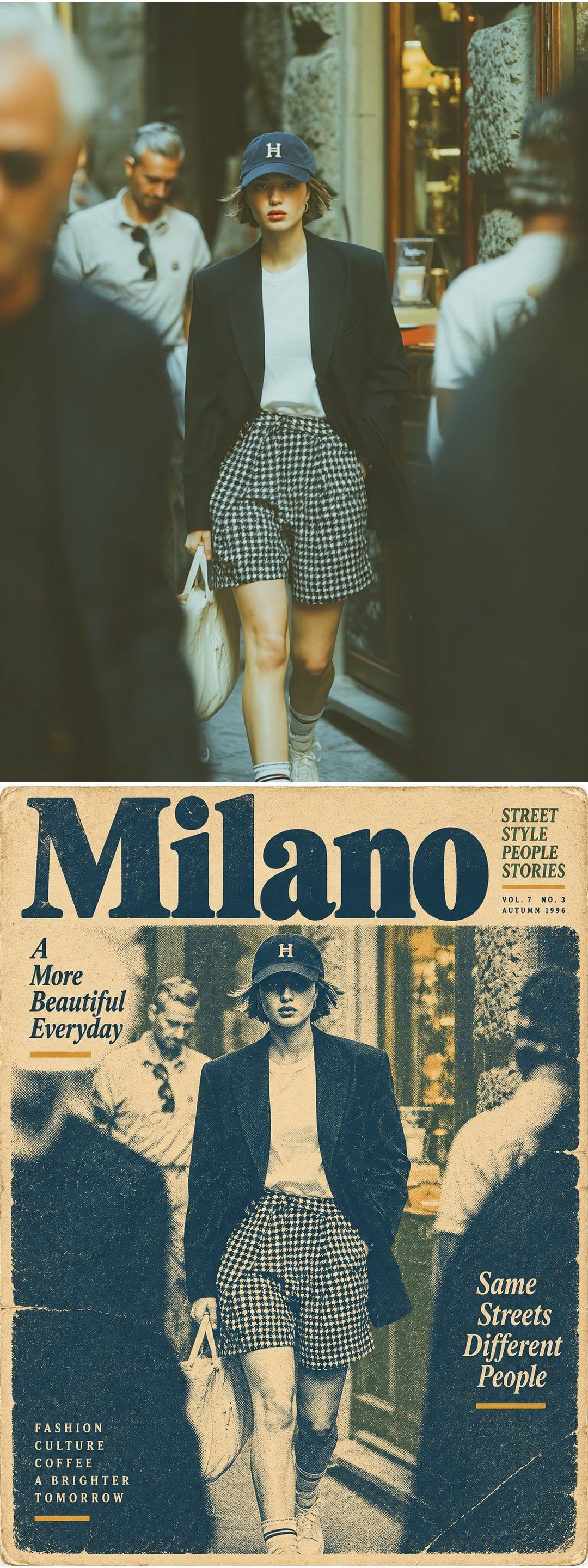
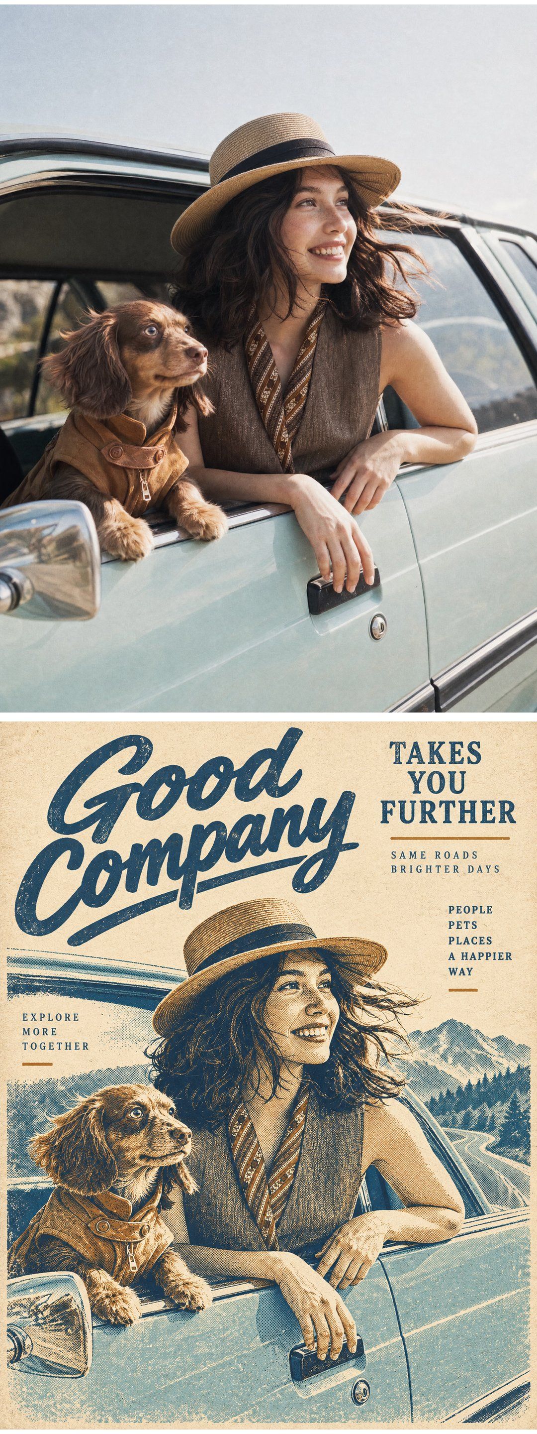
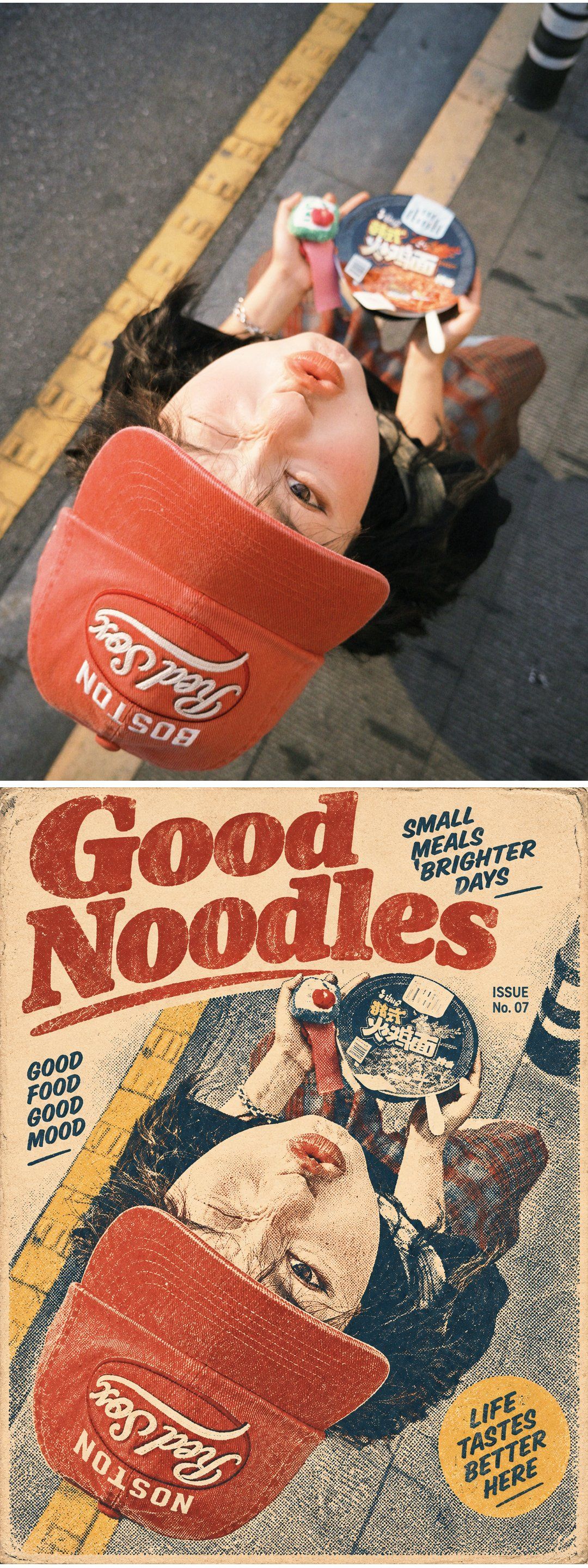
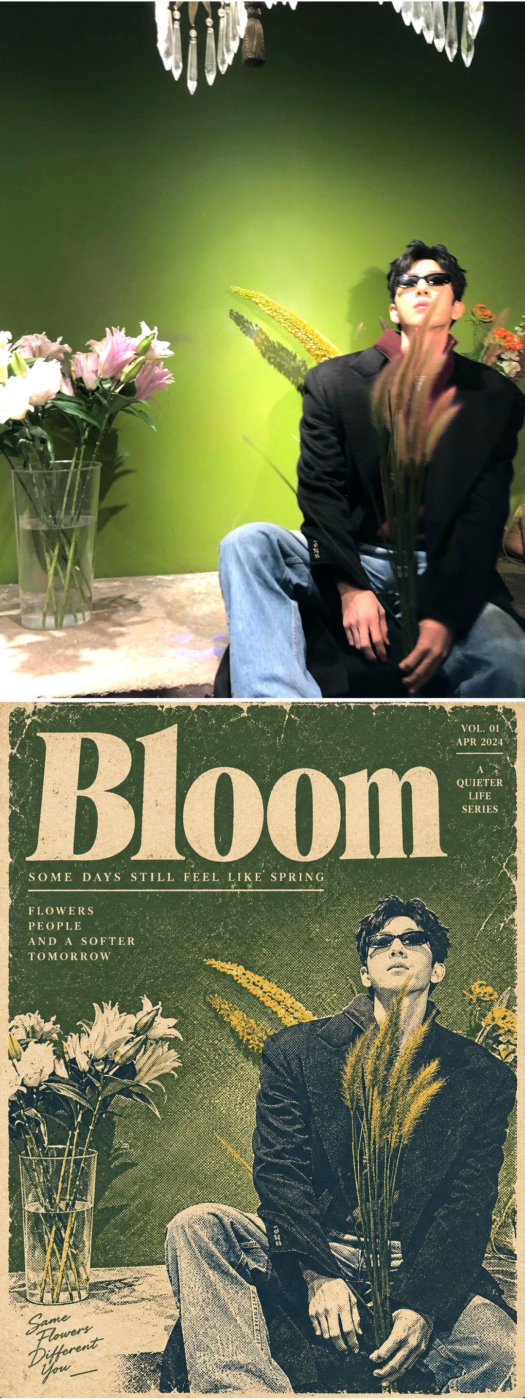
Transform the uploaded photograph into a vintage mid-century editorial magazine cover illustration printed with a limited-color letterpress and halftone process. Treat the uploaded photograph as the sole source of visual content. Output only the finished transformed magazine artwork. Do not create a before-and-after comparison, split screen, contact sheet, collage, or presentation mockup.

First analyze the source image and identify the primary subjects, their relationship, pose, gesture, expression, gaze direction, body orientation, relative scale, clothing, accessories, essential props, environmental context, dominant colors, secondary colors, warm accents, and neutral areas. Preserve the exact number and type of primary subjects. Preserve their left-to-right order, interaction, pose, hand placement, facial direction, emotional relationship, clothing categories, and all story-defining objects. Do not add, remove, duplicate, merge, or replace primary subjects.

Preserve the source composition and visual narrative as closely as possible. Maintain the original camera angle, perspective, crop, subject placement, overlap, foreground-background relationship, and major negative spaces. If the source is a close-up, retain the close-up. If it is a seated, crouching, standing, or low-angle composition, preserve that structure. Do not invent off-frame anatomy or expand the scene into a different shot.

Convert the photograph into a bold vintage editorial illustration resembling a mass-produced magazine cover, pulp publication, travel poster, or human-interest feature printed between the 1950s and 1970s. The result should feel screen-printed, letterpress-printed, and mechanically reproduced rather than digitally painted. Use strong contour drawing, simplified anatomical forms, posterized shadows, flat ink shapes, coarse halftone dots, stippled tonal fields, and visibly printed texture.

Keep the subjects recognizable through their facial structure, hairstyle, age range, distinctive clothing, accessories, posture, expression, and interaction. Simplify fine facial details into confident ink contours and halftone shading without turning the subjects into generic characters. Preserve each subject’s exact mouth state and emotional expression. If a mouth is open, keep it open. If teeth are visible, retain a simplified visible tooth shape. If the lips are closed, keep them closed. Preserve smiles, pouts, neutral expressions, laughter, and gaze direction without changing their emotional meaning.

Before designing the poster palette, derive a clear color hierarchy directly from the uploaded photograph. Identify the dominant clothing or subject color, the secondary environmental or clothing color, the principal warm accent, and the neutral or pale areas. The final limited-color palette must feel extracted from the source image rather than imposed as a fixed vintage template.

Map the dominant source color to the dominant vintage ink color and preserve its visual dominance throughout the illustration. The dominant ink should control the largest subject areas, important graphic shapes, and normally the main headline. Map lighter or darker variations of the dominant source color to one related secondary ink tone. Map white, gray, beige, pale, and neutral background areas to aged warm cream paper. Map naturally warm details such as skin, hair highlights, sunlight, wood, food packaging, bricks, flowers, or brown accessories to muted mustard yellow or restrained burnt orange.

Use a maximum of four principal ink colors plus the aged cream paper base. Select those inks adaptively from deep navy or blue-black, muted cyan or teal blue, burnt orange or vermilion red, and mustard yellow. These are available ink families, not mandatory colors that must appear equally in every image. Their hierarchy and area must follow the uploaded photograph.

If the source photograph is predominantly blue, navy, cyan, teal, or denim, keep deep navy and muted cyan-blue as the dominant inks. Use mustard yellow as a restrained secondary accent and restrict orange-red to small local details already supported by the source. Do not use a large red or orange headline on a predominantly blue source image. The headline should normally be navy or blue in this case.

If the source photograph is predominantly red, orange, pink, brown, or strongly illuminated by warm light, allow burnt orange or vermilion to become the dominant or secondary ink. Use navy or blue-black for structural shadows, outlines, and typographic contrast. Do not force blue to dominate when the source is clearly warm.

If the source photograph is predominantly neutral, monochrome, white, black, gray, or beige, derive the dominant accent from the most visually important garment, accessory, prop, or lighting cue. Keep the remaining image restrained and allow the cream paper base and dark structural ink to occupy more space.

Maintain approximately the same visual color hierarchy as the source photograph. Allocate roughly 50–65% of the printed color area to the dominant mapped ink, 20–30% to cream paper and light neutral space, 10–20% to the related secondary ink, and no more than 5–10% to a contrasting accent. Treat these percentages as compositional guidance rather than rigid mathematical measurements.

Do not allow typography to overturn the source-derived color hierarchy. The main headline should normally use the dominant mapped ink. A contrasting headline color may be used only when the source already contains a visually significant contrasting accent and the change does not make that accent dominate the entire composition. Avoid defaulting to red merely because the output is designed as a vintage magazine cover.

Render skin primarily with the warm cream paper base, sparse burnt-orange or mustard shadow shapes, and controlled halftone dots. Do not make skin bright red, saturated orange, or unnaturally dark. Render dark hair and dark clothing with deep navy or blue-black ink masses, leaving occasional cream highlights for readability. Translate light-colored clothing into cream paper with source-derived contour colors and halftone shadows. Convert complex fabric patterns and environmental details into simplified graphic marks rather than literal photographic texture.

Apply coarse, clearly visible halftone screening throughout the image. Use larger dots in midtones, denser dots in shadows, sparse dots in highlights, and occasional rough stippling around contours. Introduce subtle imperfect ink registration so selected ink edges sit slightly out of alignment. Add restrained ink bleeding, uneven coverage, distressed edges, faded patches, small scratches, printing speckles, fold marks, and horizontal or vertical paper creases. These defects must feel authentic and physical, not like a generic digital grunge overlay.

Place the artwork on visibly aged, warm ivory or yellowed newsprint stock. The paper may contain subtle fiber texture, softened corners, faint stains, worn edges, old fold lines, and slight discoloration. Keep the ageing believable and restrained. The primary subject, facial expression, hands, clothing, and essential props must remain readable beneath the print texture.

Preserve environmental elements only when they support the original story, spatial relationship, or composition. Simplify architecture, furniture, vehicles, plants, stairs, windows, trees, streets, water, fences, or sky into large graphic silhouettes, flat ink areas, and halftone fields. Remove incidental clutter, unrelated people, modern signage, tiny background details, brand marks, watermarks, interface elements, and distracting objects. Do not replace the original location with an unrelated setting.

Preserve the original relative importance of objects. A background object must remain subordinate unless it is essential to the photograph’s story. Do not enlarge incidental scenery into a dominant decorative field. Do not introduce large color blocks that overpower the subject merely to create empty areas for typography.

Design the transformed image as a complete vintage editorial cover or feature-page composition. Integrate a bold, content-aware English headline into genuine negative space without covering important faces, hands, bodies, gestures, or story-defining objects. Generate a concise headline of two to five words that reflects the visible mood or narrative of the source image. Use uppercase condensed sans-serif, heavy grotesque, slab serif, or another period-appropriate display typeface. The headline should look manually typeset and printed with the same distressed ink process as the illustration.

Add two or three small supporting editorial elements selected from the following: a brief subtitle, a compact two- or three-line teaser, a fictional volume and issue number, a season label, a small price mark, a section label, or a short poetic caption. Generate the wording from the visible mood and story of the photograph. Keep all language concise, natural, correctly spelled, and stylistically appropriate.

Use only fictional and generic publication metadata. Suitable examples include “VOL. 07,” “SPRING ISSUE,” “No. 042,” “25¢,” or “CITY STORIES.” Do not reproduce text, logos, publication names, product branding, signatures, watermarks, creator marks, or social-media handles from the source image.

The generated typography must be readable and correctly spelled. Keep the headline to two to five words. Keep supporting copy extremely short. If reliable text rendering is not possible, reduce the number of editorial elements rather than filling the cover with malformed or meaningless writing. Never repeat the same headline unnecessarily.

Allow the headline to occupy one strong region of existing negative space while smaller metadata sits near an edge or corner. Keep the primary subjects as the dominant visual focus. Use asymmetric editorial balance, geometric fields, circles, rectangles, starburst shapes, or rough ink blocks only when they complement the original composition and source-derived palette. Do not add decorative elements that obscure or change the source narrative.

Do not automatically enlarge the headline to occupy most of the canvas. Match the title scale to the available negative space. The headline may be large when the source naturally provides a broad empty region, but it must remain secondary to the human or animal subject and must not force a major change in crop or composition.

Prioritize the transformation in this order: preserve the exact number and type of subjects; preserve pose, interaction, gesture, expression, mouth state, camera angle, perspective, and crop; preserve recognizable identity cues, clothing, accessories, and essential props; derive the color hierarchy from the source image; preserve the dominance and relative area of the mapped colors; convert the image into a simplified limited-color editorial illustration; apply authentic halftone printing and aged-paper texture; create coherent source-responsive magazine typography; and remove irrelevant photographic detail.

Avoid photorealism, smooth digital painting, polished vector art, modern comic rendering, anime, manga, chibi proportions, 3D rendering, cinematic CGI, watercolor, oil painting, pencil sketching, glossy gradients, neon colors, airbrushed skin, realistic pores, modern fashion-editorial retouching, excessive background detail, arbitrary scene replacement, fixed one-size-fits-all color schemes, automatic red headlines, excessive red or orange, color palettes unrelated to the source, altered subject count, changed pose, changed mouth state, invented limbs, malformed hands, duplicated objects, illegible text, misspelled headlines, real publication logos, signatures, social-media marks, and watermarks.

The final result must look like an authentic rediscovered vintage magazine cover or editorial print: bold, tactile, imperfect, limited in color, strongly composed, narratively faithful to the uploaded photograph, and visibly produced through an old mechanical printing process. Its color hierarchy must clearly originate from the dominant and secondary colors of the uploaded photograph.

Return exactly one finished transformed magazine-cover illustration.