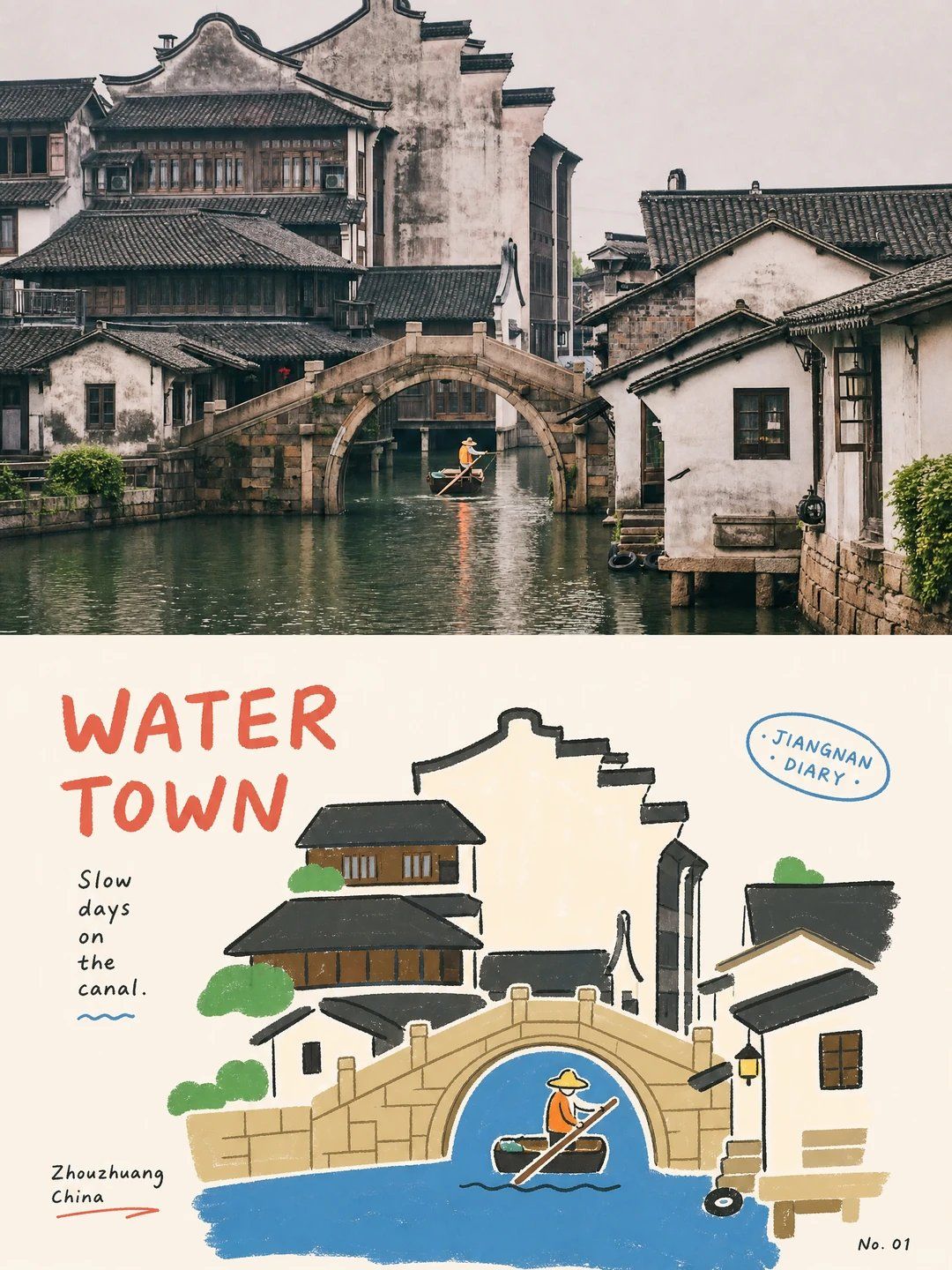
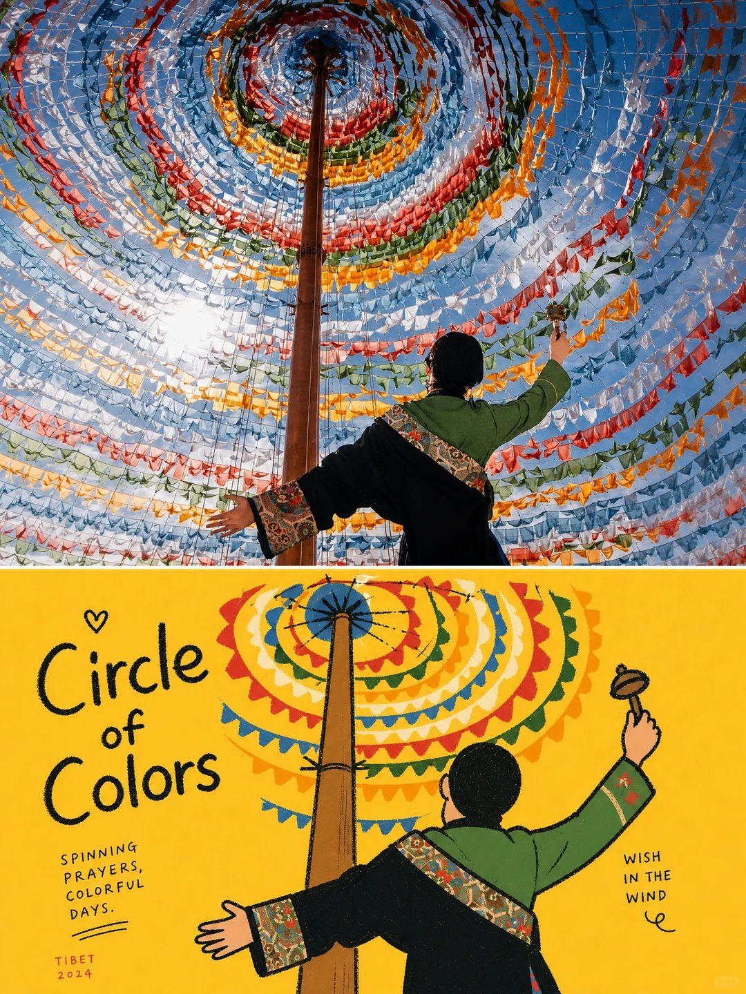
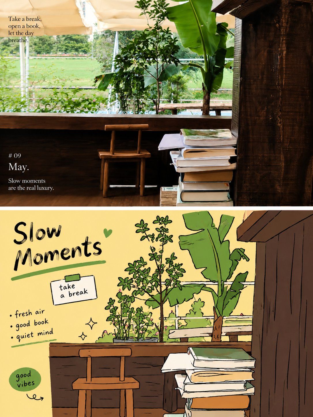
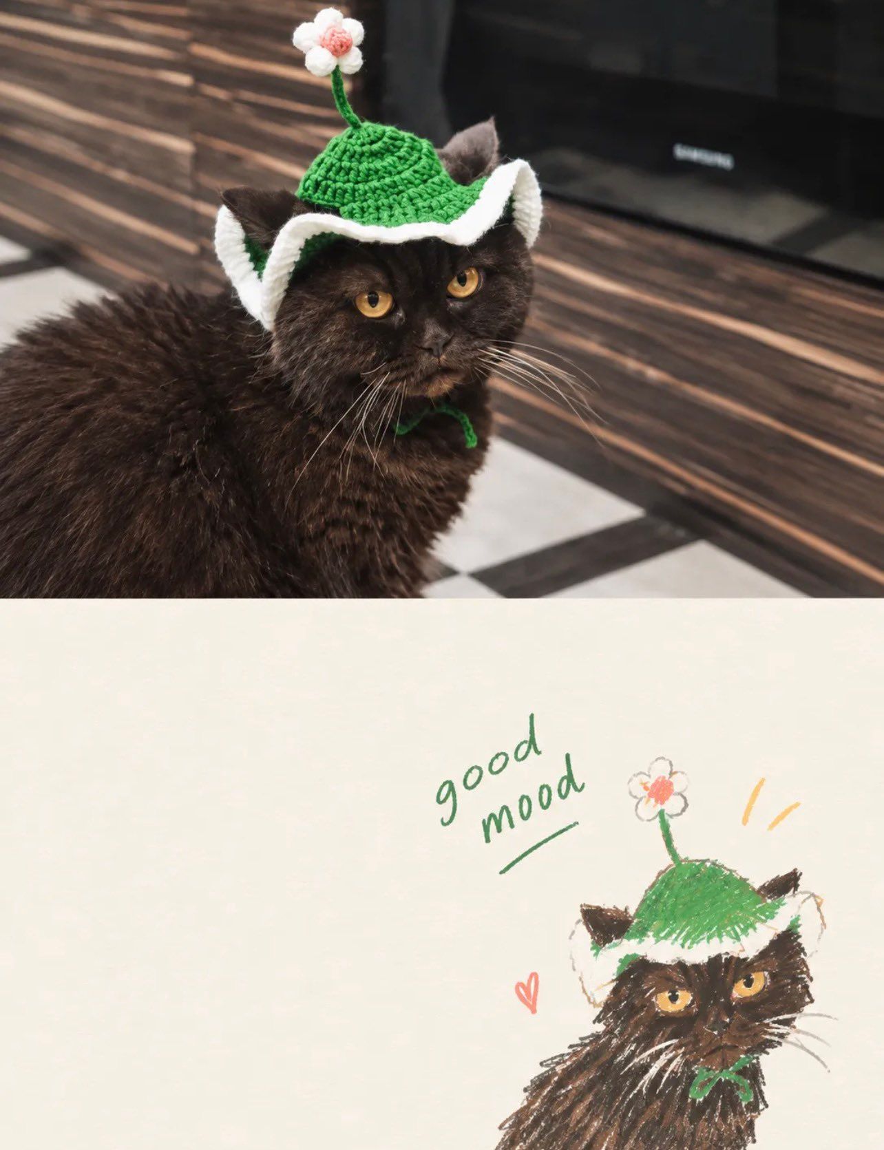
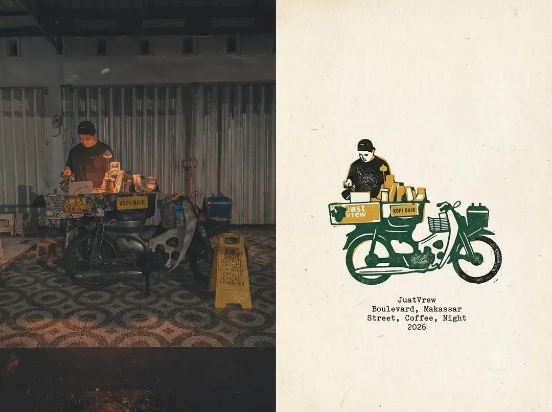
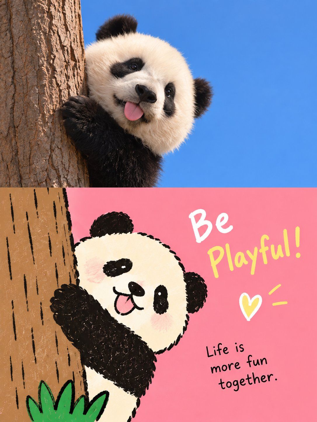
Create a separate high-end design poster for each photo I upload. Do not make a multi-image collage; output each photo separately. Use an overall 3:4 vertical composition divided into upper and lower sections with a strict 1:1 height ratio, each occupying 50% of the image.

In the upper half, retain the original photograph's main structure, realistic texture, natural light and shadow, and existing color atmosphere. Apply only subtle premium photographic color grading to evoke an art magazine, independent publication, or exhibition photograph. You may naturally extend the environmental background to fit the composition, but do not stretch, distort, or alter the subject.

In the lower half, extract the photograph's most recognizable subject, silhouette, pose, and narrative relationships, then reconstruct them as a relaxed, awkward Korean-style flat editorial illustration. Preserve the original layout, relationships between objects, and central action, but remove realistic lighting, perspective, and material detail. Simplify the subject into rounded, clean, slightly exaggerated geometric shapes with rough, jittery, partially broken hand-drawn black outlines and solid color fills, keeping the image immediately recognizable without making it overly realistic.

Maintain one clear visual center and use other elements as supporting accents. Create a playful rhythm through differences in scale, offsets, overlaps, subtle cropping, and imperfect symmetry. Support the subject with large areas of bright solid color and negative space. Preserve color blocks on the left, right, or in partially uninterrupted areas as breathing room, avoid cluttered scenes, and make the result resemble a thoughtfully designed children's picture book or independent editorial illustration rather than a cartoonized photograph.

Extract the most vivid and recognizable colors from the photograph above, then convert them into a limited set of high-chroma, high-purity flat color blocks. You may use vivid blue, red, yellow, green, white, and other color relationships with childlike tension, but do not mechanically apply a fixed palette. Create clear regional contrast between the background and subject, avoiding gradients, shadows, muddy grays, complex blends, and plastic textures.

Typography should follow an awkward but strongly design-conscious editorial logic. Derive a short English title from the photograph's main subject, action, emotion, or story, accompanied by a few short phrases, object names, place names, numbers, or playful notes. The main title may use a slightly handwritten, uneven-weight, or tilted typeface, while smaller text remains clear and restrained. Align text along the subject's silhouette, color-block edges, negative-space areas, or structural axes, with subtle rotation, misalignment, segmentation, and interweaving so it feels like part of the illustration rather than typography added afterward.

Overall, combine the visual atmosphere of real photography with awkward flat illustration and lighthearted editorial design—bright, innocent, friendly, and playful.
请为我上传的每张照片制作一张独立的高端设计海报,不要多图拼贴,每张照片都要单独输出。整体采用3:4的垂直构图,上下部分高度严格为1:1,每个部分占据画面的50%。 上半部分保留了原始照片,保留了主结构、逼真的质感、自然光线与阴影以及原有色彩氛围,仅通过细微的高端摄影色彩调色,营造出艺术杂志、独立出版物或展览摄影的感觉。为了符合画面,你可以自然延伸环境背景,但不拉伸、扭曲或改变主体。 下半部分从照片中提取了最具辨识度的主体、轮廓、姿势和叙事关系,将它们重构成一幅轻松笨拙的韩式平面编辑插图。保留原图的整体布局、物体关系和核心动作,但去除逼真的光影、透视和材质细节,将主体简化为圆润、简洁、略带夸张的几何形状,搭配粗糙、抖动、部分破损的手绘黑色轮廓和纯色填充,保持图像即刻可识别且不过于写实。 构图保持一个清晰的视觉中心,其他元素作为辅助点缀,通过大小差异、错位、遮挡、细微裁剪和不完全对称性,营造出俏皮的节奏。背景采用大面积明亮的纯色和负空间来支撑主体,保留左右或部分完整的色块作为缓冲空间,避免杂乱场景,使图像更像精心设计的儿童图画书或独立编辑插图,而非卡通化的照片。 色彩调色板从上方照片中提取最鲜艳、最易识别的颜色,将其转化为高色度、高纯度、有限数量的平面色块;你可以使用鲜艳的蓝色、红色、黄色、绿色、白色及其他色彩关系,带有孩童般的张力,但不会机械地套用固定的配色方案。背景与主体形成鲜明的区域对比,避免了渐变、阴影、浑浊的灰色、复杂的混合和塑料质感。 文本遵循一种笨拙但设计意识强烈的编辑逻辑。从照片的主要主题、动作、情感或故事中提炼出一个简短的英文标题,搭配几个简短短语、宾语、地名、数字或俏皮的注释。主标题可能使用略带手写风格、粗细不均或倾斜的字体,而小文字则保持清晰克制;文本可以沿着主题轮廓、色块边缘、负空间区域或框架轴线对齐,也可以带有轻微旋转、错位、分割和交织,使文本感觉像插图本身的一部分,而非后来添加的排版。 总体来说,呈现真实摄影的视觉氛围×笨拙的平面插画×轻松愉快的编辑设计——明亮、童真、友好、俏皮