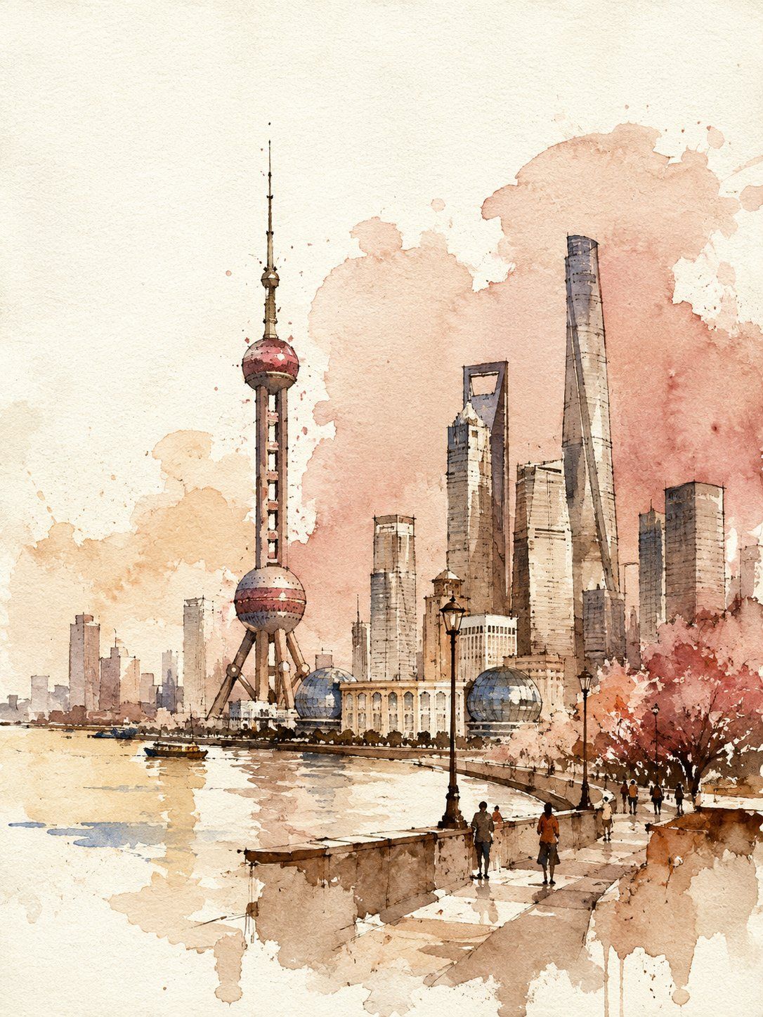
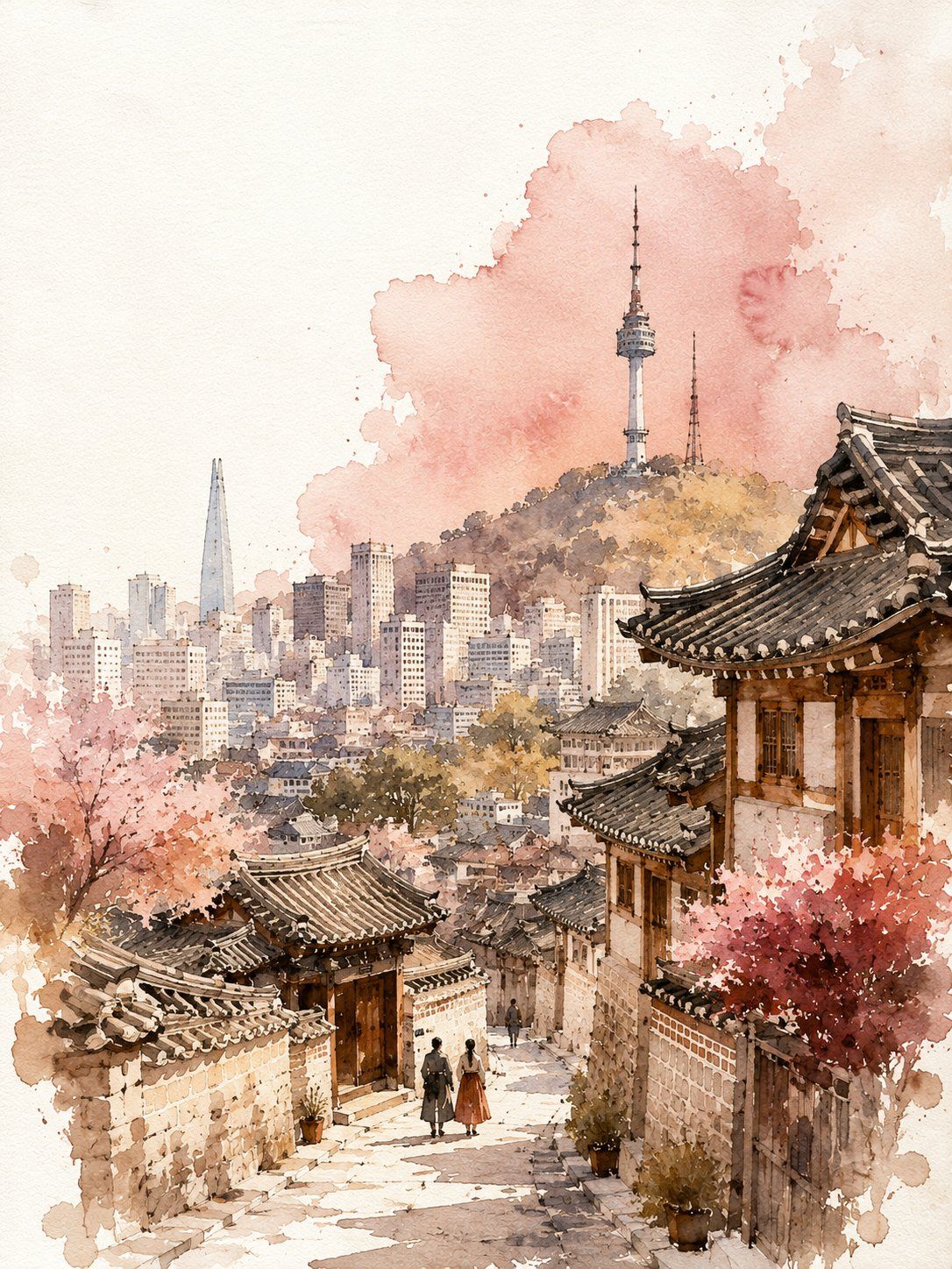
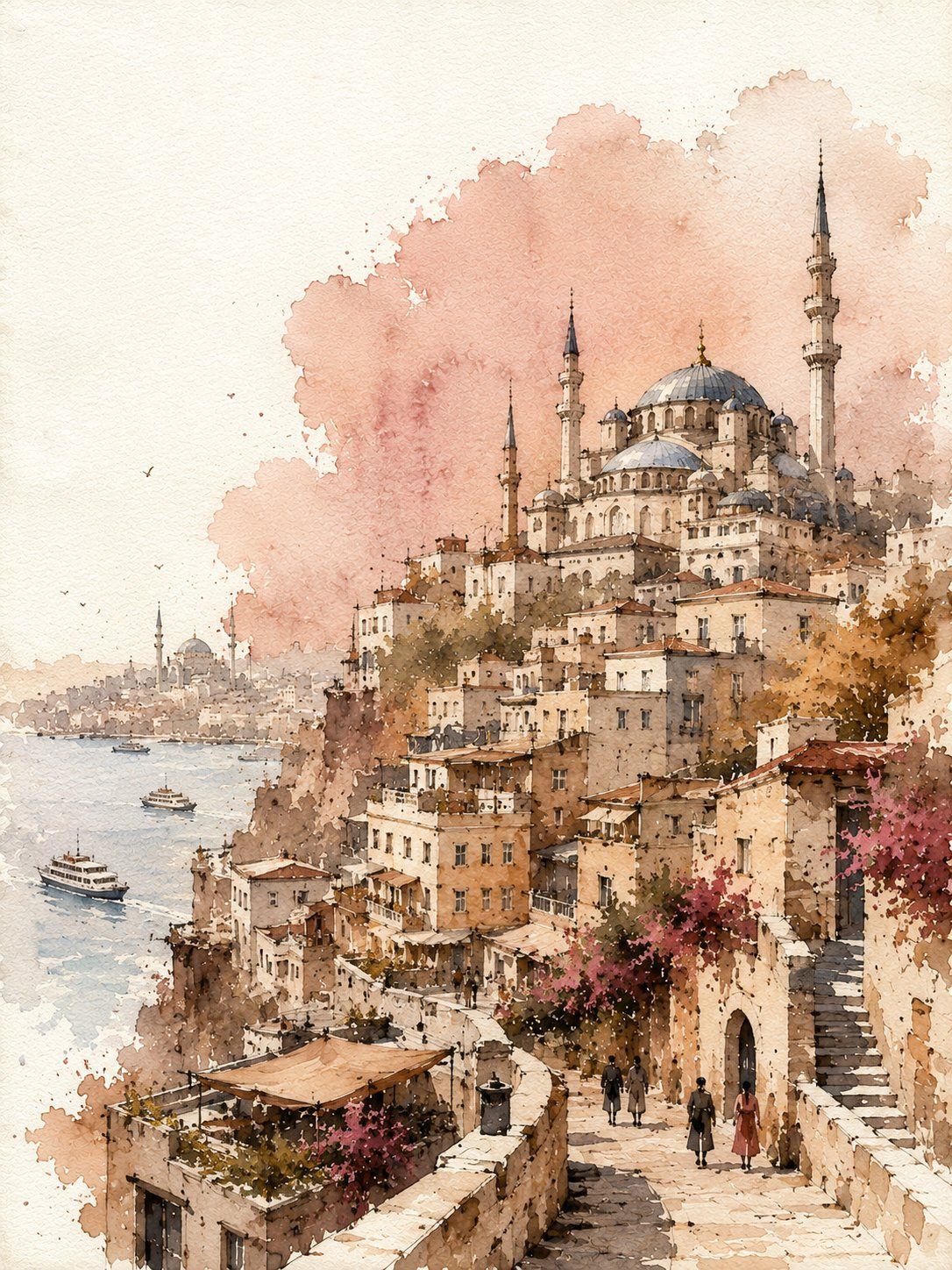
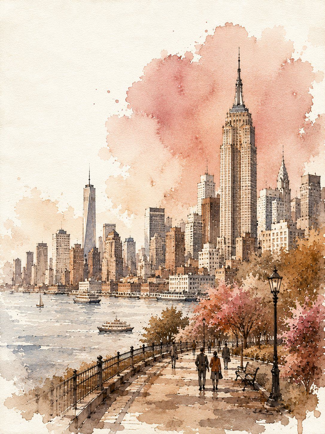
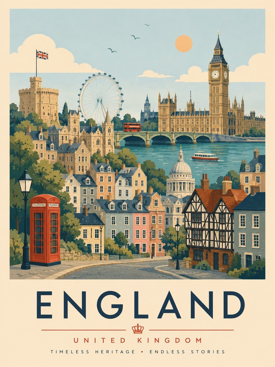
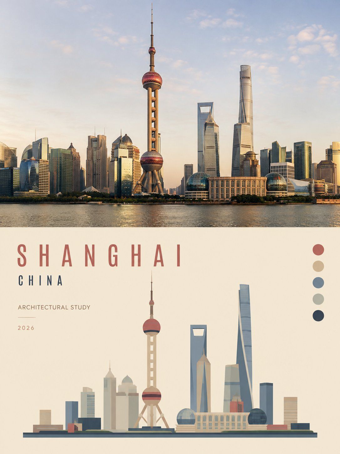
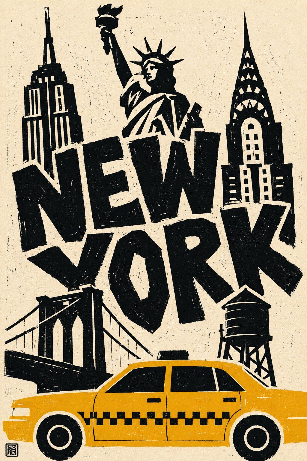
Watercolor and ink travel poster of {CITY}, {COUNTRY}. Vertical 3:4.

Loose hand-painted poster, finished — not an abandoned sketch.

IDENTITY LOCK — drawn clearly AND painted, never bare outline:

Choose 3–5 instantly recognizable symbols of {CITY}, prioritizing landmarks with clearly different silhouettes. Simplify them into strong, readable shapes while preserving their defining visual identities.

One or two landmarks should act as the primary visual destinations. Establish the city’s characteristic architecture, landscape or skyline clearly.

Simplify everything else; never the key landmarks.

COMPOSITION

Main city subject occupies approximately 65–75 percent of the frame height, arranged asymmetrically rather than perfectly centered. Keep the major landmarks fully visible, never touching the top edge and never awkwardly cropped.

Top 15 percent: mostly empty paper sky.

Foreground anchor band across the bottom 25 percent: include simplified elements characteristic of the city — streets, waterfront, landscape, vegetation, architecture or tiny figures — depending on the location.

INK — two weights, obviously different:

Wet waterline: soft round brush, diluted warm sepia, so wet the paper drinks it — feathers 2–3 mm, pooling into dark blooms at stroke ends.

Dry fine nib: raw umber hairline on top, broken and scratchy.

Use ink only for essential structure, joints, selected contours and architectural details. No line should be perfectly thin, even or continuous throughout.

VALUE — all four steps present:

1. Bare white paper, 30–35 percent — sky, illuminated surfaces and outer margins.
2. Light wash — main buildings, landmarks and landscape.
3. Mid tone — shadows, secondary structures, foreground and cast shadows.
4. DARK ANCHORS — 6–10 fingertip-sized deep burnt umber accents placed only in important recesses, doorway/window masses, structural shadows, landmark bases and tiny figure marks. Mandatory: without them the poster becomes a flat pastel blur.

WATERCOLOR — warm pastel tints mixed ON THE PAPER, never premixed:

Pale apricot (main), butter cream (lightest), dusty rose (secondary surfaces and atmospheric accents), clay taupe (shadows), muted dusty blue (only for selected cool elements appropriate to {CITY}), deep burnt umber (dark anchors only).

Wet-on-dry, with a second glaze dropped in while damp so colours naturally bleed into a third tone. Hard pooled edges, granulation and cauliflower blooms.

Every wash boundary dissolves into bare paper over 5–15 mm — no wash ends at a hard line.

FADE ZONE

Dissolving happens at the picture's outer edges, never through the primary landmarks.

Use fading along the left and right margins, distant background, far landscape or skyline, and outer ends of the foreground anchor band.

The main subject remains whole, solid and immediately recognizable.

OFF-REGISTER

Allow watercolor washes to drift 4–8 mm outside selected contours and stop short in others, leaving natural white slivers.

Colour never outlines the subject.

ABSTRACT ACCENT

One soft, irregular colour field behind the main subject, using a muted dusty rose or another warm pastel tone appropriate to the composition.

Overlap the main silhouette by roughly one-third and allow the field to run naturally off one canvas edge.

Irregular wet edges, pooled bloom and visible granulation. It must feel like an intentional painterly gesture, never a rectangular stain.

PAPER & FINISH

Pure white cold-press paper, visible tooth and scanned handmade texture. Natural watercolor bleeding reaches all four edges.

AVOID:

Repeated identical windows, generic landmarks, tourist crowds, postcard saturation, electric blue, flat even fills, uniform line weight, technical architectural drawing, unpainted main subject, floating rectangular stains, muddy grey, cream or beige paper cast, pure black, photorealism, text, lettering, signature, watermark and border frame.