Please turn each travel photograph I upload into a separate, standalone “Architectural Silhouette Halftone Translation” editorial poster. Generate each photograph individually. No multi-image collages, nine-panel grids, or combining different locations in one work.

Use an overall 3:4 vertical diptych composition, with the upper and lower areas close to a 1:1 ratio and a clear, straight, restrained horizontal boundary between them.

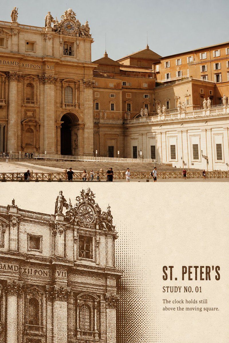
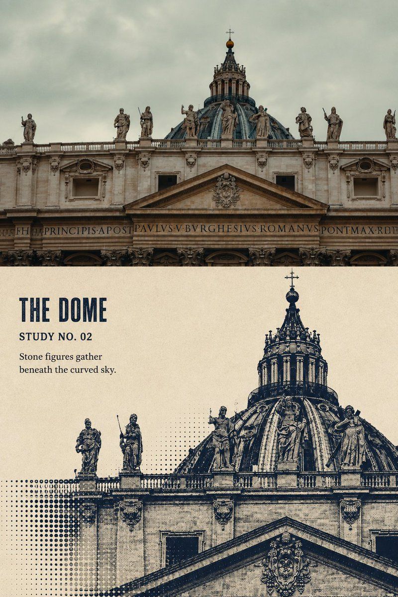
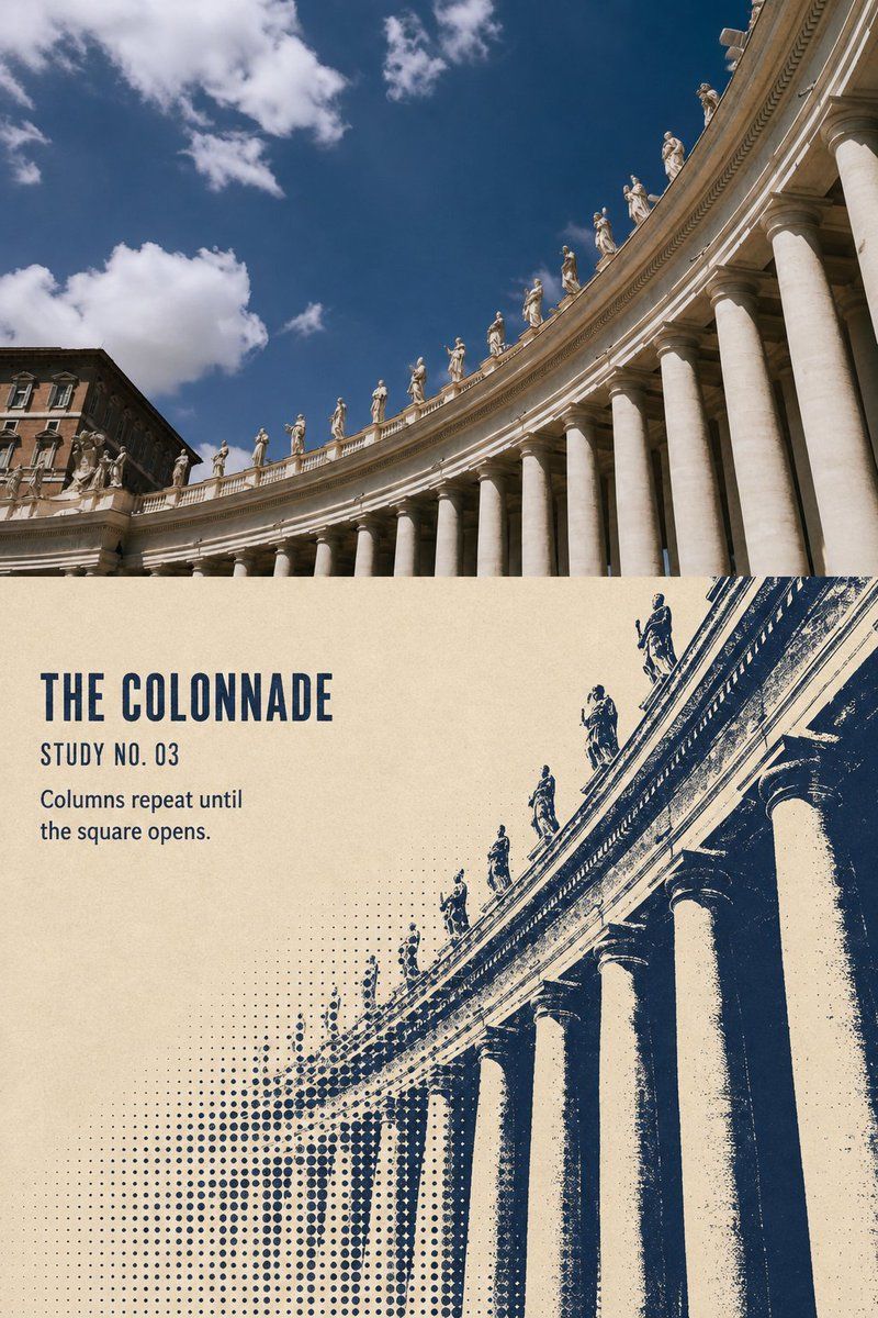
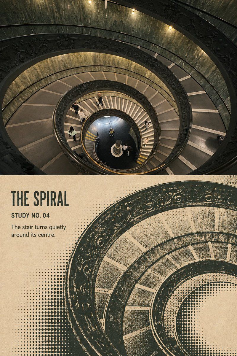
Preserve the original photograph completely in the upper half. Faithfully maintain the building's identity, roof outline, dome, spires, colonnades, relationships between doors and windows, the apparent number of statues, viewpoint, perspective direction, positions of people, real materials, natural light and shadow, and original color atmosphere. Apply only slight art-publication-quality photographic color grading and extremely fine film grain. The upper half must remain clearly a real photograph. Do not turn it into an illustration, replace buildings, change perspective, add or remove people, or reshape the sky.

In the lower half, extract the most recognizable architectural contours and spatial structure from the same photograph and reorganize them into a monochrome screen-printed architectural silhouette and halftone composition. Do not simply apply a black-and-white halftone filter to the photograph, and do not redraw its entire framing at the same proportions.

Actively recompose according to the architecture: enlarge core structures such as domes, towers, roofs, colonnades, arches, or stairs to 65%–90% of the illustrated area's height. Allow the subject to extend beyond the bottom or side edges, using partial cropping for stronger visual impact. Retain only structures that establish the building's identity; remove repetitive small windows, sky textures, miscellaneous surrounding buildings, and photographic noise.

Use one dark screen-printing ink to form heavy, solid silhouettes for roofs, domes, spires, arches, and principal structures. Summarize facades with only a few thick lines, broken lines, and broad light-and-dark masses. Gradually dissolve people, plants, distant colonnades, architectural edges, or secondary structures into circular halftone dots of different sizes. Dot size, density, and absence should convey distance, curved surfaces, occlusion, and spatial depth rather than uniformly covering the entire image.

Use warm ivory, off-white, or unbleached paper as the illustrated area's background. Extract one representative dark ink color from the original photograph, such as deep blue, dark green, brick red, dark brown, or charcoal black. Use only this single ink throughout the illustration, creating tonal layers through solid areas, lines, halftone density, and variations in missing ink. Do not add a second decorative color.

Preserve approximately 25%–38% continuous blank paper. The negative space must work with the architectural contours to form the layout. It may sit beside the building, toward the sky, inside a curve, or along the subject's edge, but must not be a rigid white rectangular patch.

Add a small amount of English text in the negative space corresponding to the photograph's content:

- A main title of 1–3 English words;
- A numbering field such as “STUDY NO. 01”;
- One brief observation of 5–12 English words.

Generate the title from architectural, structural, or spatial features genuinely visible in the photograph, such as a dome, colonnade, bell tower, arch, or spiral staircase. Do not invent dates, coordinates, building names, or historical information.

Print the text in the same dark ink as the image, using bold condensed uppercase lettering, old-fashioned screen-print type, or a publication typeface with slight ink loss. The main title must remain clearly legible at chat-preview size. Supporting text may be smaller but must not shrink into unreadable decorative lines. Letter edges may have slight ink loss, paper tooth, and the imperfect quality of hand printing.

The overall visual character should evoke architectural archives, independent publications, monochrome screen prints, and contemporary architectural posters: structured, spacious, and substantial in printed weight, while remaining quiet, restrained, and collectible.

Avoid: halftone filters covering the entire photograph, grayscale-photo effects, fine etching, smooth vector dots of uniform size, completely copying the original composition, generic city skylines, invented architecture, multiple ink colors, cheap vintage filters, dense explanatory text, author names, signatures, logos, watermarks, QR codes, fake Chinese characters, and gibberish.
请将我上传的每一张旅游照片分别制作成一张独立的「建筑剪影网点转译」编辑海报。每张照片单独生成,禁止多图拼接、九宫格或将不同地点组合在同一张作品中。

整体采用3:4竖版双联构图,上下两个区域比例接近1:1,中间使用清楚、平直、克制的水平边界。

上半部分完整保留原始照片。必须忠实保持建筑身份、屋顶轮廓、穹顶、塔尖、柱列、门窗关系、雕像数量印象、观察角度、透视方向、人物位置、真实材质、自然光影和原有色彩氛围。仅进行轻微的艺术出版物级摄影调色与极薄胶片颗粒处理。上半部分仍应明确是一张真实摄影作品,不得插画化、替换建筑、修改透视、增删人物或重塑天空。

下半部分从同一张照片中提取最具识别度的建筑轮廓与空间结构,重新组织为单色丝网印刷式的建筑剪影网点画面。不要将照片直接变成黑白半调滤镜,也不要按照原照片的完整取景等比例重画。

根据建筑特征主动重新构图:将穹顶、塔楼、屋顶、柱廊、拱门或楼梯等核心结构放大至转绘区域高度的65%–90%,允许主体从底部或侧边出画,通过局部裁切形成更强的视觉冲击。只保留决定建筑身份的结构,删除重复小窗、天空纹理、周边杂楼和摄影噪声。

建筑屋顶、穹顶、塔尖、拱门和主要结构使用一种深色丝网印刷墨形成厚重的实色剪影;立面只使用少量粗线、断线和大块明暗关系概括。人物、植物、远处柱列、建筑边缘或次要结构逐渐溶解成大小不同的圆形网点。网点的大小、疏密与缺失应承担远近、曲面、遮挡和空间深度,而不是均匀覆盖整张画面。

转绘区域使用暖象牙色、米白色或未经漂白的纸张作为底色,并从原始照片中提取一种最有代表性的深墨色,例如深蓝、墨绿、砖红、深棕或炭黑。整张转绘仅使用这一种墨色,通过实色、线条、网点密度和缺墨变化建立层次,不加入第二种装饰色。

保留约25%–38%的连续纸面留白。留白必须与建筑轮廓共同构成版式,可以位于建筑的一侧、天空方向、弧线内侧或主体边缘,但不能使用生硬的白色矩形贴片。

在留白中加入少量与照片内容对应的英文文字:

- 一个1–3个英文单词的主标题;
- 一个类似“STUDY NO. 01”的编号字段;
- 一句5–12个英文单词的简短观察句。

标题应根据照片中真实可见的建筑、结构或空间特征生成,例如穹顶、柱廊、钟楼、拱门、旋梯。不要虚构日期、坐标、建筑名称或历史信息。

文字使用与画面相同的深色油墨,采用粗窄体大写字、旧式丝网铅字或略带缺墨的出版物字体。主标题必须在聊天预览尺寸下仍然清楚可读,辅助文字可以较小,但不能缩成无法辨认的装饰线。文字边缘允许出现轻微缺墨、纸齿和手工印刷的不完整感。

整体呈现建筑档案、独立出版物、单色丝网版画和现代建筑海报的视觉气质:有结构感、有留白、有印刷重量,同时保持安静、克制和收藏感。

避免:整张照片覆盖网点滤镜、灰度照片效果、精细蚀刻画、平均大小的光滑矢量圆点、完整复制原图构图、通用城市天际线、虚构建筑、多色油墨、廉价复古滤镜、密集说明文字、作者名字、签名、Logo、水印、二维码、假中文和乱码。