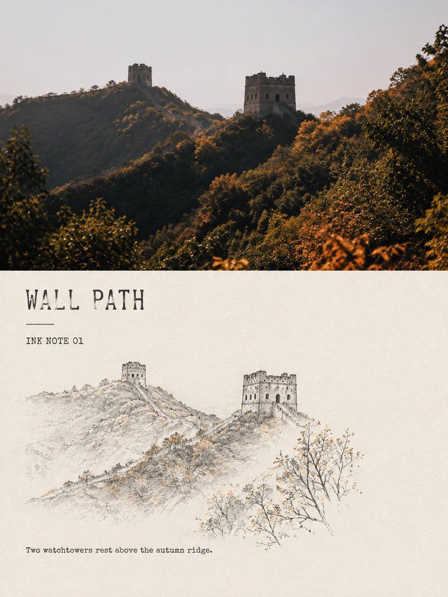
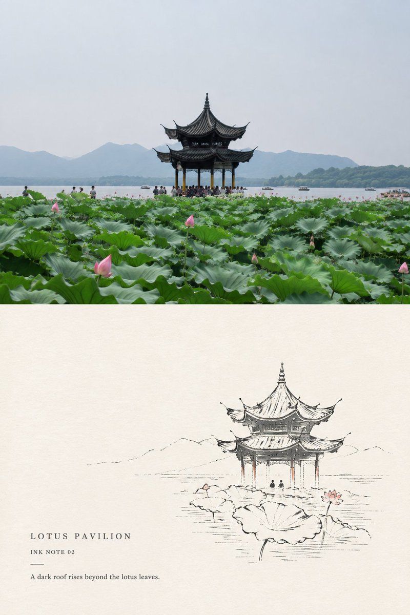
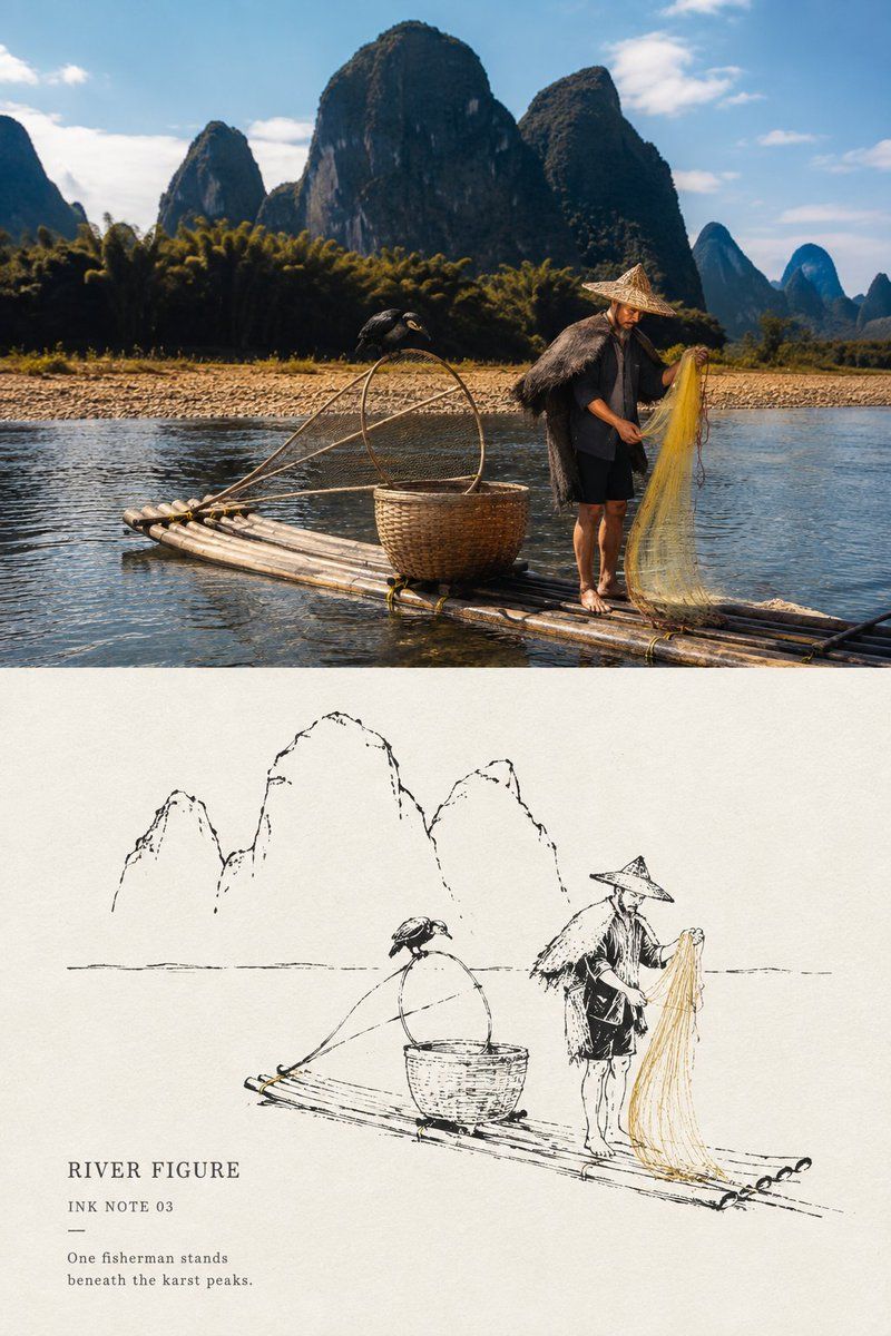
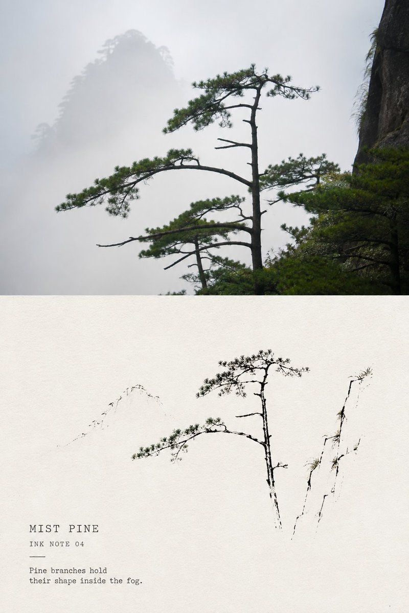
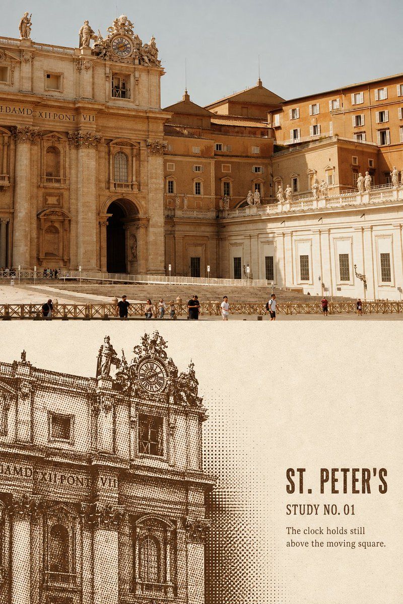
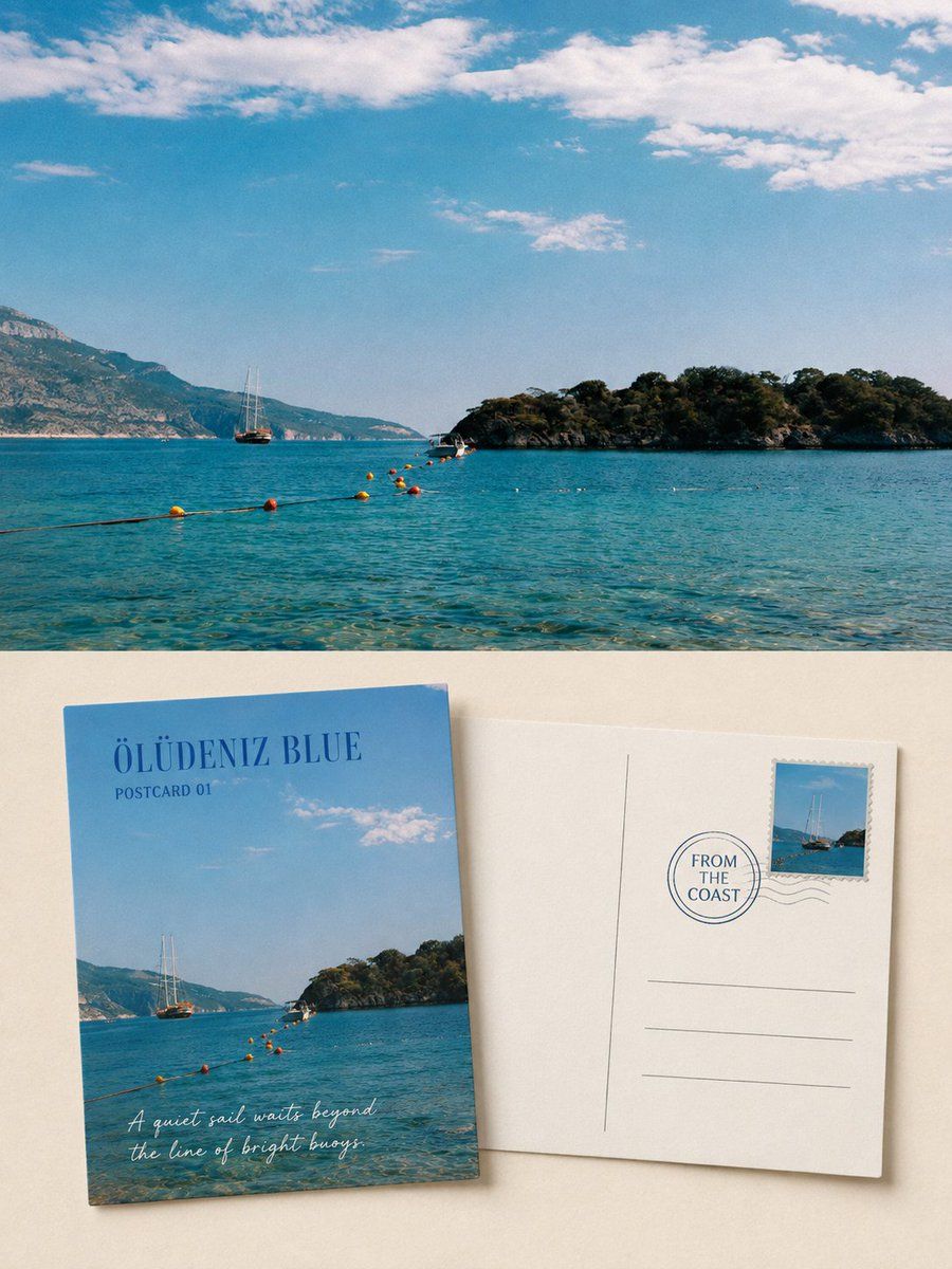
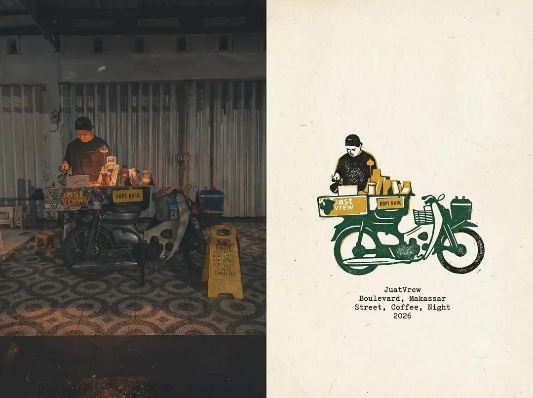
Please turn each travel photograph I upload into a separate “Minimal Ink-Line Landscape Note” comparison poster. Do not combine multiple photographs; output each photograph individually.

Use an overall 3:4 vertical composition with a clear visual comparison: the original photograph above and the stylized reinterpretation below. The proportions of the upper and lower areas may adjust naturally to the photograph's content rather than being mechanically equal, but their boundary and reading relationship must be clear, and together they must form one complete editorial design.

Preserve the original photograph with high fidelity in the upper half: retain the location, subject, architectural structure, human poses, natural light and shadow, spatial layers, and original color atmosphere. Do not replace the scene, alter key objects, stretch the subject, or invent landmarks absent from the original photograph. Apply only slight, restrained magazine-photography color grading. If necessary to fit the format, naturally extend the sky, water, ground, or surrounding environment.

Use warm off-white or natural paper white as the entire background of the lower half, distilling the photograph into a small, reduced, minimal ink-line landscape sketch. Do not copy the original in full or give every part of the scene equal line-drawing treatment. Actively select just a few of its most recognizable and poetic details, such as one architectural or landform anchor, a ridge or shoreline, an expressively shaped plant, a small human figure or travel object, and one or two clues to the weather and space.

Remove irrelevant crowds, cluttered vegetation, repetitive buildings, and incidental background details. The illustrated subject should occupy only about 38%–62% of the lower area's width, leaving approximately 55%–72% continuous, intact, perceptible blank paper.

Use black or deep gray-black fine-pen lines, dry ink, and subtle dry-brush texture. Allow variations in thickness, pauses, interruptions, paper tooth, skipped ink, and open contours so that the result feels like a quick but accurate observational sketch made while traveling.

Convey architectural proportions through a few structural lines. Keep only sparse outlines for mountains and distant scenery. Express water, mist, sky, and distance mainly through negative space. Do not draw plants leaf by leaf; suggest their gesture through the direction of branches and a very small number of ink dots. Avoid broad gray-ink washes, a fully developed traditional landscape painting, or precise architectural drafting.

Use predominantly black ink, allowing at most two small accent colors extracted from the original photograph, such as vermilion red, autumn-leaf ochre, pale lotus pink, moss gray-green, or the warm yellow of a fishing net. Their combined area must not exceed 8% of the lower image, and they should appear only in one particularly memorable detail. No full watercolor washes, colored outlines, or highly saturated decoration.

Text should resemble the running headers and captions of a small travel publication: sparse but clearly readable. Generate a short English title based on the photograph, accompanied by the numbering field “INK NOTE 01” and one extremely short English observation.

Use a restrained serif, typewriter typeface, or slightly irregular hand-printed lettering for the title. Place the text in the main negative space with breathing room between it and the illustration. Do not cover the subject, use ornate calligraphy, or generate Chinese seals, artist signatures, brand names, or watermarks. Across different images, change only the title, number, and observation; keep the overall layout and typographic character consistent.

The final image should clearly contrast authentic travel photography with a light ink-line observational sketch. It should be quiet, restrained, and spacious, like a paper note taken from an independent travel publication, architectural observation book, or private sketchbook. The point is not to show off technique, but to make a place, a kind of weather, or a fleeting action in the original photograph visible anew through subtraction, stopping the pen, and blank paper.

Avoid: applying a line-art filter directly to the entire photograph, completely identical upper and lower content, filling the lower half, continuous gray washes, full traditional Chinese landscape compositions, complex foliage, precise cross-hatching, comic-style architecture, cartoon people, watercolor fills, highly saturated clashing colors, fake Chinese text, copying signs from the photograph, author names, watermarks, an e-commerce-template appearance, and cheap vintage filters.
请将我上传的每一张旅行照片分别制作成一张独立的「极简墨线风景小笺」对比海报,不多图拼接,每张照片单独输出。

整体采用3:4竖版构图,明确保留“上方原始照片、下方风格转绘”的视觉对照。上下区域可根据原图内容自然调整比例,不必机械均分,但两部分必须边界清楚、阅读关系明确,并共同构成一张完整的编辑设计作品。

上半部分高保真保留原始照片:保持地点、主体、建筑结构、人物姿态、自然光影、空间层次和原有色彩氛围,不得替换场景、改变关键物体、拉伸主体或虚构原图中不存在的地标。仅进行轻微而克制的杂志摄影调色;如需适配画幅,可自然延展天空、水面、地面或环境背景。

下半部分使用温润的米白色或自然纸白作为完整底面,将照片提炼为一幅缩小的极简墨线风景小稿。不要完整照搬原图,也不要把整个画面平均线描;应主动筛选画面中最有识别度和诗意的少数信息,例如:一个建筑或地貌结构锚点、一条山脊或水岸线、一株具有姿态的植物、一名小人物或一件旅行物件,以及一至两条天气与空间线索。

删除无关人群、杂乱植被、重复建筑和琐碎背景。转绘主体仅占下半区域宽度约38%–62%,保留约55%–72%连续、完整、可感知的纸白。

线条使用黑色或深灰黑色的细钢笔、干墨与轻微毛笔飞白质感:允许粗细变化、停顿、断续、纸齿、漏墨和未闭合轮廓,使其像旅行途中迅速但准确留下的观察小稿。

建筑依靠少量结构线表现比例,山峰与远景只保留稀疏轮廓,水面、雾气、天空与距离主要通过留白完成;植物不逐片描绘叶子,而以枝干方向和极少墨点表现姿态。避免灰墨大面积铺染,避免画成完整传统山水画或精密建筑制图。

配色以黑墨为主,只允许从原照片中提取最多两种小面积强调色,例如朱砂红、秋叶赭黄、荷花淡粉、苔藓灰绿或渔网暖黄。强调色总面积不超过下半画面的8%,仅落在一个最有记忆点的局部,不做水彩满铺、彩色轮廓或高饱和装饰。

文字应像小型旅行出版物的页眉与图注,数量少但清楚可读。根据照片内容生成一个简短英文标题,搭配编号字段“INK NOTE 01”和一句极短英文观察句。

标题可使用克制的衬线体、打字机体或略带手工不齐的印刷体;文字放在主要留白区域,与插画保持呼吸距离,不压住主体,不使用华丽书法,不生成中文印章、作者签名、品牌名或水印。不同图片只更换标题、编号和观察句,整体版式与字体气质保持统一。

最终画面应呈现真实旅行摄影与轻盈墨线观察稿之间的明确对照;安静、克制、疏朗,像一页从独立旅行刊物、建筑观察册或私人速写本中取出的纸本小笺。重点不是炫技,而是通过删减、停笔与纸白,让原照片中的一个地点、一种天气或一个短暂动作被重新看见。

避免:整张照片直接线稿滤镜化、上下内容完全重复、下半铺满画面、连续灰色晕染、传统国画满构图、复杂树叶、精密交叉排线、漫画化建筑、卡通人物、水彩填色、高饱和撞色、伪中文、复制照片中的招牌文字、作者姓名、水印、电商模板感和廉价复古滤镜。