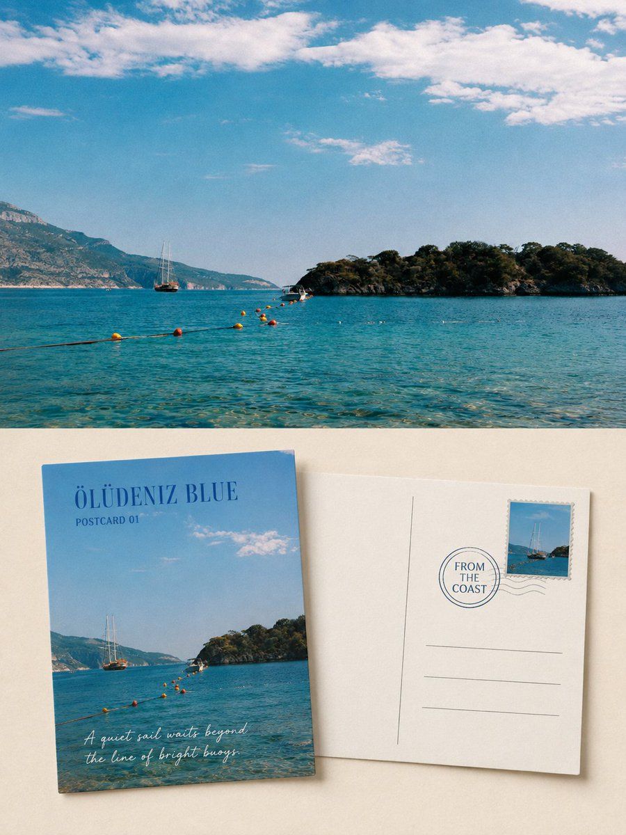
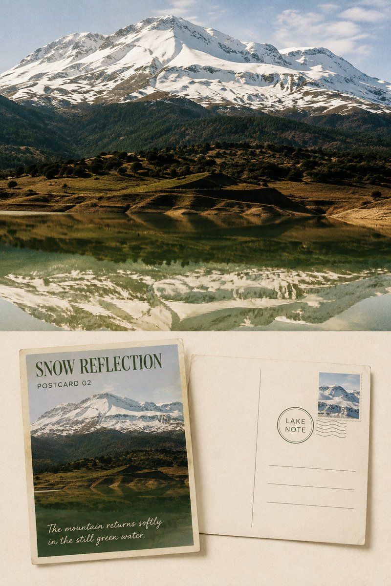
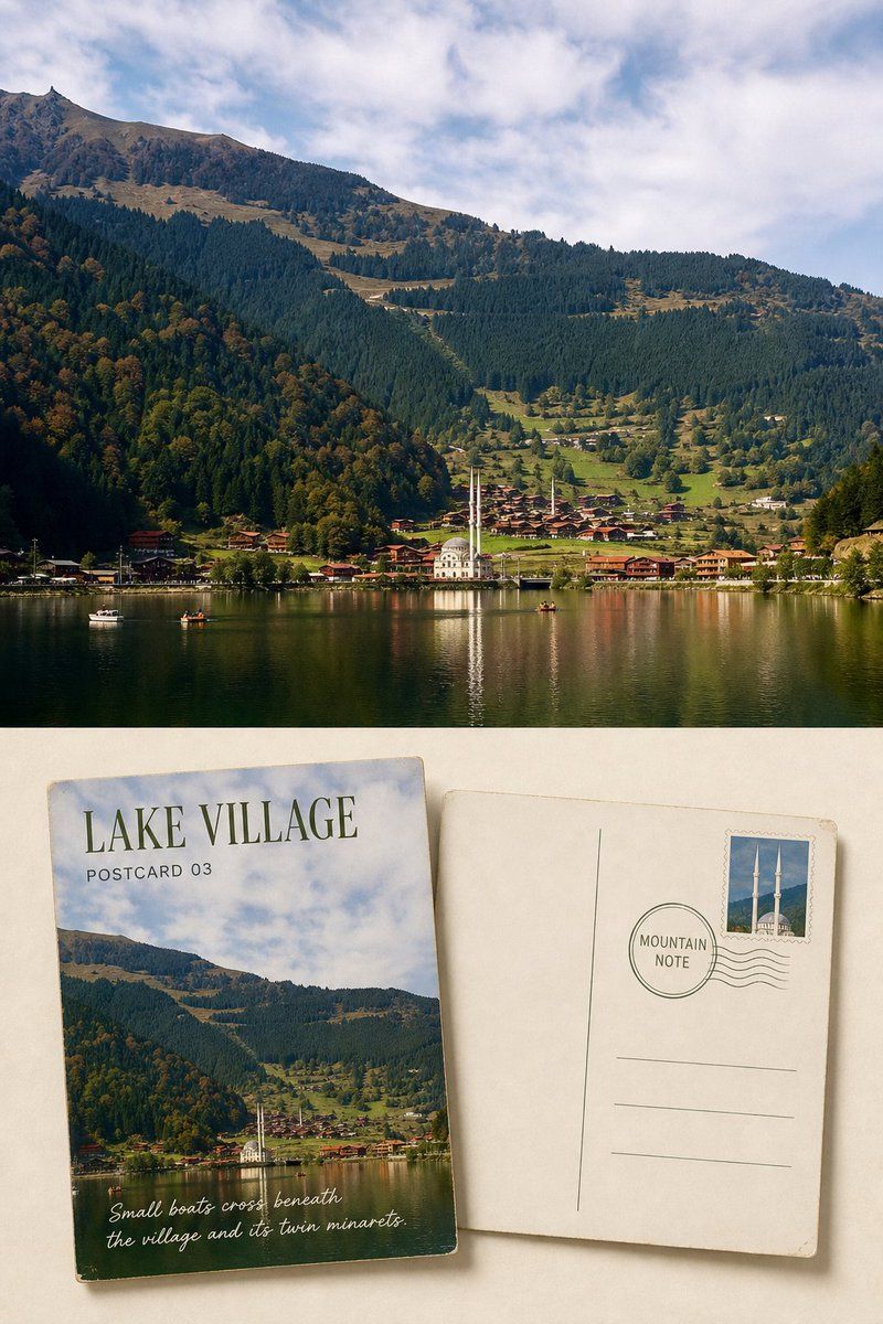
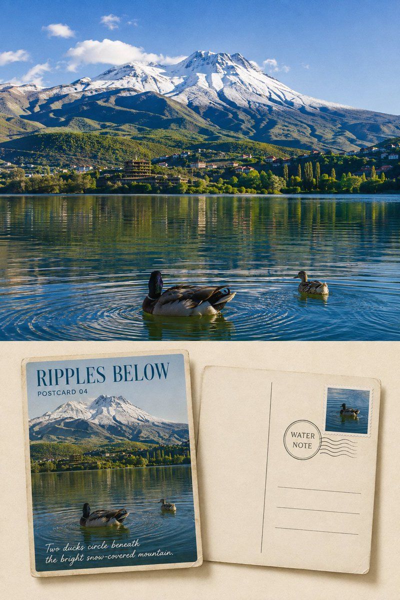
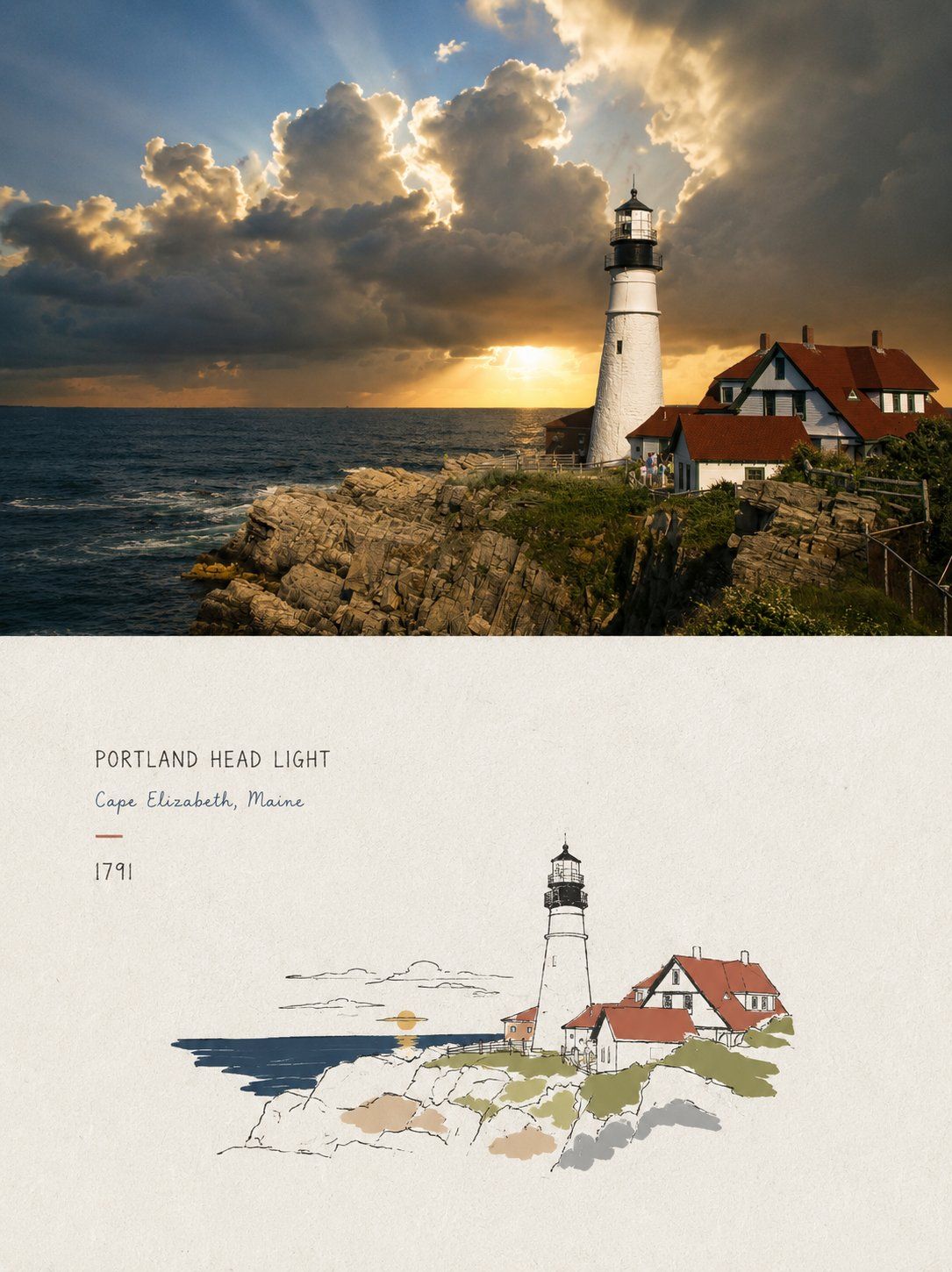
Turn each travel photograph I upload into a separate premium editorial poster displaying the front and back of a scenic postcard. Do not combine multiple photographs; produce one output per photograph.

Use a vertical 3:4 composition and clearly retain the same original travel photograph as evidence for comparison. The upper portion or photographic background should occupy approximately 45%–55% of the whole work and faithfully reproduce the original photograph. Accurately preserve the identity, number, direction, proportions, spatial positions, viewpoint, natural light and shadows, realistic textures, and original color atmosphere of mountains, coasts, lakes, buildings, boats, roads, plants, people, or animals. Apply only subtle premium travel-photography color grading and extremely fine film grain. Do not turn the photograph into an illustration, replace the sky, add or remove subjects, move scenery, alter terrain, or reshape buildings.

On warm-white, pale-ivory, or another quiet light-colored paper surface sampled from the photograph in the lower half, display two equally sized, convincingly tangible physical postcards together: one showing the front and one showing the back. Keep both cards in standard landscape postcard proportions, slightly offset or rotated, without substantial overlap. Clearly show paper thickness, firm edges, slight wear, natural cast shadows, and uncoated paper fibers. Do not hide the original photograph solely inside the front postcard: the upper photographic area must still occupy a substantial, clearly recognizable portion.

For the front postcard, select a fresh crop of the original photograph's most representative scenery. Preserve the subject's most recognizable outlines, terrain relationships, weather, colors, and spatial orientation, but do not simply shrink the entire photograph proportionally into the card. You may enlarge a visual anchor and remove distracting background clutter so the front feels like a carefully selected travel landscape print. Add a place or scene title of 1–3 English words, along with restrained labels such as “SCENIC NOTE 01” or “POSTCARD STUDY”.

The back postcard should have a clear center dividing line, address lines, a stamp area, and appropriate blank space. Derive a single stamp from a subject, silhouette, or accent color in the same photograph. Keep the postmark restrained and do not invent complicated postal information. In the writing area, add an original travel observation of no more than two sentences, describing only weather, light, colors, boats, mountains, the lake surface, villages, or spatial impressions actually visible in the photograph. Determine every word from the photograph, and keep the text clearly legible.

Use primarily warm-white or pale-ivory paper. Sample ink colors from the photograph's deep blues, gray-greens, charcoal grays, or browns; the stamp may retain one accent color from the original photograph. The two cards should occupy approximately 45%–65% of the lower area, with at least 30% continuous low-detail negative space around them. Set titles and short phrases in gentle serif type, handwriting, or postal letterpress type, with slight paper-tooth effects, broken ink, and old-print registration imperfections so the lettering truly belongs to the postcards.

Maintain a clear, restrained hierarchy between the original photograph and the postcard display area. If using an upper-and-lower layout, keep the boundary distinct: no fogging, feathering, or blending them into a single painting.

Take inspiration from collectible travel postcards, independent publications, photographic archives, and contemporary editorial design. The overall visual character should feel quiet, sincere, restrained, warm with paper texture, and suggestive of an unfinished story.

Avoid multi-photo collages, nine-panel grids, missing photographs, using the original image only as tiny decoration, duplicate cards, excessive stamps, elaborate stickers, invented cities, long strings of gibberish, author names, account handles, brands, QR codes, logos, picture-frame mockups, handheld displays, watermarks, and cheap retro templates.
请将我上传的每一张旅行照片分别制作成一张独立的高级风景明信片正反面编辑海报,不多图拼接,每张照片单独输出。

整体采用3:4竖版构图,并清楚保留同一张原始旅行照片作为对比证据。上半部分或画面背景约占整张作品45%–55%,忠实呈现原始照片,准确保持山体、海岸、湖泊、建筑、船只、道路、植物、人物或动物的身份、数量、方向、比例、空间位置、观察角度、自然光影、真实质感和原有色彩氛围。仅进行轻微高级旅行摄影调色与极薄胶片颗粒处理,不得把照片插画化,不得替换天空、增删主体、移动景物、改变地形或重塑建筑。

在下半部分的暖白、浅象牙或由照片提取的安静浅色纸面上,同时陈列两张同尺寸、真实可触的实体明信片:一张展示正面,一张展示背面。两张卡片保持标准横向明信片比例,轻微错位或转角,但不得彼此大面积遮挡。清楚表现纸张厚度、硬挺边缘、细微磨损、自然投影和无涂布纸纤维。原始照片不能只被藏进正面卡片里,上方真实摄影区域仍需具有实质面积并清楚可辨。

正面明信片从原照片中重新选择最有代表性的风景裁切,保留主体最具识别度的轮廓、地形关系、天气、色彩和空间方向,但不要把完整照片等比例缩小塞进卡片。可放大一个视觉锚点,删除杂乱背景,让正面更像一张被认真选择的旅行风景印刷品。加入1–3个英文单词的地点或场景标题,以及“SCENIC NOTE 01”或“POSTCARD STUDY”等克制字段。

背面明信片使用清楚的中线、地址横线、邮票区与适度留白。邮票从同一照片中的主体、轮廓或强调色提炼而来,只保留一枚;邮戳保持克制,不虚构复杂邮政信息。在书写区放置一段不超过两句的原创旅行观察,只描述照片中真实可见的天气、光线、颜色、船、山、湖面、村落或空间感受。所有文字必须根据照片逐字确定,大小清楚可读。

纸张以暖白或浅象牙色为主,墨色从照片中的深蓝、灰绿、炭灰或棕色提取;邮票可以保留原照片的一处强调色。两张卡片约占下半区域45%–65%,四周至少保留30%连续低信息空场。标题与短句使用温和衬线、手写笔迹或邮政铅字,带轻微纸齿、断墨与旧印刷偏差,让文字真正属于明信片。

原始照片与明信片陈列区之间要有清晰、克制的层级关系。若采用上下结构,边界必须清楚,不雾化、不羽化、不混成同一张画。

整体参考收藏级旅行明信片、独立出版物、摄影档案和现代编辑设计,呈现安静、真诚、克制、有纸张温度和未说完故事的视觉气质。

避免多照片拼贴、九宫格、照片缺失、原图仅作微小装饰、重复卡片、过量邮票、复杂贴纸、虚构城市、长段乱码、作者名、账号、品牌、二维码、Logo、相框Mockup、手持展示、水印和廉价复古模板。