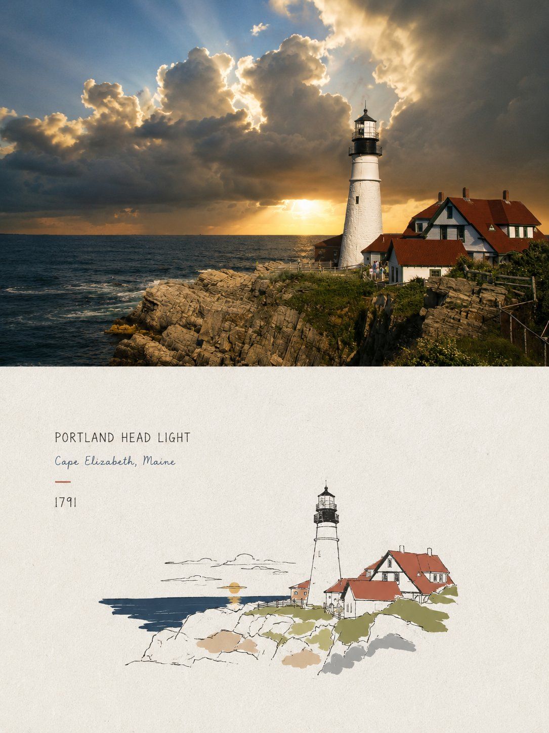
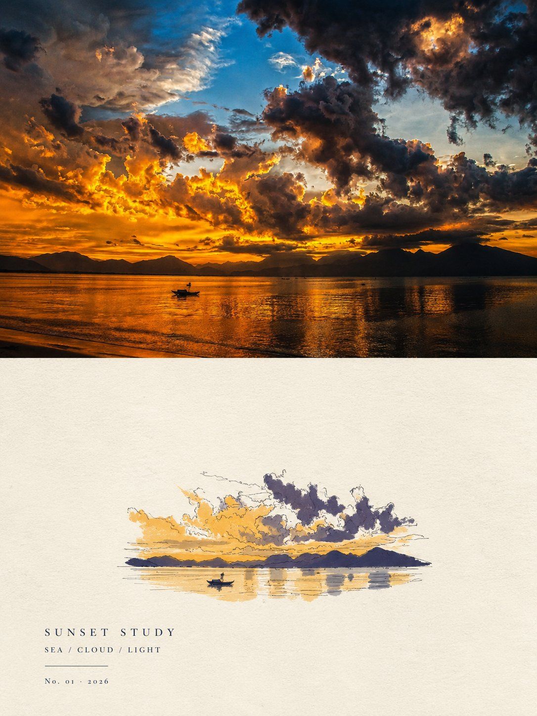
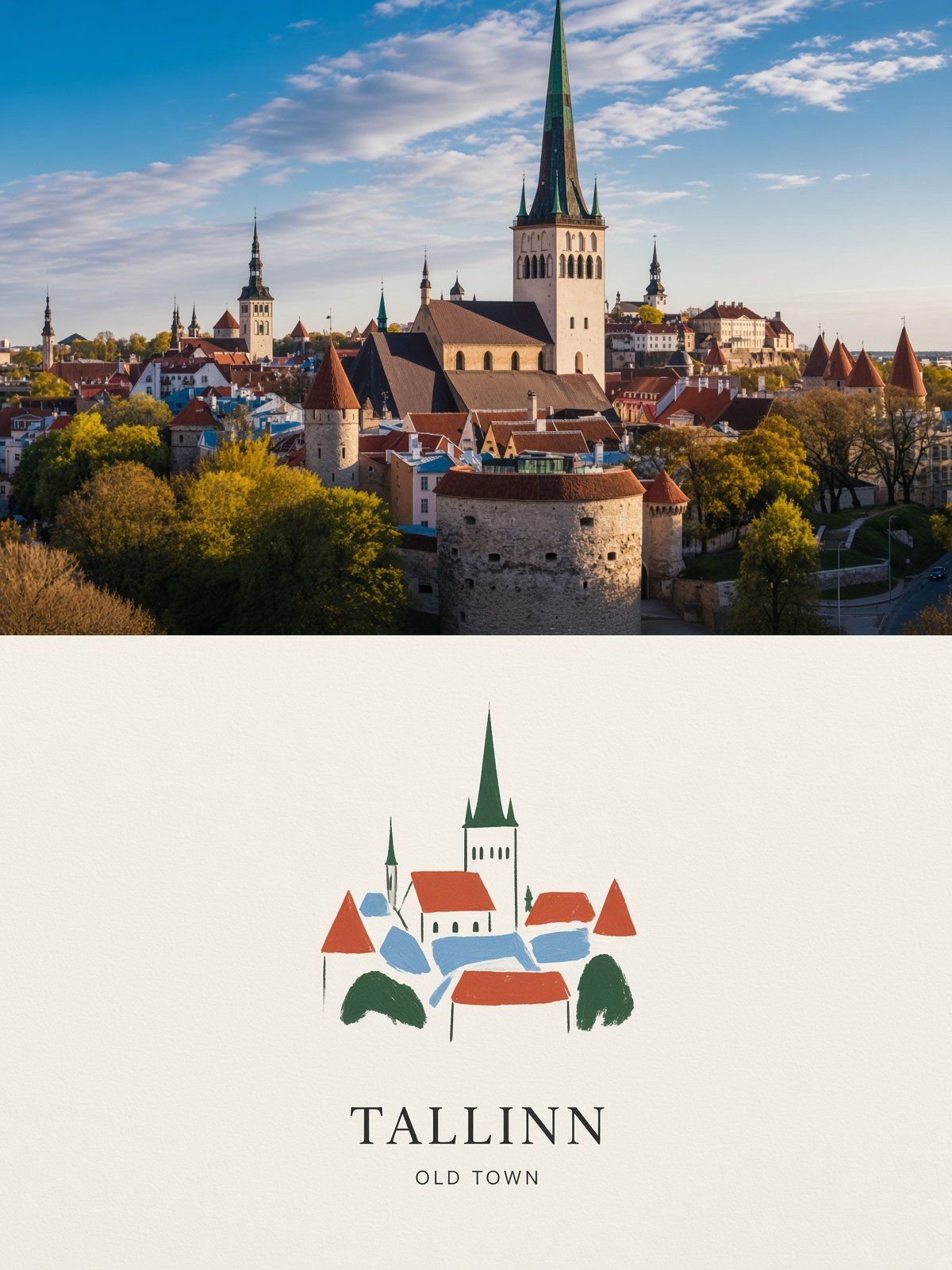
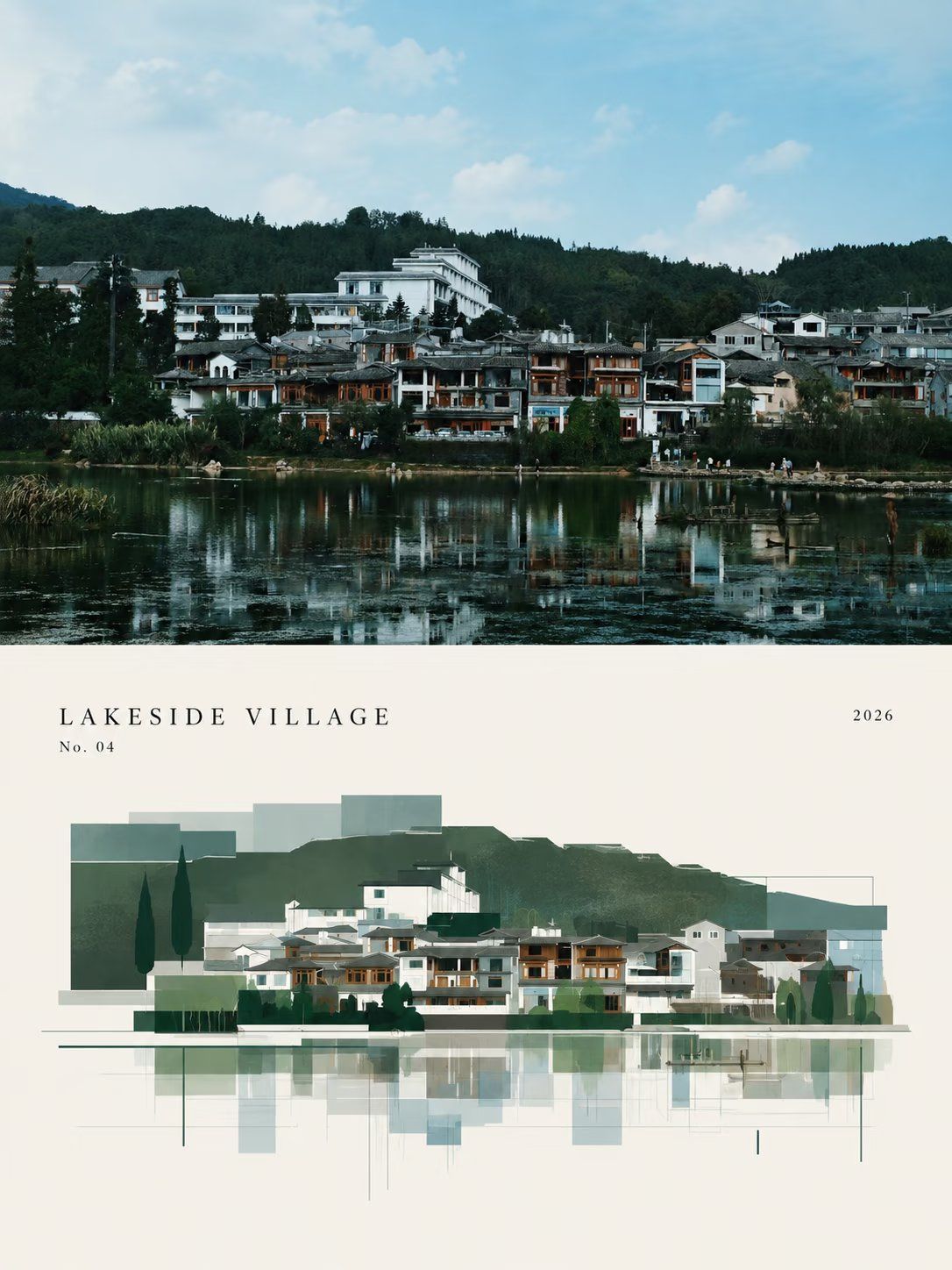
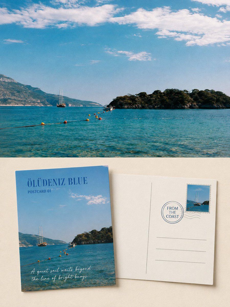
Create one independent high-end design poster for each photo I upload. Do not combine multiple photos; output each photo separately. Use a vertical {argument name="Aspect ratio" default="3:4"} composition, divided into two regions with a strict 1:1 height ratio, each occupying 50% of the canvas.

Keep the original photo in the upper half, preserving the subject's structure, realistic texture, natural light and shadow, and original color atmosphere. Apply only subtle, sophisticated photographic color grading so it feels like magazine photography or an art publication. To fit the format, naturally extend the sky, ground, or environmental background if needed, but never stretch, distort, or alter the subject.

In the lower half, extract the photo's most recognizable subject, contours, pose, and narrative relationships, then reconstruct them as a minimalist, paper-textured, hand-drawn cover illustration. Strongly distill and simplify complex details, retaining only the essential visual features. Re-express them with delicate, slightly imperfect hand-drawn lines and a few clear, flat acrylic color blocks so the original theme remains instantly recognizable. Keep the subject small and concentrated, occupying about {argument name="Subject proportion" default="10%–20%"} of the lower half, with abundant negative space around it. Use rough white or pale paper as the background, with only a few lines or color fields to suggest the environment.

Extract the palette from the upper photo and compress it to no more than four main colors. Keep the color blocks vivid, complete, and restrained, preserving paper grain, handmade brushwork, and slightly irregular edges. Lines should suggest structure; color blocks should establish the subject. Avoid colored pencil, crayon, bleeding watercolor, pure line art, complex realism, heavy oil paint, smooth digital illustration, and 3D texture.

A small amount of simple text may be added. Depending on the photo, flexibly use a title, theme word, object name, location, year, number, or short phrase; the subject need not be urban. Keep typography sparse and restrained, naturally integrated with the negative space and illustration, with the design character of an art-book cover, independent publication, or children's picture book. The overall visual mood should feature a small subject, abundant negative space, strong distillation, high recognizability, quietness, childlike charm, ease, poetry, and sophistication. Avoid commercial-cartoon, e-commerce, and template-like aesthetics.
请将我上传的每一张照片分别制作成一张独立的高级设计海报,不多图拼接,每张照片单独输出。整体采用{argument name="构图比例" default="3:4"}竖版构图,上下两个区域高度严格1:1,各占画面50%。
上半部分保留原始照片,保持主体结构、真实质感、自然光影和原有色彩氛围,仅进行轻微高级摄影调色,使其具有杂志摄影和艺术出版物质感。为适配画幅,可自然扩展天空、地面或环境背景,但不得拉伸、扭曲或改变主体。
下半部分提取照片中最具识别性的主体、轮廓、姿态与叙事关系,重构为极简纸感手绘封面插画。高度提炼并删减复杂细节,只保留最关键的视觉特征,以纤细、略带不稳定感的手绘线条和少量明确的丙烯平涂色块重新表达,让人一眼识别原始主题。主体保持小而集中,约占下半部分{argument name="主体占比" default="10%–20%"},四周大面积留白,背景以粗糙白纸或浅色纸张为主,仅用极少量线条或色面暗示环境。
配色从上方照片提取并压缩为不超过4种主要颜色,色块鲜明、完整、克制,保留纸张颗粒、手工涂抹和轻微不规则边缘。线条负责提示结构,色块负责建立主体。避免彩铅、蜡笔、水彩晕染、纯线稿、复杂写实、厚重油画、光滑数字插画和3D质感。
可加入少量简洁文字,根据照片内容灵活使用标题、主题词、对象名称、地点、年份、编号或短句,不局限于城市题材。文字排版疏朗克制,与留白和插画自然融合,具有艺术书封、独立出版物和儿童绘本式设计感。整体呈现小主体、大留白、强提炼、高识别度、安静、童趣、轻松、诗意而高级的视觉气质,避免商业卡通感、电商感和模板感。