Prompt:

Create a 9:16 editorial collage poster built around a fan-shaped composition where the geometry directly expresses the concept.

SUBJECT: [your theme / subject]
TITLE: [main title]
CONCEPT: [what the poster should communicate]
FAN STRUCTURE: [layered curved fan / concentric arcs / large color wedges / radial burst / custom variation]
VISUAL CONTENT: [people / places / events / objects / moments / textures]
COLOR SYSTEM: [2–5 dominant colors]
TYPOGRAPHY: [editorial serif / grotesk / condensed sans / mixed system]
BACKGROUND: [paper tone / flat color / minimal backdrop]
TEXT DETAILS: [short meaningful phrases / optional event or editorial information]

Choose the fan structure according to the meaning of the poster rather than using it as decoration.

For example:

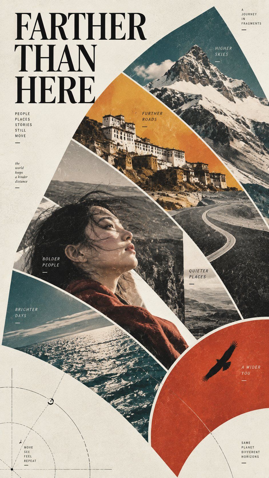
* layered curved fans can suggest distance, travel, space, or unfolding experience
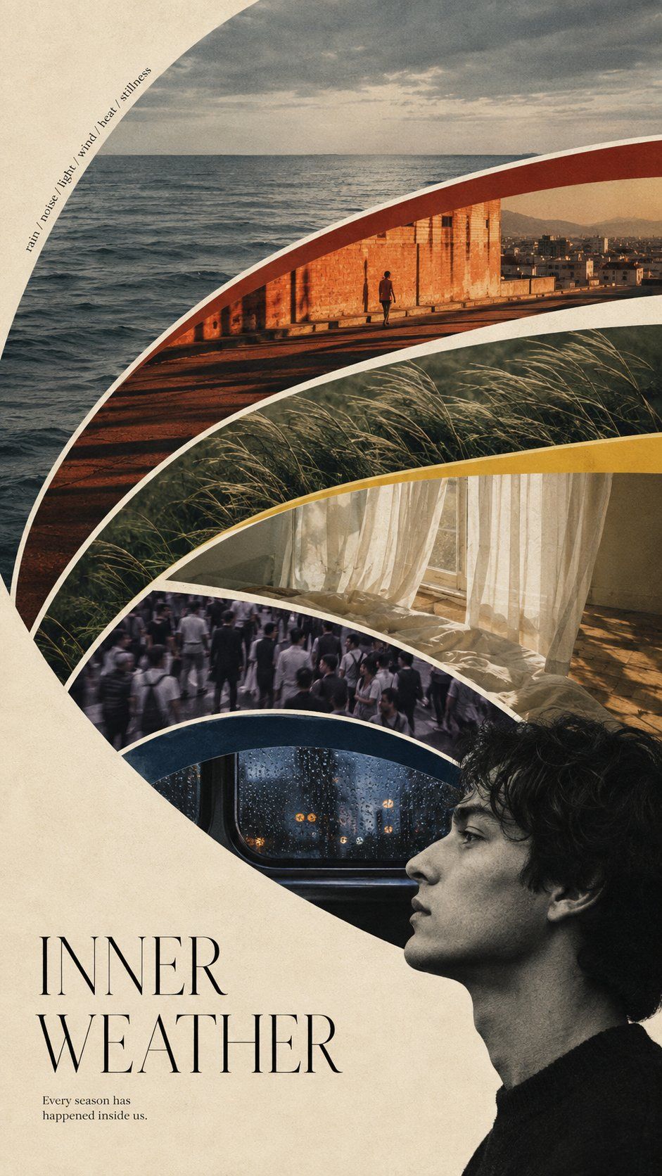
* concentric arcs can suggest emotion, perception, memory, or inner states
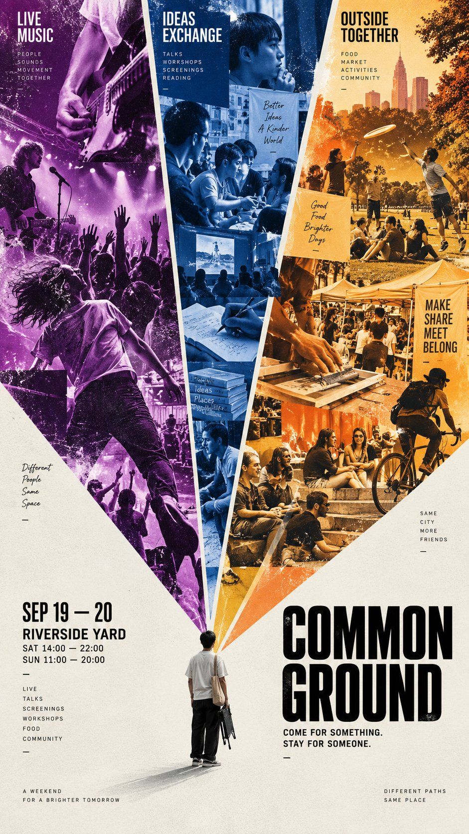
* large color wedges can organize communities, events, contrasting themes, or parallel worlds
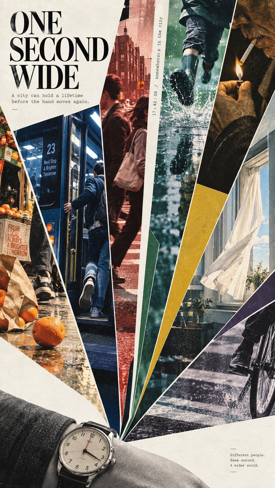
* sharp radial cuts can suggest time, speed, simultaneous moments, or explosive energy

Build one clear large-scale composition first. From a distance, the fan geometry should be immediately readable and visually striking; up close, the viewer should discover richer photography, people, environments, textures, and narrative details.

Do not make every section equal. Vary the width, scale, density, and direction of the fan areas. Mix image-heavy sections with pure color fields and negative space to create rhythm.

Photography should adapt to the geometry rather than sit inside rectangular frames. Use bold cropping, scale shifts, partial subjects, layered imagery, and a few controlled elements crossing the boundaries when useful.

Keep each major section visually coherent with its own dominant color or tonal identity. The overall palette should feel intentional, not randomly multicolored.

Typography should support the concept and composition. Use one strong title, a concise supporting line, and only the amount of editorial information the poster actually needs. Place text mainly in quieter areas so it does not compete with the most complex collage regions.

The finished image should feel like a complete art or editorial poster, not a fan-shaped photo template. The shape itself should help tell the story.