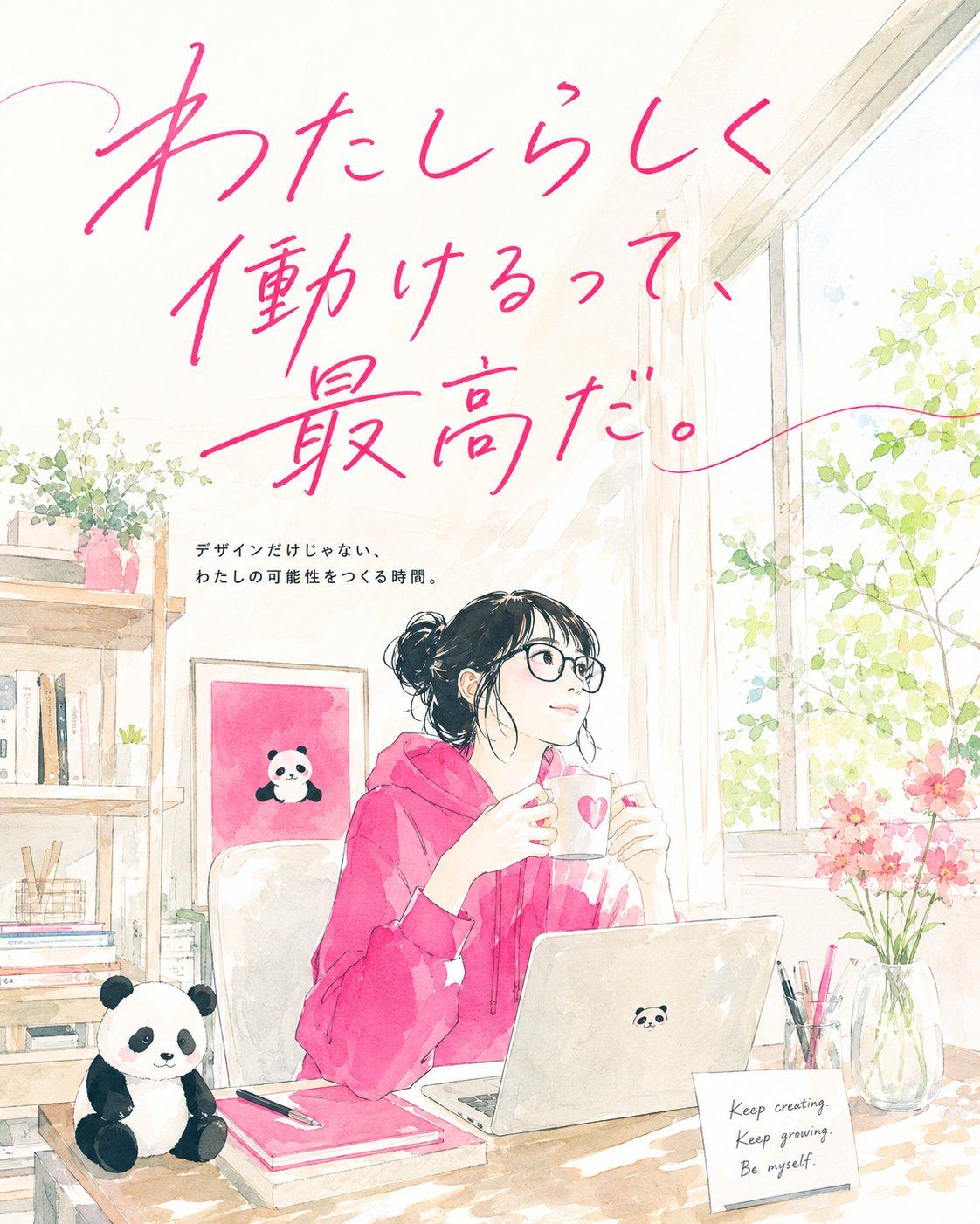
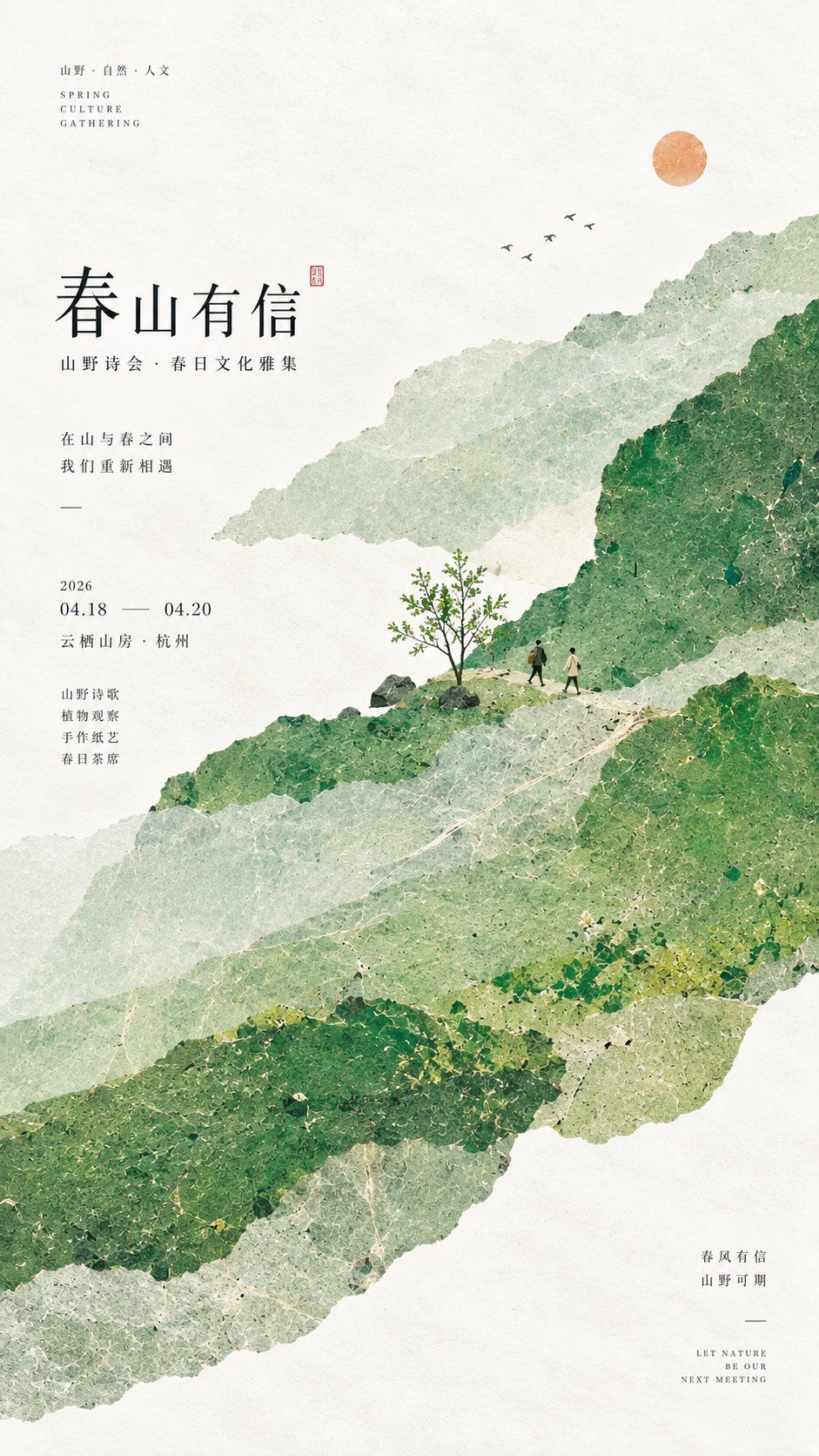
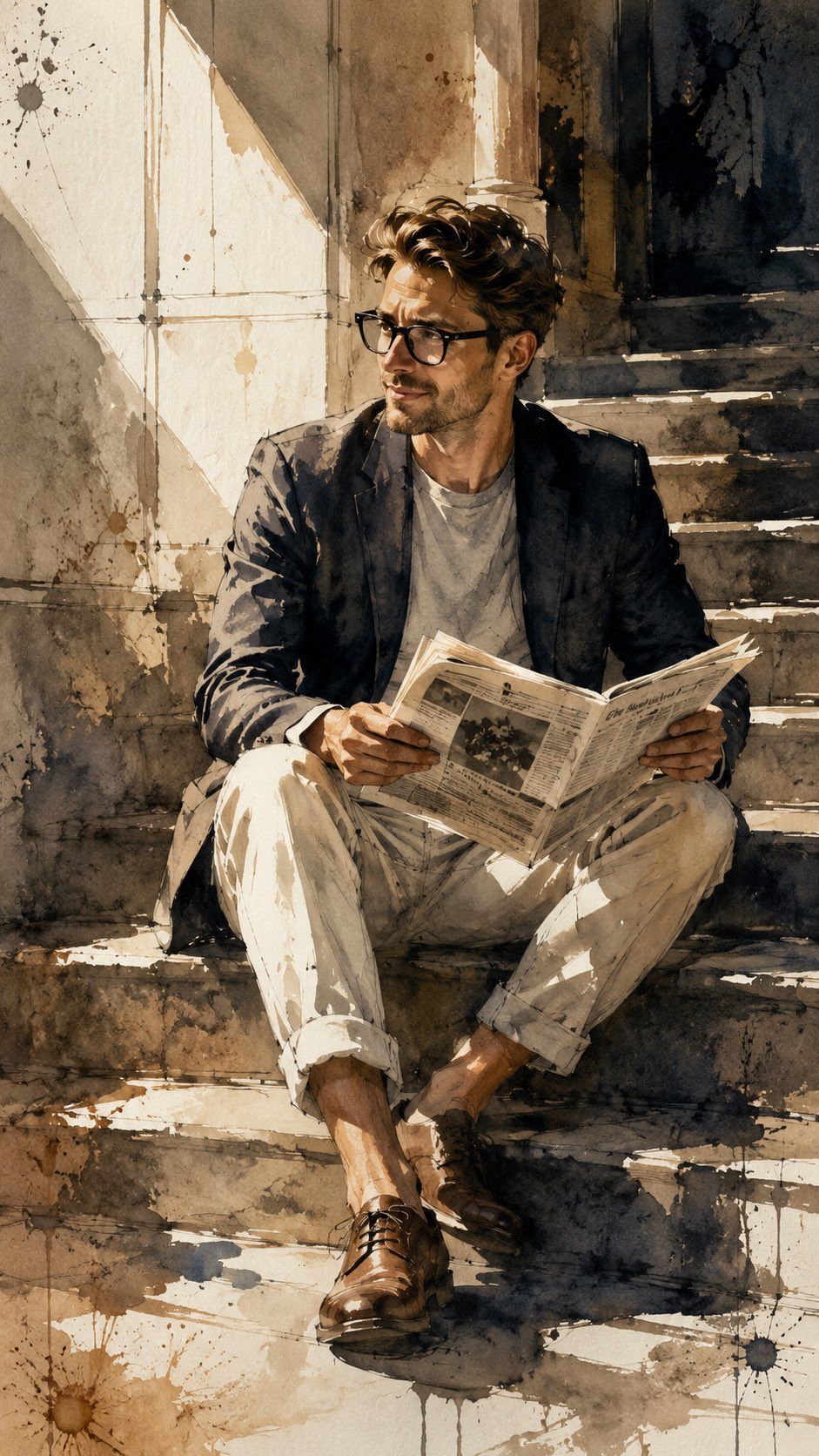
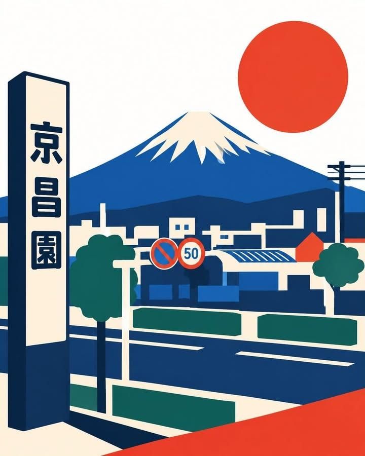
Use the attached screenshots, social media profiles, posts, landing pages, product pages, writing, photographs, and other materials as references. Re-edit their content and context, then generate one portrait 4:5 illustrated advertising poster for social media.

Do not reproduce the screens or existing layouts from the reference materials. Instead, internally infer the following from the supplied information:

・The person, brand, product, or service
・The most important feature and benefit to communicate
・The time, place, and everyday situation in which it is used
・The desires and feelings of the target audience
・The brand's language and emotional temperature
・The primary colors and symbolic objects
・The future you want viewers to imagine

Do not output confirmation questions, analysis, explanatory text, or a production plan. Generate the finished image immediately.

【MOST IMPORTANT CONCEPT】

Translate the input into a single emotional advertising scene where real everyday life blends with a small touch of fantasy.

Do not diagram the product's functions. Depict the time, mood, actions, and lingering feeling that arise from using it.

Create an advertisement that naturally makes viewers feel:

“I love this kind of moment.”
“I want to be there too.”
“I somehow want to try this.”

Let viewers project their own lives onto the scene.

Do not duplicate the copy, composition, characters, or product placement of existing advertisements. Refer only to their gentle emotional design, lived-in worldbuilding, and integration of typography and illustration.

【ADVERTISING SCENE】

Choose only one usage situation from the input that is the most symbolic.

Use such a setting and depict a moment in which a person is naturally experiencing the product or service.

Place only a small number of objects around the person that reveal something about their life and activities.

These objects should not be explanatory symbols. They should suggest the person's character, work, hobbies, worries, and ideal future.

Add only a faint sense of floating, a shift in scale, or an imaginative expanse to the real-world scenery, creating an image that sits on the boundary between everyday life and fantasy.

【ILLUSTRATION WORLD】

Use a visual expression that sits between premium Japanese lifestyle advertising, culture magazines, anime-film background art, and contemporary editorial illustration.

Do not exaggerate the person into an anime character. Depict them as though a real person had been translated into a refined illustration.

・Thin, light lines with natural variation created by pen pressure
・Soft coloring that feels like a combination of transparent watercolor, gouache, and colored pencil
・Primarily flat colors with only a very subtle paper or brush texture
・Do not use cel shading, heavy painting, or photorealistic rendering
・Keep shading to a minimum and create atmosphere through color fields and negative space
・Use the main colors of the input materials as a base, adding a small amount of complementary or analogous color
・Use bright, clear colors; do not drift toward muddy beige or reddish brown
・Make only the main subject or product slightly more vivid, keeping the surroundings soft and restrained
・Create transparency as though morning or evening natural light were wrapping around the entire scene
・Unify the people, background, and objects through one palette and atmosphere so they do not look drawn separately

Keep facial contours and expressions relatively simple, and softly omit background and object details in favor of atmosphere.

Do not render every part at the same level of detail. Vary the information density so the viewer's eye flows naturally from the person to the typography and then to the background.

Capture the face, hair, and clothing with the minimum necessary lines and colors. Avoid excessive eyelashes, shine, skin rendering, or a visual style associated with beautiful-girl games.

Do not explain every background detail. Give the foreground a little more information, then reduce the lines and colors in the middle and far distance so they dissolve softly.

Do not create a “cute character.” Depict “the moment when an ordinary day becomes a scene from a film.”

【TYPOGRAPHY】

Do not copy large amounts of information from the input. Edit the central emotion of the advertisement into one short sentence.

The main copy should not be an explanation or command. Write it in Japanese as an inner thought, question, or realization that appears in the person's mind.

Aim for approximately 10–22 characters and place it boldly from the top toward the center of the image.

Design the main copy as thin, flowing handwritten logotype with rhythm.

Do not simply place an existing handwritten font. Draw it as a title logo made specifically for the advertisement, adjusting the shape, tilt, line weight, spacing, and overlap of every character.

・Let the baseline waver slightly
・Extend selected sweeps, hooks, and curves
・Let the lettering naturally wrap through the space around the person and scenery
・Coordinate the lettering strokes with the flow of air and wind
・Maintain readability while leaving a slight sense of interpretive ambiguity
・Choose the lettering color from the main or accent colors in the input materials
・Do not use uniform digital fonts, heavy rounded lettering, or childish pop lettering
・Do not add unnecessary underlines, circles, arrows, stars, dots, or wavy lines

Only when a product name, brand name, or supporting information is necessary, organize it in a neutral sans-serif typeface that is substantially smaller than the main copy.

Keep supporting information to a minimum and do not let it compete with the main copy.

【MATCHING TYPOGRAPHY AND ILLUSTRATION】

First choose only one emotion for the entire advertisement, then reflect that emotion in both the typography and the illustration.

・For light and free content, use extended lettering strokes, generous letter spacing, and an airy composition
・For quiet and introspective content, use thin lines, a low visual center of gravity, and calm negative space
・For curiosity-provoking content, use slightly bouncing lettering and scenery that draws the eye deeper into the image
・For positive change, compose the lettering and scenery so they open upward or outward

Do not create an emotional mismatch in which only the typography is energetic, only the illustration is quiet, only the lettering feels luxurious, or only the picture feels childish.

Do not make the lettering look as though it was placed on top of a finished illustration afterward. Design the lettering, person, scenery, and negative space together as one composition from the beginning.

Harmonize the line quality of the lettering with the line quality of the illustration, the lettering color with the overall palette, and the movement of the lettering with the movement of the person and scenery.

【COMPOSITION】

Portrait 4:5.

Leave ample safe space around the outer edges.

Place one lived-in illustrated scene from the center toward the lower part of the frame.

Set the main copy large from the top toward the center, creating a spatial relationship in which part of it passes behind or in front of the illustration.

Make the person clearly visible as the main subject, but do not enlarge only the face excessively. Use a scale that shows the person's relationship to their living environment.

Integrate the object that symbolizes the product or service naturally into the person's actions. Do not float it separately as an explanatory product shot.

From a distance, the composition should clearly communicate three things:

・Emotional main copy
・One memorable everyday scene
・The main person or product

Up close, viewers should discover small stories in the person's actions, the objects, and the background.

【INFORMATION DENSITY】

Focus on one thing that matters most.

Do not pack the profile introduction, achievements, features, and service explanation all into the image.

The illustration may contain a sense of everyday life, but keep the advertising message sparse.

Do not use long passages, extremely small text, multiple boxed articles, card UI, social media screens, QR codes, checklists, speech bubbles, or explanatory icons.

【AVOID THESE RESULTS】

・A self-introduction image with large amounts of text and icons scattered around the person
・AI beautiful-girl illustration, game illustration, or a standalone anime-style image
・An image that renders the face, hair, skin, and background at the same density
・Heavy rendering with photographic precision
・A childish style resembling children's educational materials or a novelty-goods brand
・A generic illustrated advertisement with handwritten text merely placed on top
・So many colors that the main subject becomes unclear
・A retro treatment in which the background drifts toward muddy beige or reddish brown
・A design in which the emotions or line qualities of the typography and illustration do not match
・An image that fills negative space with meaningless decoration
・A result that imitates the composition, copy, or characters of an existing advertisement

Do not make an image that merely explains the input. Complete it as one premium illustrated advertising poster whose distinctly brand-like time and emotion remain in the viewer's memory.
添付されたスクリーンショット、SNSプロフィール、投稿、LP、商品ページ、文章、写真などを資料として読み取り、その内容と背景を再編集した、縦位置4:5のSNS向けイラスト広告ポスターを1枚生成してください。

資料の画面や既存レイアウトは再現せず、入力情報から以下を内部で読み取ってください。

・人物、ブランド、商品、サービス
・最も伝えるべき特徴とベネフィット
・利用される時間、場所、生活場面
・ターゲットが抱える欲望や気分
・ブランドの言葉づかいと感情の温度
・主要色と象徴的な小物
・見た人に想像してほしい未来

確認質問、分析結果、説明文、制作方針は出力せず、そのまま完成画像を生成してください。

【最重要コンセプト】

入力内容を、現実の日常と小さな空想が溶け合った、一つの情緒的な広告シーンへ翻訳してください。

機能を図解するのではなく、それを使うことで生まれる時間、気分、行動、余韻を描いてください。

見る人が、

「この時間、いいな」
「自分もここにいたい」
「なんだか試してみたい」

と自然に感じ、自分の生活を重ねられる広告にしてください。

既存広告のコピー、構図、人物、商品配置を複製せず、柔らかな感情設計、生活感のある世界観、タイポグラフィとイラストの一体感だけを参考にしてください。

【広告シーン】

入力情報から最も象徴的な利用場面,を一つだけ選んでください。

などを舞台にし、人物が商品やサービスを自然に体験している瞬間を描いてください。

人物の周囲には、その人の生活や活動が伝わる小物を少数だけ配置してください。

小物は説明のための記号ではなく、人物の性格、仕事、趣味、悩み、理想の未来を感じさせるものにしてください。

現実の風景に、ごくわずかな浮遊感、スケールのずれ、空想的な広がりを加え、日常と妄想の境界にあるような一枚にしてください。

【イラスト世界観】

日本の上質なライフスタイル広告、カルチャー誌、アニメ映画の背景美術、現代的なエディトリアルイラストの中間にある表現にしてください。

人物はアニメキャラクターとして誇張せず、現実の人物を洗練されたイラストへ翻訳したように描いてください。

・細く軽やかで、筆圧による自然な強弱のある線
・透明水彩、ガッシュ、色鉛筆を合わせたような柔らかな塗り
・フラットカラーを基本に、ごく淡い紙やブラシの質感
・セル塗り、厚塗り、写真風レンダリングは使わない
・陰影は最小限にし、色面と余白で空気感を作る
・入力資料の主要色を基準に、補色または近似色を少量加える
・明るく澄んだ色を使い、濁ったベージュや赤茶色へ寄せない
・主役や商品だけを少し鮮やかにし、周辺は柔らかく抑える
・朝や夕方の自然光が画面全体へ回り込むような透明感
・人物、背景、小物を別々に描いたように見せず、一枚の絵として色と空気を統一する

人物は輪郭と表情をやや簡潔に描き、背景や小物は空気感を優先して柔らかく省略してください。

全体を均一に描き込まず、見る人の視線が自然に人物→タイポグラフィ→背景へ流れるよう、情報密度に強弱をつけてください。

人物の顔、髪、服は最低限の線と色で印象を捉え、過剰なまつ毛、光沢、肌の描き込み、美少女ゲーム風の表現を避けてください。

背景は細部をすべて説明せず、近景のみ少し情報量を持たせ、中景と遠景は線や色を減らして柔らかく溶かしてください。

「かわいいキャラクター」ではなく、「何気ない日常が映画のワンシーンになる瞬間」を描いてください。

【タイポグラフィ】

コピーは入力情報を大量に転記せず、広告の中心となる感情を短い一文へ編集してください。

メインコピーは、説明や命令ではなく、人物の頭の中に浮かんだ独り言、問いかけ、気づきのような日本語にしてください。

文字数は10〜22文字程度を目安にし、画面上部から中央へ大胆に配置してください。

メインコピーは、細く伸びやかでリズムのある手書きロゴタイプとして設計してください。

既製の手書きフォントを置くだけにせず、一文字ずつ形、傾き、線の強弱、文字間、重なりを調整した広告専用のタイトルロゴとして描いてください。

・ベースラインをわずかに揺らす
・一部の払い、はね、曲線を長く伸ばす
・文字を人物や風景の空間へ自然に回り込ませる
・空気や風の流れと文字線を連動させる
・可読性を保ちながら、少しだけ判読の余韻を残す
・文字色は入力資料の主要色またはアクセント色から選ぶ
・均一なデジタルフォント、太い丸文字、幼いポップ文字は禁止
・不要なアンダーライン、丸、矢印、星、点、波線を足さない

商品名、ブランド名、補足情報が必要な場合のみ、メインコピーより十分小さなニュートラルなゴシック体で整理してください。

補足情報は最小限にし、メインコピーと競合させないでください。

【タイポグラフィとイラストの一致】

広告全体の感情を最初に一つだけ定め、その感情をタイポグラフィとイラストの両方へ反映してください。

・軽やかで自由な内容なら、伸びる文字線、広い文字間、風が通る構図
・静かで内省的な内容なら、細い線、低い重心、落ち着いた余白
・好奇心を刺激する内容なら、少し跳ねる文字、視線が奥へ進む風景
・前向きな変化なら、文字と景色が上または外へ広がる構成

タイポグラフィだけが元気、イラストだけが静か、文字だけが高級、絵だけが幼い、といった感情の不一致を起こさないでください。

文字を完成したイラストの上へ後から載せたように見せず、最初から文字、人物、風景、余白を一つの画面として設計してください。

文字の線質とイラストの線質、文字色と画面の配色、文字の動きと人物や風景の動きを調和させてください。

【構図】

縦位置4:5。

外周に十分な安全余白を設けてください。

画面中央から下側に、生活感のある一つのイラストシーンを配置してください。

メインコピーは上部から中央へ大きく入り、一部がイラストの奥や手前を通るような空間的な関係を作ってください。

人物は画面の主役として明確に見せますが、顔だけを極端に大きくせず、生活空間との関係が伝わるサイズにしてください。

商品やサービスを象徴する対象は、人物の行動の中へ自然に組み込み、説明用の物撮りとして浮かせないでください。

遠くから見ると、

・感情的なメインコピー
・一つの印象的な生活場面
・主役となる人物または商品

の三つが認識できる構成にしてください。

近づくと、人物の行動、小物、背景の細かな物語を発見できるようにしてください。

【情報量】

一番伝えたい内容を一つに絞ってください。

プロフィール紹介、実績、特徴、サービス説明をすべて画面へ詰め込まないでください。

イラストの中には生活感を持たせても構いませんが、広告メッセージは少なくしてください。

長文、極小文字、複数の囲み記事、カードUI、SNS画面、QRコード、チェックリスト、吹き出し、説明アイコンは禁止です。

【避ける仕上がり】

・人物の周囲へ文字やアイコンを大量に散らした自己紹介画像
・AI美少女イラスト、ゲームイラスト、アニメの一枚絵
・顔、髪、肌、背景をすべて同じ密度で描き込んだ画面
・写真のように精密で重いレンダリング
・子ども向け教材や雑貨ブランドのような幼い絵柄
・手書き文字を載せただけの一般的なイラスト広告
・色数が多すぎて主役が分からない画面
・背景が濁ったベージュや赤茶色へ寄ったレトロ表現
・タイポグラフィとイラストの感情や線質が一致していないデザイン
・意味のない装飾で余白を埋めた画面
・既存広告の構図、コピー、キャラクターを模倣した表現

入力内容を説明する画像ではなく、そのブランドらしい時間と感情が記憶に残る、一枚の上質なイラスト広告ポスターとして完成させてください。