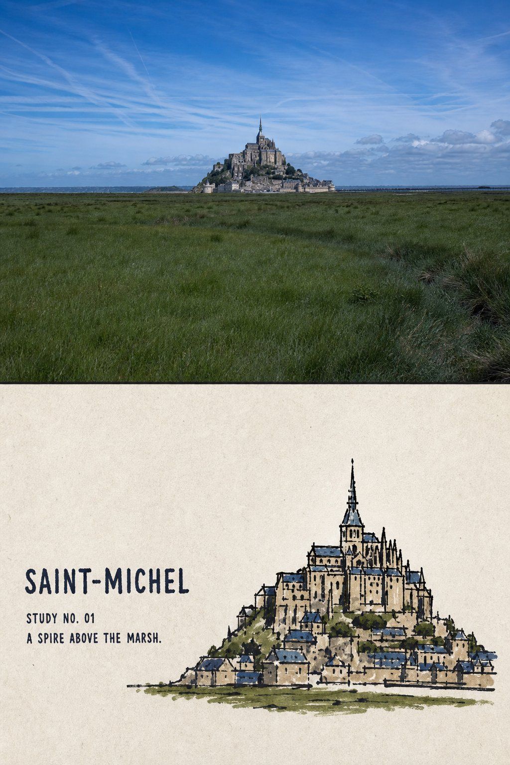
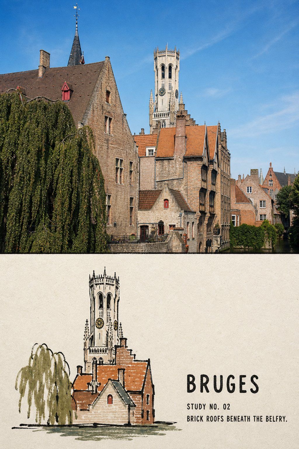
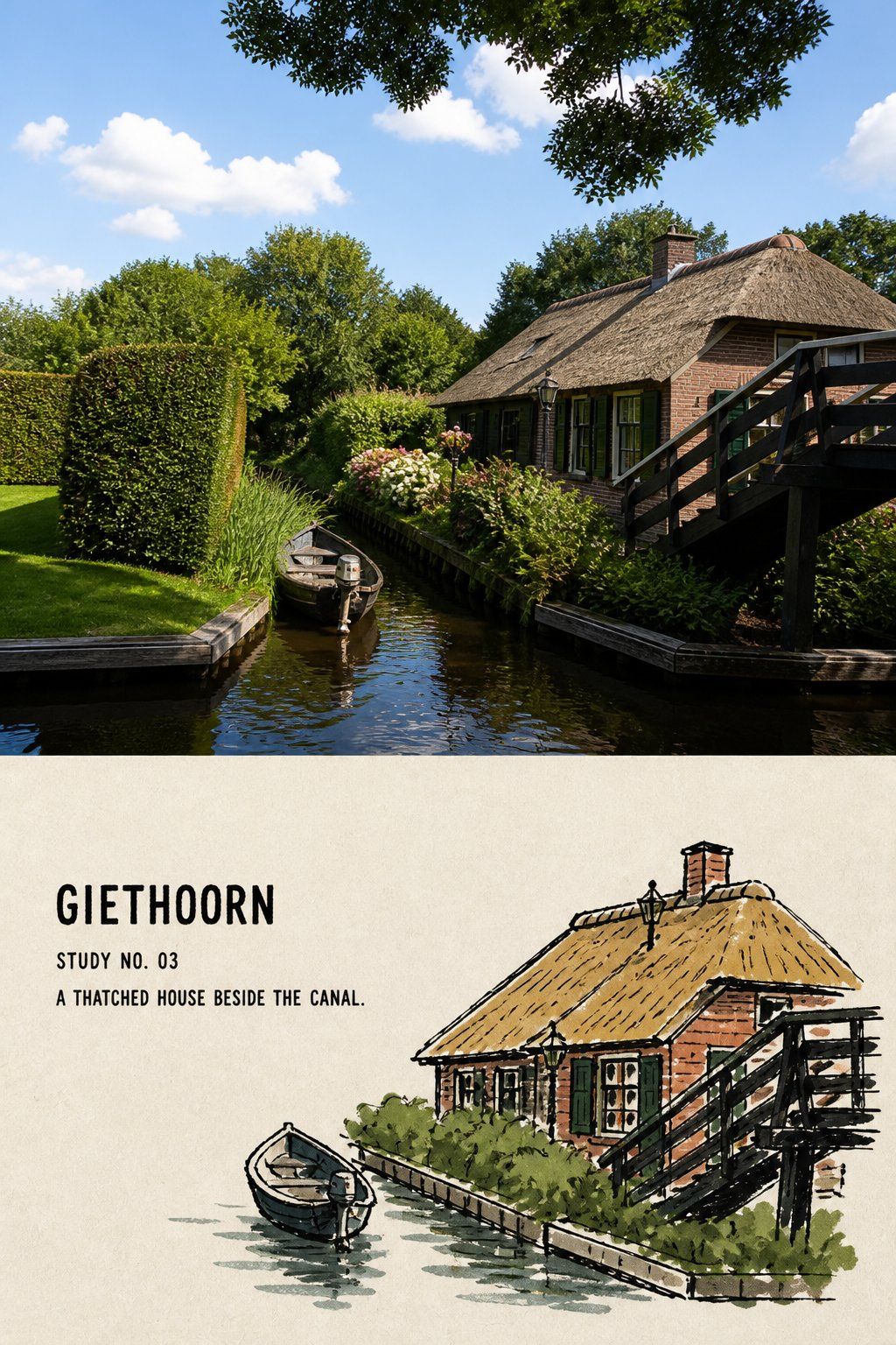
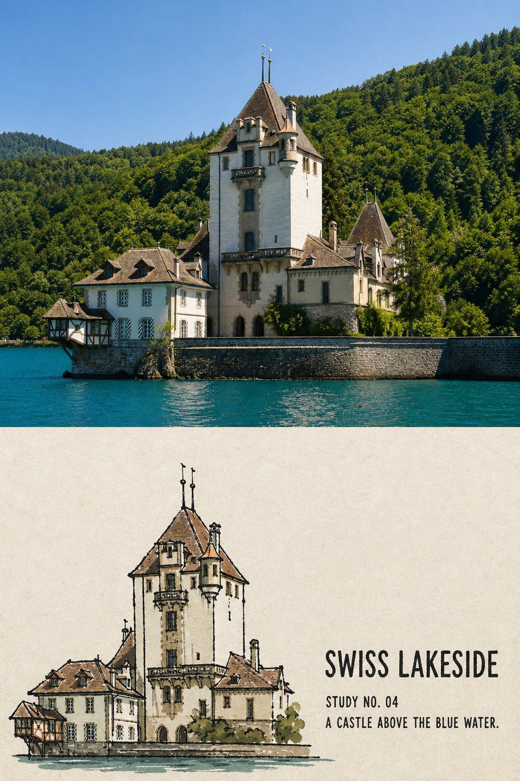
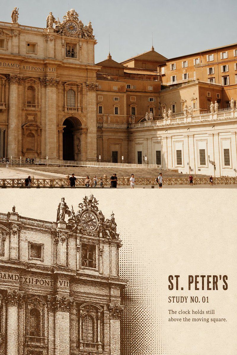
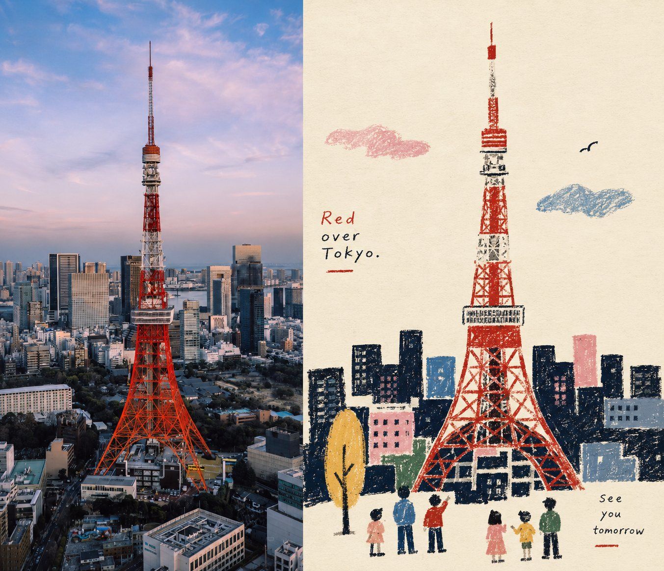
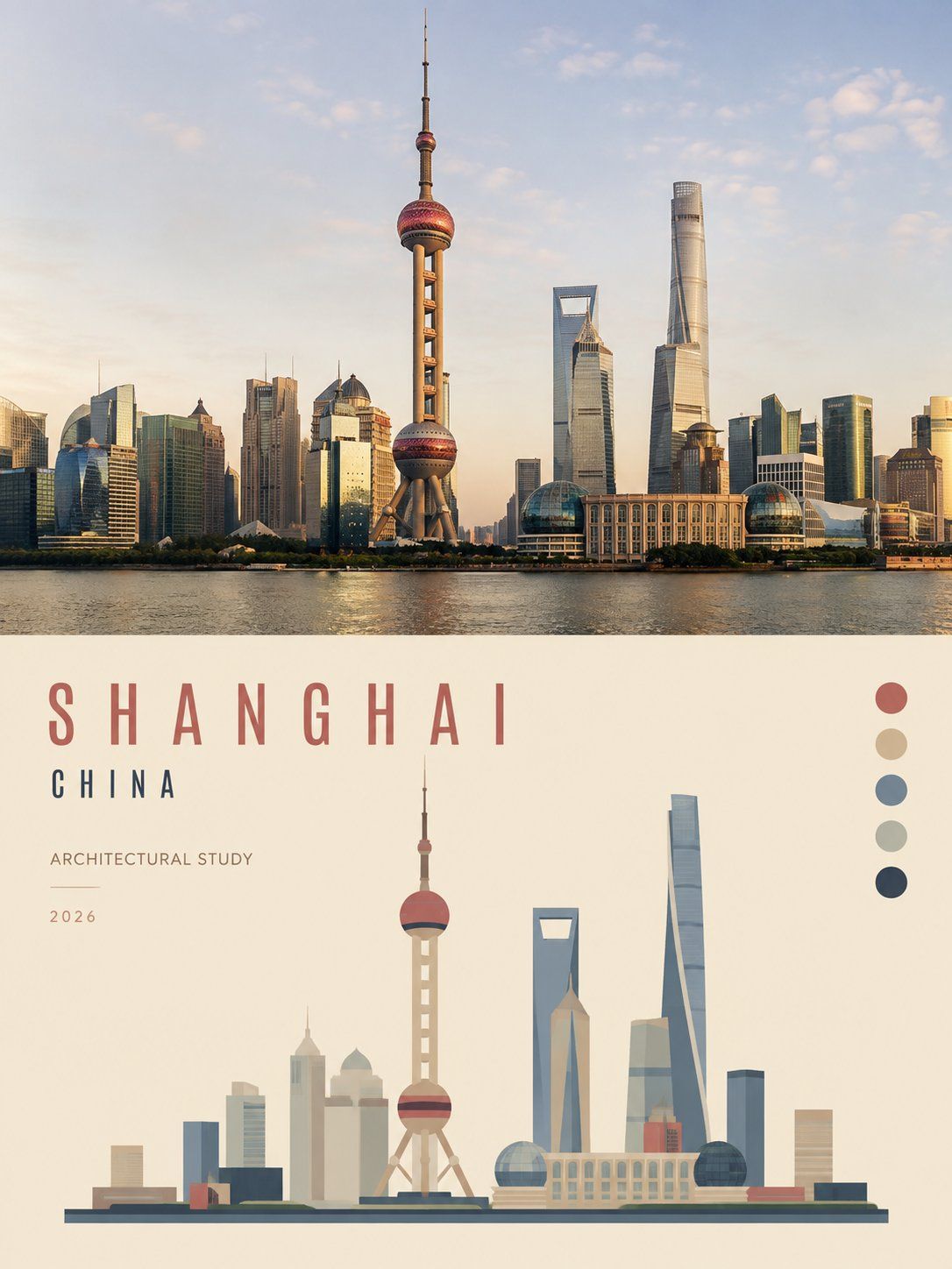
Turn each travel photo I upload into a separate comparison poster featuring a “folk ink-line colored landmark miniature.” Output each photo separately; do not combine multiple photos into a single image.

## Overall Layout

Use a 3:4 vertical composition.

Divide the canvas vertically into two regions of approximately equal height:

- Upper half: a high-fidelity original photograph;
- Lower half: a folk ink-line colored landmark miniature distilled from the same photograph.

Use a straight, clear, restrained horizontal boundary between the two regions. Do not use gradients, feathering, or torn edges, and do not allow ink lines or color blocks to intrude into the photo area.

## Upper Half: Authentic Photograph

Faithfully preserve the following from the original photograph:

- The identity of the landmark or building;
- The building's height-to-width proportions;
- The viewing angle of the front or oblique facade;
- The relationships among roofs, domes, towers, and doorways;
- The direction of steps, colonnades, sculptures, and entrances;
- Any necessary surrounding roads, trees, water, or walls;
- Authentic materials, natural light and shadow, and the original color atmosphere.

Apply only subtle color grading in the style of a travel magazine, independent publication, or art-exhibition photograph, plus an extremely thin layer of film grain.

The upper half must still be a genuine photograph. Do not turn it into an illustration, move the building, change the perspective, add decoration, replace the sky, stretch, mirror, or duplicate the subject.

## Lower Half: Landmark Miniature

Do not fully redraw the photograph or apply an ink-outline filter to it.

First identify the two to four structures that most strongly define the building's identity, such as:

- The outline of a roof or dome;
- The relative heights of towers;
- The main doorway and arches;
- The direction of steps and the base;
- The rhythm of colonnades;
- The position of a statue;
- A bridgehead, wall, or short stretch of shoreline.

Actively remove tourists, vehicles, advertisements, signs, dense vegetation, repeated windowpanes, brick joints, carvings, complex cornices, sky texture, and photographic noise.

Retain only the minimum information needed to make the building instantly recognizable in the lower half.

The architectural miniature should normally occupy only 36%–55% of the illustrated area. Place it in the center, lower center, or offset to one side according to the original photograph's visual center of gravity. Preserve 45%–60% continuous warm white paper around it.

Remove the background first, then reduce the subject's scale. Do not shrink the complete landscape and stuff it into the lower half, and do not fill the entire background.

## Ink Lines

Redraw the building on warm, off-white, matte drawing paper with subtle paper fibers, using a heavy, slightly shaky black brush, oil-based marker, or broad ink pen.

The ink lines should convey real wrist pressure and resistance from the paper surface:

- Uneven line weight;
- Slight hesitation and retracing;
- Locally reinforced strokes;
- Occasional broken lines;
- Small clumps of ink;
- Rough paper tooth;
- A few unclosed contours.

First use a few confident outer contours to capture the roof, tower mass, doorway, steps, and base. Then suggest internal structure with only a handful of short lines, dotted ink marks, or small black shapes.

The lines may look slightly clumsy, but they must accurately capture the building's character. Do not create a precise pen-and-ink architectural drawing, automatic photo tracing, uniformly weighted vector outlines, or a children's coloring sheet.

## Coloring

Use only two or three signature colors extracted from the original photograph, together with paper white and black ink, to form the entire palette.

Prioritize extracting:

- A representative color from the building walls or roof;
- One environmental color from the sky, vegetation, water, or ground;
- When necessary, one darker visual anchor color.

Slightly reduce the colors' saturation to create rich, somewhat aged, matte gouache fills.

The color blocks may show:

- Visible brush marks;
- Uneven coverage;
- Paint extending beyond the ink lines;
- Local misregistration;
- Unpainted gaps;
- Missing edge fragments;
- Paper texture showing through.

Colors do not need to fit perfectly inside the lines. They should look as though the artist directly brushed a few blocks of old color onto the paper, rather than using closed digital fills.

Use color only on the principal walls, roof, ground, or two or three irregular backing shapes; do not cover the entire background.

## Negative Space and Composition

The architectural miniature and the text should each occupy a separate patch of white paper with space between them.

- When the building is on the left, place the text on the right or upper right;
- When the building is on the right, place the text on the left or upper left;
- Maintain clear breathing room between the building and the text.

Beyond the building and text, preserve at least one complete, continuous area of blank paper with no image or lettering, allowing the emptiness to represent sky, distance, light, and the quiet feeling of travel.

Do not use a template layout that packs information into all four corners.

## Text

By default, add a restrained but clearly legible set of English travel captions.

Before generation, determine every word from facts visible in the photograph. Include:

1. A one-to-three-word English title naming the place or scene;
2. A short field such as “STUDY NO. 01” or “LANDMARK NOTE”;
3. One five-to-ten-word observational sentence describing a roof, doorway, steps, color, shoreline, or weather actually visible in the photograph.

Set the main title in slightly hesitant broad-brush uppercase English, oil-marker lettering, or handmade vintage letterpress type.

The title must be clearly readable at normal chat-preview size and should usually occupy 20%–32% of the lower region's width. Slight unevenness, broken ink, paper tooth, and handmade letterspacing are allowed, but the writing must not become illegible.

Set the number and observational sentence at approximately 45%–65% of the title's letter height, using small vintage letterpress type, handwritten marginal notes, or a humanist sans serif; they must also remain clearly readable.

Use black ink or a dark color extracted from the building's color blocks for the text, so it looks directly written, drawn, or printed on the paper rather than like a floating layer of smooth digital typography.

If the location cannot be identified reliably, use the actual scene type as the title. Do not guess a city, building name, date, or coordinates.

Do not use Chinese inscriptions, fake Chinese, pseudo-calligraphy, an author's name, signature, social-media handle, logo, QR code, URL, invented location, or garbled text.

## Strictly Avoid

Avoid:

fixed Chinese temple template, red-wall blue-background formula, invented stone lions, invented flags, fake seals, Chinese calligraphy, copied reference architecture, detailed pen-and-ink architecture drawing, transparent watercolor wash, screenprint halftone, full-page rubber stamp texture, woodcut hatching, automatic photo outlines, vector illustration, clean closed color fills, childish coloring-book style, cartoon landmark icon, complete background rendering, excessive architectural details, edge-to-edge painting, tiny unreadable typography, floating digital text, author signature, logo, watermark.

The most important rules:

The upper half must clearly preserve the authentic original photograph.

In the lower half, use heavy, slightly shaky black ink lines to capture the same building's most distinctive roof, tower mass, doorway, steps, or statue. Then establish the primary relationships with two or three aged flat colors that slightly cross the lines and retain visible brush marks.

Actively remove detail, reduce the building's scale, add readable travel captions, and preserve a large expanse of continuous white paper, making the result feel like a folk architectural miniature carefully drawn during a journey rather than a detailed architectural rendering, photo filter, or generic cartoon landmark.
请将我上传的每一张旅行照片分别制作成一张独立的「民间墨线设色地标小像」对比海报。每张照片单独输出,不得将多张照片拼接在同一画面中。

## 整体版式

采用3:4竖版构图。

画面上下分为两个高度接近1:1的区域:

- 上半部分:高保真原始照片;
- 下半部分:从同一照片提炼出的民间墨线设色地标小像。

上下区域之间使用笔直、清楚、克制的水平边界。不得渐变、羽化、撕裂或让墨线和色块侵入照片区域。

## 上半部分:真实照片

忠实保留原始照片中的:

- 地标或建筑身份;
- 建筑高宽比例;
- 正立面或侧正面的观察角度;
- 屋顶、穹顶、塔楼与门洞关系;
- 台阶、廊柱、雕塑和入口方向;
- 周围必要的道路、树木、水面或围墙;
- 真实材质、自然光影与原有色彩氛围。

只进行轻微的旅行杂志、独立出版物与艺术展览摄影调色,并加入极薄的胶片颗粒。

上半部分必须仍然是一张真实摄影作品。不得插画化、移动建筑、改变透视、增加装饰、替换天空、拉伸、镜像或复制主体。

## 下半部分:地标小像

不要完整重画照片,也不要给照片添加墨线滤镜。

先识别建筑最具身份的2–4项结构,例如:

- 屋顶或穹顶轮廓;
- 塔楼高低关系;
- 主门洞与拱券;
- 台阶与基座方向;
- 廊柱节奏;
- 雕像位置;
- 桥头、围墙或一小段水岸。

主动删除游客、车辆、广告、标牌、密集植物、重复窗格、砖缝、雕花、复杂檐口、天空纹理与摄影噪声。

下半部分只保留能够让建筑一眼可辨的最少信息。

建筑小像通常只占转绘区域的36%–55%,放置在中部、中下部或顺应原照片重心偏向一侧。四周保留45%–60%的连续温暖白纸。

先删除背景,再缩小主体。不得把完整风景缩小后塞入下半区,也不得铺满整个背景。

## 墨线

在温暖、偏白、带细微纸张纤维的哑光画纸上,使用粗重、略带抖动的黑色毛笔、油性记号笔或粗墨笔重新绘制建筑。

墨线应具有真实手腕压力和纸面阻力:

- 粗细不均;
- 轻微迟疑与回折;
- 局部重描;
- 偶尔断线;
- 小块墨团;
- 毛糙纸齿;
- 少量不闭合轮廓。

先用少量坚定的外轮廓抓住屋顶、塔体、门洞、台阶和基座,再以极少短线、点状墨痕或黑色小块提示内部结构。

线条可以略显笨拙,但必须准确抓住建筑性格。不要画成精细钢笔建筑图、照片自动描边、统一粗细的矢量轮廓或儿童填色稿。

## 设色

只使用2–3种从原始照片中提取的标志性色彩,加上纸白与黑墨构成整套色盘。

优先提取:

- 建筑墙面或屋顶的代表色;
- 天空、植物、水面或地面的一个环境色;
- 必要时加入一个较深的视觉锚点色。

将颜色降低少量饱和度,形成饱满、略微陈旧、哑光的水粉平涂。

色块可以出现:

- 明显刷痕;
- 不均匀覆盖;
- 越过墨线;
- 局部错位;
- 漏白;
- 边缘缺口;
- 纸纹透出。

颜色不必严丝合缝地填在线条内部。它应像画者直接把几块旧色刷在纸上,而不是数字软件中的封闭填色。

颜色只用于主要墙面、屋顶、地面或两三块不规则背板,不得铺满全部背景。

## 留白与构图

建筑小像与文字分别占据两块有间隔的纸白区域。

- 建筑偏左时,文字放置在右侧或右上方;
- 建筑偏右时,文字放置在左侧或左上方;
- 建筑与文字之间保持明显呼吸距离。

除建筑与文字之外,至少保留一块完整、连续、无图无字的纸白区域,让空白代表天空、距离、光线和旅行中的安静感。

不得使用四角全部塞满信息的模板版式。

## 文字

默认加入一组克制但能够正常阅读的英文旅行题签。

文字内容必须在生成前根据照片事实逐字确定,包括:

1. 一个1–3个英文单词的地点或场景标题;
2. 一个简短字段,例如“STUDY NO. 01”或“LANDMARK NOTE”;
3. 一行5–10个英文单词的观察句,描述照片中真实可见的屋顶、门洞、台阶、颜色、岸线或天气。

主标题采用略带迟疑感的粗笔英文大写、油性记号笔字或手工旧铅字。

标题必须在正常聊天预览尺寸下清楚可读,通常占下半区域宽度的20%–32%。允许轻微不齐、断墨、纸齿和手工字距,但不得潦草到无法辨认。

编号和观察句约为标题字高的45%–65%,采用小号旧铅字、手写边注或人文无衬线,同样保持清楚可读。

文字使用黑墨或从建筑色块中提取的一种深色,像直接写、画或印在纸上,不得成为悬浮的光滑数字排版图层。

如果不能可靠确认地点,使用真实场景主题作为标题,不得猜测城市、建筑名称、日期或坐标。

禁止中文题字、假中文、伪书法、作者名、签名、社交账号、Logo、二维码、网址、虚构地点和乱码。

## 强制避免

Avoid:

fixed Chinese temple template, red-wall blue-background formula, invented stone lions, invented flags, fake seals, Chinese calligraphy, copied reference architecture, detailed pen-and-ink architecture drawing, transparent watercolor wash, screenprint halftone, full-page rubber stamp texture, woodcut hatching, automatic photo outlines, vector illustration, clean closed color fills, childish coloring-book style, cartoon landmark icon, complete background rendering, excessive architectural details, edge-to-edge painting, tiny unreadable typography, floating digital text, author signature, logo, watermark.

最重要的规则:

上半部分必须清楚保留真实原始照片。

下半部分用粗重而略带抖动的黑色墨线,抓住同一建筑最有身份的屋顶、塔体、门洞、台阶或雕像;再用两三块稍微越线、带刷痕的旧色平涂压住主要关系。

主动删除细节、缩小建筑、加入可读的旅行题签,并保留大片连续白纸,使结果像旅途中认真画下的一枚民间建筑小像,而不是建筑精描、照片滤镜或通用卡通地标。