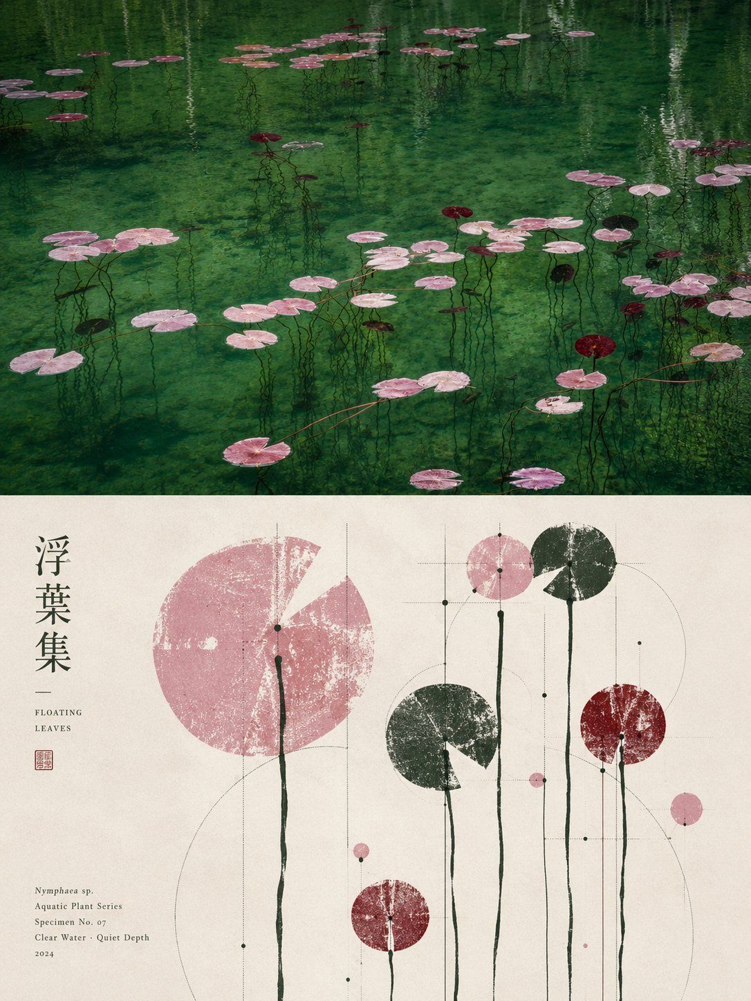
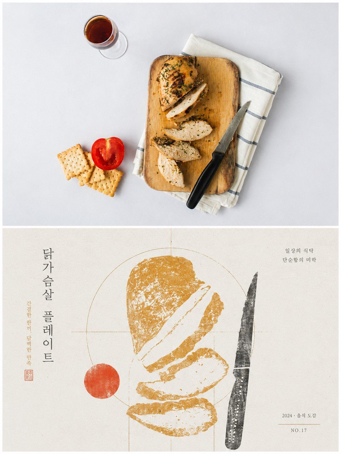
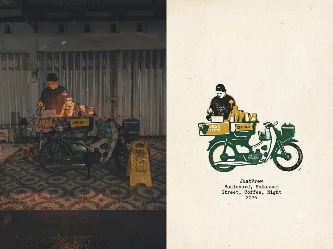
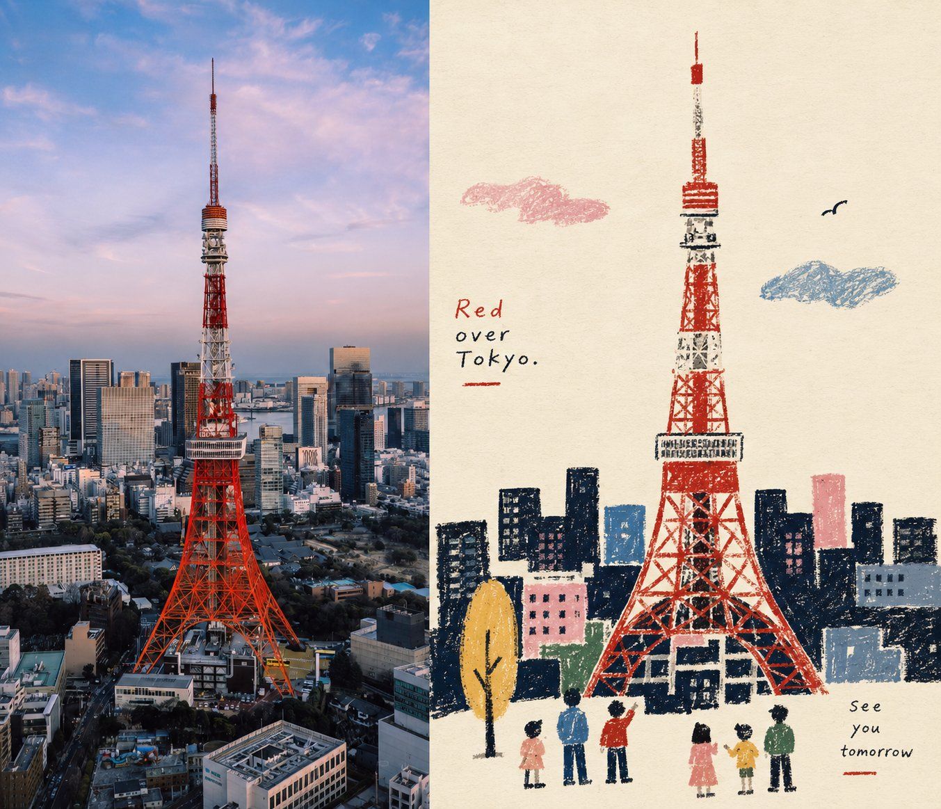
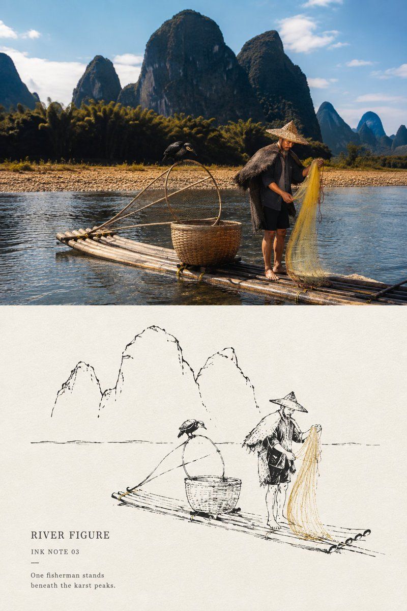
Please turn each uploaded photo into a separate high-end design poster, one photo per output with no multi-image collage, using a 3:4 vertical layout divided strictly into two equal 1:1-height sections, each occupying 50% of the canvas.

The upper half preserves the original photograph, including its subject structure, authentic material qualities, natural lighting, and original color atmosphere, with only subtle editorial-grade color correction to achieve the refinement of an art publication or exhibition photograph; the sky, ground, or surrounding environment may be naturally extended when necessary to fit the composition, but the subject must never be stretched, distorted, or structurally altered.

The lower half extracts the most recognizable subject, silhouette, posture, and narrative relationship from the photograph, first interpreting its underlying meaning, cultural character, emotional relationship, or symbolic essence, then reconstructing it into a graphic composition combining folk-archive imagery, antique rubbing aesthetics, and contemporary editorial design. Do not translate every visible object literally and do not add generic traditional motifs; retain only one dominant visual motif and a very limited number of secondary forms that genuinely contribute to the meaning, using silhouette reduction, negative space, selective enlargement, shape fusion, abstraction, and symbolic transformation so the result remains recognizably connected to the original while expressing something beyond its literal appearance.

Build the composition on a rigorous geometric skeleton and proportional system derived from the subject itself, reducing its structural logic into circles, squares, triangles, arcs, axes, repeated ratios, or directional angles, then make every graphic element, typographic element, and area of negative space respond to the same geometric parent system through alignment, tangency, shared axes, nesting, mirroring, proportional progression, cropping, or controlled overlap. The layout may be asymmetric, off-center, freely distributed, cropped, or extended beyond the frame, but it must maintain a precise visual center of gravity, hierarchy, rhythm, tension, and negative-space logic; from a distance the composition should feel disciplined and architecturally ordered, while closer inspection reveals the irregularities and tactile traces of traditional printing.

Derive the palette from the most distinctive, vital, and spirited colors in the original photograph rather than using predetermined folk colors: use a bright clean paper tone as the breathing field, one deep tone to establish structural weight, and one or two colors drawn from the original image to organize the main motif and restrained accents, controlling hierarchy through area ratio, overprinting, and value contrast; colors should feel clean, vivid, refined, and full of energy rather than muddy, artificially aged, or excessively multicolored.

Use a hybrid material language of woodblock rubbing, dry-brush screen printing, archival illustration, and paper texture, allowing broken ink, abrasion, exposed paper, uneven pigment coverage, and subtle printing imperfections mainly inside graphic forms while keeping important contours, geometric relationships, and the overall layout precise and legible, creating a contrast between tactile roughness and rigorous modern structure.

Typography should remain secondary and function as part of the composition rather than as a conventional title block: derive a small amount of title text or micro-annotation from the subject’s theme, symbolism, identity, or cultural meaning, and position it along geometric axes, negative spaces, edges, or structural boundaries through alignment, nesting, rotation, or subtle overlap without competing with the main image.

The final result should embody meaning-first reconstruction, restrained symbolism, rigorous geometry, tactile print texture, controlled negative space, and a sophisticated balance between traditional cultural memory and contemporary graphic design; every visible element must have a clear source, symbolic purpose, and structural function, and anything that does not strengthen the theme should be removed, avoiding decorative clutter, random folk motifs, scattered collage logic, literal illustration, generic symmetry, and template-like poster design.
请将我上传的每一张照片分别制作成一张独立的高级设计海报,不多图拼接,每张照片单独输出。整体采用3:4竖版构图,上下两个区域高度严格1:1,各占画面50%。

上半部分保留原始照片,保持主体结构、真实质感、自然光影和原有色彩氛围,仅进行轻微高级摄影调色,使其具有艺术出版物与展览摄影质感。为适配画幅,可自然扩展天空、地面或环境背景,但不得拉伸、扭曲或改变主体。

下半部分提取照片中最具识别性的**主体、轮廓、姿态与叙事关系**,先理解其核心寓意、文化属性或情绪关系,再重构为具有民俗图录、古物拓片与现代平面设计气质的图形画面。不要把照片中的元素逐一翻译,也不要添加泛泛的传统纹样;只保留**一个核心视觉母题与极少量真正有叙事意义的辅助形态**,通过剪影、负形、局部放大、形态合并与符号化转译,使图形既能对应原物,又能表达其背后的意义。

构图建立在“严谨的**几何骨架与比例系统**”之上,根据主体自身的结构提炼圆、方、三角、弧线、轴线或重复比例作为“几何母体”,再让所有主体、辅助图形、文字和留白与其发生对齐、切线、共轴、嵌套、镜像、比例递进或边界裁切关系。版面可以自由分布、偏心、越界或不对称,但必须共享同一套结构逻辑,形成清晰的视觉重心、层级、节奏与负空间;远看秩序明确,近看才发现传统印痕与细节变化,避免随机散点和装饰性堆砌。

配色从上方照片中提取最具辨识度、生命力与精神气质的颜色,重新归纳为清爽克制的纸面印刷色组。以明亮浅色纸底形成呼吸感,用一个深色建立视觉骨架,再以1-2个源自原图的主题色组织主体和少量强调,通过面积比例、叠印与明度关系建立层次,颜色应干净、有精神,避免灰脏做旧、固定民俗配色和杂乱多色。

材质采用**木刻拓印、干刷丝网印与旧式图录印刷**的混合质感,断墨、擦痕、露底和不均匀墨量主要存在于图形内部,几何边界、重要轮廓和整体版式仍保持清晰准确,形成“粗粝物质感 × 严谨几何秩序”的对比。

文字仅作为构图中的辅助信息,从照片的主题、寓意或文化属性中提炼少量标题与微型注释,可响应几何轴线、负形或图形边界自由排布,与主体形成对齐、嵌套或穿插关系,但不抢夺视觉中心。

整体呈现**寓意先行、图形克制、几何严谨、拓印粗粝、留白清晰、传统文化感与现代设计秩序并存**的视觉气质。每一个出现的图形都必须有来源、有寓意、有结构作用;删除不能增强主题理解的装饰元素,避免素材拼贴、传统符号乱入、平均排版、写实插画和模板感。