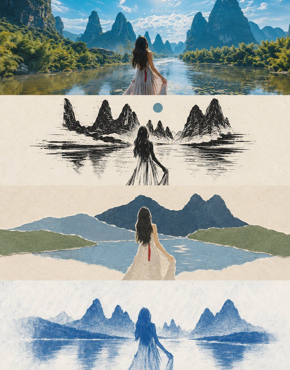
Transform my uploaded photo into a vertical collage poster using a 3:4 portrait composition. Divide the canvas from top to bottom into exactly four equal horizontal regions. Each region’s height must be precisely 25% of the full image, maintaining a strict 1:1:1:1 ratio with no deviation. Join the regions seamlessly, with no separators or gaps, in this order: original image → style 1 → style 2 → style 3. Because each layer is an extremely flat, wide strip of about 3:1, center the subject horizontally and emphasize generous negative space and breathing room on both sides. Avoid vertical stretching, distortion, or crowding against the edges. Keep the people’s positions, scene structure, and gaze directions coherent across all four layers so the result feels like one scene translated in four ways. The style layers, from the second through the fourth, must follow minimalist principles: reduce visual elements to the absolute minimum, retain only one core subject symbol, omit every secondary decoration, background detail, and supporting element, and keep at least 60% negative space.

The first layer preserves the original photo’s subject structure, authentic interactions and poses, realistic texture, natural lighting, and existing color atmosphere. Apply only subtle high-end photographic color grading for an editorial magazine quality. Do not change the relationships between people or the compositional logic. You may naturally extend the sky, ground, or environmental background without changing those relationships or the composition, giving the image more space and narrative depth.

The second layer uses a woodcut-print style: depict the scene texture and human silhouettes with high-contrast black-and-white carved marks, accented by one or two limited colors. Use an off-white or light-gray paper background. The carved lines should feel rough and forceful without becoming chaotic. Use primarily black and off-white with one accent color. Avoid overly dense carving and too many gray levels that make the image look muddy.

The third layer uses a torn-paper collage style: depict the scene and environment with blocks of torn colored paper, preserving the natural torn texture along overlapping edges. Use an off-white kraft-paper background. Build the main subject from several overlapping pieces of torn colored paper, with no more than three layers. Limit the palette to two to four natural colors. Avoid so many paper pieces that the image becomes cluttered, and avoid overly precise cut edges.

The fourth layer uses a cyanotype blueprint style: render the people and environment as silhouettes in only Prussian blue and white, evoking a traditional photographic process. Use an off-white or pale blue-white background with a subtle developed-film grain. Keep the palette monochromatic in Prussian blue and white. Do not add other colors, and avoid excessive grain that makes the image look dirty.

Convert the subject and scene consistently into the corresponding style in every layer. Keep the overall expression extremely restrained and simplified, retaining only the single most important subject symbol and its basic silhouette relationships. Remove all unnecessary background elements, decorative details, and supporting objects. Preserve the key positional relationships, interaction directions, and pose characteristics between people, but abstract them into recognizable silhouette relationships—fewer elements, clearer relationships. Derive each layer’s colors from the original photo and strictly limit each layer to two to four main colors. The four regions must maintain a strict 1:1:1:1 height ratio, each occupying 25%, with no stitching misalignment or proportional deviation. Avoid punk or cyberpunk aesthetics, forced overlays of realistic photographic texture, cartoon styling, 3D rendering, commercial-poster styling, complex background buildup, excessive or crowded elements, two adjacent layers that look too similar, and any text, logos, watermarks, or titles.
请将我上传的照片制作成一张竖版拼图海报,整体采用 3:4 竖版构图。画面从上到下严格四等分为四个横向区域,每个区域的高度必须精确控制为整体画面高度的25%(四层比例严格为1:1:1:1,不允许出现比例偏差),区域之间无缝衔接,不设分隔线、不留间隙,顺序为:原图→风格1→风格2→风格3。由于每层为约3:1的极扁宽幅比例,各层主体建议横向居中排布,强调左右开阔留白与呼吸感,避免元素纵向拉伸变形或贴边拥挤。四层在人物站位、场景结构、视线方向上保持连贯呼应,呈现同一画面、四种转译的整体感。风格层(第二至四层)须遵循极简原则:每层视觉元素数量压缩至最低限度,只保留1个最核心的主体符号,其余次要装饰、背景细节与陪衬元素一律省略,画面留白占比不低于60%。

第一层保留原始照片的主体结构、人物真实互动关系与姿态、真实质感、自然光影与原有色彩氛围,仅进行轻微高级摄影调色,呈现杂志摄影质感,不改变人物关系与构图逻辑,并可在不改变人物关系与构图逻辑的前提下自然扩展天空、地面或环境背景,使整体更具空间感与叙事感。

第二层为木刻版画风格:以高对比黑白木刻刀痕表现场景肌理与人物剪影,辅以一至两处限定色点缀。背景为米白或浅灰纸底,刀痕线条粗犷有力但不杂乱。色彩以黑、米白为主,搭配一处点缀色。避免刀痕过密,避免灰阶层次过多导致画面发灰。

第三层为撕纸拼贴风格:以撕边纸张色块拼贴表现场景与环境,层叠边缘保留自然撕裂肌理。背景为米白牛皮纸底色。主体元素由数张撕边色纸叠加构成,层次不超过三层。色彩控制在2至4种自然色系以内。避免纸片过多导致画面凌乱,避免裁剪边缘过于精细。

第四层为蓝晒氰版风格:采用氰版摄影(蓝晒)风格,以单一普鲁士蓝与白表现人物与环境剪影,营造老工艺质感。背景为米白或浅蓝白底,可有轻微显影颗粒感。色彩为普鲁士蓝与白的单色系。避免加入其他杂色,避免颗粒感过重显脏。

每一层需将主体与场景统一转换为对应风格,整体表达极度克制与简化,只保留最核心的一个主体符号及其基本轮廓关系,删除一切非必要的背景元素、装饰细节与陪衬物;人物之间的关键位置关系、互动方向与姿态特征需保留,但应抽象为可识别的轮廓关系,做到“元素越少、关系越清晰”。色彩均从原图中提取归纳,每层严格控制在2-4种主色以内。四个区域的高度比例须严格保持1:1:1:1(各占25%),不可出现拼接错位或比例偏差。整体避免朋克/赛博朋克风格、写实照片质感强行叠加、卡通风格、3D渲染感、商业海报感、复杂背景堆砌、元素过多或画面拥挤、相邻两层风格雷同,以及任何文字、Logo、水印或标题。