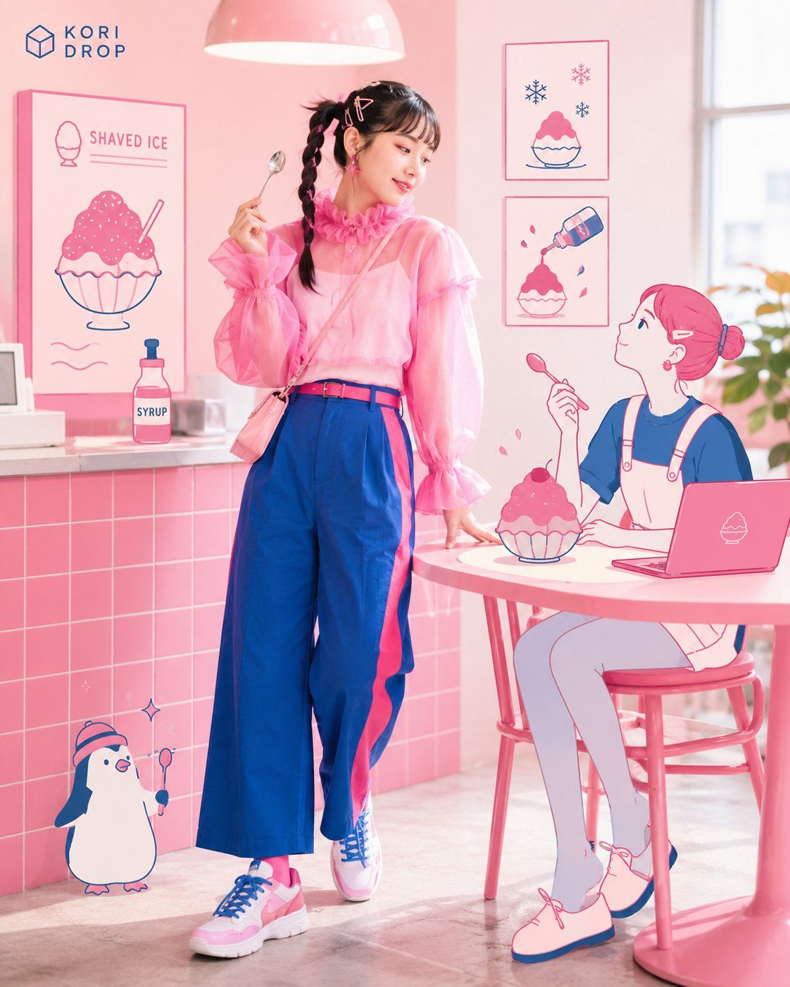
Theme | {{shaved ice}}
Main color | {{pink}}

Using the specified theme and main color, generate one portrait 4:5 advertising visual that integrates a live-action person, a contemporary flat illustration for a Japanese audience, and a small, precise English logotype.

## Most important specifications

- Portrait 4:5
- A sophisticated live-action fashion advertisement
- Flat illustration suited to Japanese urban fashion and culture media
- Include two pieces of visual evidence that make the theme instantly recognizable
- Do not use pure black outlines in the illustration
- English must appear as a small, refined logotype, not handwriting
- Use a main color plus a clearly distinct accent color
- Prioritize natural human anatomy and a natural full-body silhouette for the live-action person
- Present only the strongest single concept and one finished image

## Concept

Internally determine the following from {{theme}}:

1. Features that distinguish the theme from adjacent themes
2. Two pieces of visual evidence that communicate the theme instantly
3. One scene in which the live-action person and main illustration perform together
4. The person's clothing, hairstyle, and makeup
5. An accent color that contrasts with the main color
6. A short English logo name

Do not merely replace the theme word with generic icons. Incorporate tools, operations, and results specific to the theme into the actions of the person and illustration.

If the theme is AI design, always show both of the following:

- Evidence that “AI generates concepts,” such as prompt input, multiple generated options, or changes during generation
- Evidence of “editing the design,” such as layers, vector nodes, a color panel, or a selection

Treat the main illustration as an AI partner that emerges from the screen or generated concepts and edits together with the person. Do not represent AI merely by placing a robot in the scene.

## Live-action person

Use one fictional model suited to the theme. Infer age and gender from the theme rather than defaulting to a young woman.

Style the person as part of a sophisticated Japanese urban fashion campaign.

- Distinctive clothing that could be worn in real life
- One bold feature in the collar, sleeves, pattern, or silhouette
- Repeat the main and accent colors
- Design the full outfit through shoes, socks, and accessories
- A constructed hairstyle such as braids, multiple buns, hairpins, or an asymmetrical part
- One effective makeup accent, such as colored eyeliner or vivid lipstick
- A gaze and pose that respond to the illustration or screen

Do not use an ordinary shirt, business attire, an unremarkable hairstyle and makeup, or a stock-photo look. Do not turn it into extravagant cosplay.

**First construct the person as a natural full-body pose that would work even without the illustration. Keep the connections and lengths of the head, neck, shoulders, torso, waist, arms, hands, legs, and feet anatomically natural.**

**Draw one left and one right arm, one left and one right leg, one left and one right hand, and five fingers on each hand. Do not bend the joints, wrists, elbows, knees, or ankles unnaturally. Do not duplicate, merge, omit, or multiply body parts.**

Render the face, skin, hair, hands, and fingers naturally.

## Illustration

Use one main illustration and two to four small illustrations that reinforce the theme.

Follow these rules for a contemporary Japanese editorial illustration:

- Simple forms with breathing room
- Small, neatly organized eyes, nose, and mouth
- Expressions that are not overly exaggerated
- Fashionable hair and clothing
- Crisp, flat color fields
- Thin to medium-weight colored outlines
- A natural pose that is not excessively symmetrical
- Cute but not childish
- Slightly deadpan humor and urban refinement

Do not use pure black for the primary outlines. Use a dark chromatic color suited to the palette, such as deep magenta, burgundy, navy, cobalt, or purple.

Do not use an overseas children's-book look, a generic Western vector style, Webtoon style, 3D anime, old clip art, or excessive deformation. Do not imitate existing artists or characters.

## Integrating live action and illustration

Connect the live action and illustration in at least three places.

- The illustration touches the person's tool or screen
- The person looks at, imitates, or reacts to the illustration
- Part of the illustration passes behind the person or furniture
- Another part overlaps in front
- A live-action operation produces an illustrated result
- Colors or shapes from the clothing or screen continue into the illustration

Do not simply paste illustrations around the scene. Create one action or story between the person and the main illustration.

**However, do not express the integration by deforming the person's anatomy. The live-action body must stand independently as one complete human figure; then add front-to-back relationships with the illustration.**

**Prioritize contact with tools, screens, furniture, the outside of clothing, and the space around the person. Do not substantially hide the forms or connections of the arms, hands, legs, or feet, and do not divide the person's body with illustration.**

Do not overlap illustration across the face, eyes, or fingers. Do not merge the human body and illustration unnaturally.

## English logotype

Handwriting, script, and brush lettering are prohibited.

Design a precise geometric logotype that is beautiful on its own even at a small size.

- A custom-designed modern sans serif
- Accurate spacing and optical adjustment
- Apply cutouts, joins, or a shared angle to only selected letters
- If appropriate, turn two letters into a natural ligature
- Integrate only one small geometric symbol that represents the theme
- A horizontal or neatly arranged compact lockup
- Place it in an upper corner at about 15–25% of the image width

Do not simply typeset an existing font, use a large headline, script, wavy letters, or flashy decoration.

Do not crush, stretch, or compress letterforms. Do not include body copy, numbers, or a fictional brand other than the title.

## Color palette

Use {{main color}} as the main color across 45–60% of the image.

Also choose:

- One accent color clearly different from the main color
- One light neutral
- One dark chromatic color for the illustration outlines

Repeat the accent color in at least three places across the person's outfit, the live-action set, and the illustration. Do not use it only once as a tiny decoration.

Do not stop at tints and shades of the same hue. Create a vivid clash between the main and accent colors.

Give every color field one of these roles: frame the person, signal the theme, separate foreground and background, or guide the eye. Meaningless gradients and shapes are prohibited.

## Composition and lighting

Let the person occupy 40–55% of the image and the main illustration 25–40%. Form a large triangle with the person, illustration, and logotype.

**Place and size the person so the entire figure fits comfortably from head to toe, without unnaturally cropping the limbs at the edge. Avoid extreme perspective, excessively strong wide-angle effects, and poses that greatly distort the body.**

Leave breathing room around the logotype. Do not distribute supporting elements evenly; arrange them according to the person's gaze and the sequence of operations associated with the theme.

Use bright, high-key photography for the live-action portion while preserving the textures of skin, hair, clothing, and furniture. Keep the illustration flat and clear, adding only slight front-to-back separation where it meets the live action.

Dark interiors, muddy colors, plastic-looking skin, and a fully monochrome background are prohibited.

## Final check

Before generating, internally confirm:

1. Is the image portrait 4:5?
2. Are there two pieces of evidence that identify the theme without explanation?
3. If the theme is AI design, are both “AI generation” and “design editing” visible?
4. Do the person's clothing, hair, and makeup have individuality?
5. Does the illustration suit Japanese urban editorial media?
6. Are the illustration outlines a color other than pure black?
7. Are live action and illustration connected in at least three places?
8. Is the accent color repeated in at least three places?
9. Is the English rendered as a small, refined geometric logotype?
10. Are the spelling and letterforms of the logo correct?
11. Are there no meaningless objects or color fields?
12. **Does the person work as one normal human body, with a natural number, connection, proportion, and articulation of the head, torso, arms, hands, legs, and feet?**
13. **Are the fingers and limbs free of multiplication, omission, fusion, or twisting?**
14. **Does overlap with the illustration leave the body's silhouette and joints unambiguous?**

Fix any failing area by correcting the relationship between the theme-identifying evidence, person, main illustration, and logotype rather than adding more elements.

**If the anatomy has a problem, fix it by prioritizing anatomical naturalness over decoration or integration with the illustration.**

Display only one finished image that satisfies every requirement. Do not output analysis, multiple concepts, work-in-progress, or explanation.
テーマ|{{かき氷}}
主役色|{{ピンク}}
指定したテーマと主役色から、実写人物、現代的な日本向けフラットイラスト、小さく精密な英語ロゴタイプが一体化した、縦位置4:5の広告ビジュアルを1枚生成する。
## 最重要仕様
- 縦位置4:5
- 高感度な実写ファッション広告
- 日本の都市型ファッション・カルチャー媒体に似合うフラットイラスト
- テーマを一瞬で判別できる視覚的証拠を2つ入れる
- イラストの純黒主線は禁止
- 英語は手書き文字ではなく、小さく端正なロゴタイプ
- 主役色+明確なアクセントカラー
- 実写人物の人体構造と全身シルエットを最優先で自然に保つ
- 推し1案・完成画像1枚だけを出す
## コンセプト
{{テーマ}}から次を内部で決める。
1. テーマを隣接テーマと区別する特徴
2. 一瞬でテーマが伝わる視覚的証拠2つ
3. 実写人物と主役イラストが共演する一つの場面
4. 人物の衣装、髪型、メイク
5. 主役色と対比するアクセントカラー
6. 短い英語ロゴ名
テーマの単語を汎用アイコンへ置き換えるだけにしない。テーマ特有の道具、操作、結果を、人物とイラストの行動へ組み込む。
AIデザインがテーマの場合は、次の両方を必ず見せる。
- プロンプト入力、複数の生成案、生成途中の変化など「AIが案を生む」証拠
- レイヤー、ベクターノード、配色パネル、選択範囲など「デザインを編集する」証拠
主役イラストを、画面や生成案から現れて人物と一緒に編集するAIパートナーとして扱う。ロボットを置くだけでAIを表現しない。
## 実写人物
テーマに合う架空のモデル1人を使う。年齢や性別はテーマから判断し、若い女性へ固定しない。
人物は、感度の高い日本の都市型ファッションキャンペーンとしてスタイリングする。
- 現実に着用できる個性的な服
- 襟、袖、柄、シルエットのうち1か所に大胆な特徴
- 主役色とアクセントカラーを反復
- 靴、靴下、アクセサリーまで含む全身設計
- 三つ編み、複数のお団子、ヘアピン、非対称な分け目など構築的な髪型
- カラーライン、鮮やかなリップなど、1か所に効かせたメイク
- イラストや画面へ反応する視線とポーズ
普通のシャツ、ビジネス服、無難な髪型とメイク、ストックフォト風は禁止。奇抜なコスプレにはしない。
**人物はまず、イラストが存在しなくても成立する自然な全身ポーズとして構成する。頭、首、肩、胴体、腰、腕、手、脚、足の接続と長さを解剖学的に自然に保つ。**
**腕と脚はそれぞれ左右1本ずつ、手は左右1つずつ、指は各手5本として自然に描く。関節の向き、手首、肘、膝、足首を不自然に曲げない。身体の一部を重複、融合、欠損、増殖させない。**
顔、肌、髪、手、指は自然に描く。
## イラスト
主役イラスト1つと、テーマを補強する小さなイラスト2〜4個を使う。
日本の現代的なエディトリアルイラストとして、次を守る。
- 余白のある簡潔な形
- 小さく整理された目、鼻、口
- 感情を誇張しすぎない表情
- ファッション性のある髪型と服
- パキッとしたフラットな色面
- 細めから中太の有彩色アウトライン
- 左右対称にしすぎない自然なポーズ
- かわいいが幼すぎない
- 少し気の抜けたユーモアと都会的な品
主線に純黒を使わない。濃いマゼンタ、ボルドー、ネイビー、コバルト、紫など、配色に合う有彩色を使う。
海外の児童書、欧米の汎用ベクター、Webtoon風、3Dアニメ、古いクリップアート、過度なデフォルメは禁止。既存作家やキャラクターは模倣しない。
## 実写とイラストの融合
実写とイラストを最低3か所で関係させる。
- イラストが人物の道具や画面へ触れる
- 人物がイラストを見る、真似する、反応する
- イラストの一部が人物や家具の背後へ回る
- 別の部分が手前へ重なる
- 実写の操作結果がイラストとして現れる
- 衣装や画面の色・形がイラストへ連続する
周囲へイラストを貼るだけにせず、人物と主役イラストの間に一つの行動や物語を作る。
**ただし、人物の人体構造を変形させて融合を表現しない。実写人物の身体は一人分の完全な人体として独立して成立させ、その上にイラストとの前後関係を加える。**
**イラストとの接触は、道具、画面、家具、衣服の外側、人物の周囲を優先する。腕、手、脚、足の形や接続部分を大きく隠さず、人物の身体をイラストで分断しない。**
顔、目、指へイラストを重ねない。人体とイラストを不自然に融合させない。
## 英語ロゴタイプ
手書き、筆記体、ブラシ文字は禁止。
小さくても単体で美しい、精密な幾何学ロゴタイプとして設計する。
- カスタム設計したモダンなサンセリフ
- 正確な字間と光学調整
- 一部の文字にだけ切り欠き、接続、共通角度を入れる
- 必要なら2文字を自然なリガチャにする
- テーマを象徴する小さな幾何学記号を1つだけ統合
- 水平または整ったコンパクトなロックアップ
- 画面上部の隅へ、横幅15〜25%程度で配置
既成フォントのベタ打ち、大きな見出し、筆記体、波打つ文字、派手な装飾は禁止。
字形を潰す、伸ばす、圧縮することは禁止。タイトル以外の文章、数字、架空ブランドは入れない。
## 配色
{{主役色}}を主役色として画面の45〜60%へ使う。
さらに、
- 主役色と明確に異なるアクセントカラー1色
- 明るいニュートラル1色
- イラスト主線用の濃い有彩色1色
を選ぶ。
アクセントカラーは、人物の衣装、実写セット、イラストの最低3か所へ反復する。小さな飾りに一度使うだけにしない。
同系色の濃淡だけで終わらせず、主役色とアクセントカラーの鮮明な衝突を作る。
すべての色面に、人物を囲う、テーマを示す、前後を分ける、視線を導く、のいずれかの役割を持たせる。意味のないグラデーションや図形は禁止。
## 構図と光
人物を画面の40〜55%、主役イラストを25〜40%にし、人物・イラスト・ロゴタイプで大きな三角形を作る。
**人物は頭から足先まで無理なく収まるサイズと位置に配置し、手足を画面端で不自然に切らない。極端な遠近法、強すぎる広角表現、人体が大きく歪むポーズは避ける。**
ロゴタイプの周囲には余白を残す。補助要素を均等に散らさず、人物の視線とテーマの操作順に沿って配置する。
実写部分は明るいハイキー撮影にし、肌、髪、衣装、家具の質感を残す。イラストは平面的でクリアに保ち、実写と接触する部分にだけ小さな前後差を付ける。
暗い室内、濁った色、プラスチック状の肌、全面単色背景は禁止。
## 最終確認
生成前に内部で確認する。
1. 縦位置4:5か
2. 説明なしでテーマを判別できる証拠が2つあるか
3. AIデザインなら「AI生成」と「デザイン編集」の両方が見えるか
4. 人物の服、髪、メイクに個性があるか
5. イラストが日本の都市型エディトリアルに合うか
6. イラスト主線が純黒以外か
7. 実写とイラストが最低3か所で関係しているか
8. アクセントカラーが3か所以上へ反復されているか
9. 英語が小さく端正な幾何学ロゴタイプか
10. ロゴの綴りと字形が正確か
11. 意味のない物や色面がないか
12. **人物が一人分の正常な人体として成立し、頭・胴体・腕・手・脚・足の数、接続、比率、関節が自然か**
13. **手指や四肢に増殖、欠損、融合、ねじれがないか**
14. **イラストとの重なりによって人体の輪郭や関節が曖昧になっていないか**
不合格部分は要素を増やさず、テーマの識別証拠、人物、主役イラスト、ロゴタイプの関係を修正する。
**人体に問題がある場合は、装飾やイラストとの融合より人体の自然さを優先して修正する。**
すべてを満たした完成画像1枚だけを表示する。分析文、複数案、制作過程、解説は出力しない。