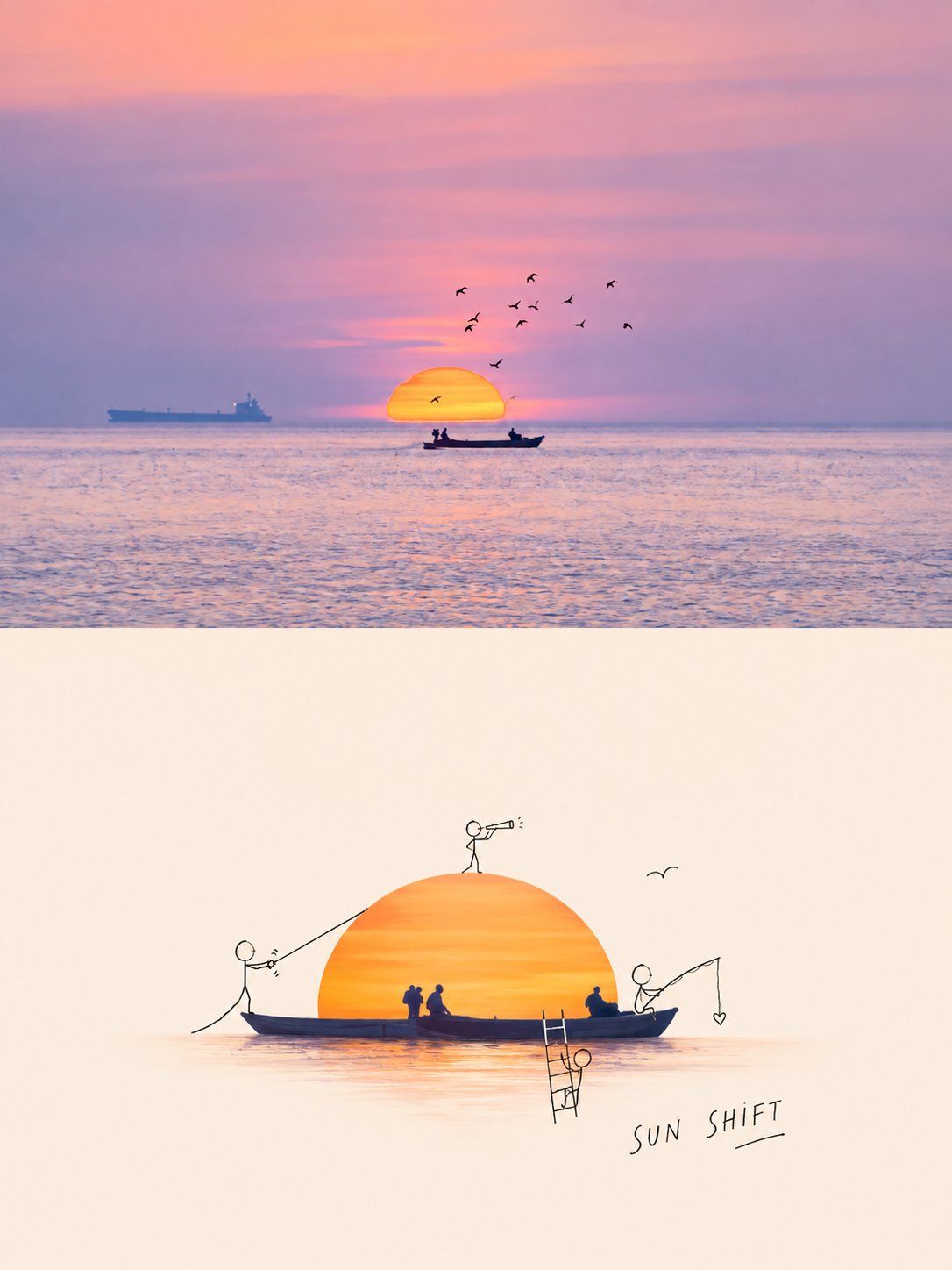
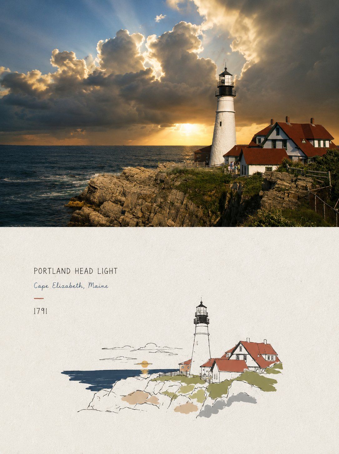
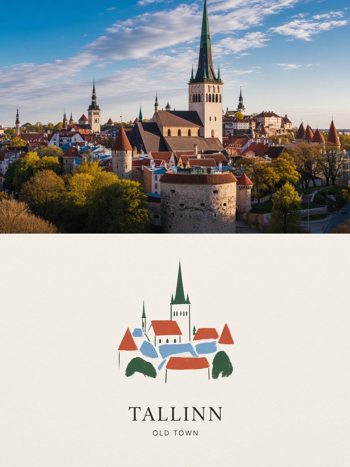
Same treatment:

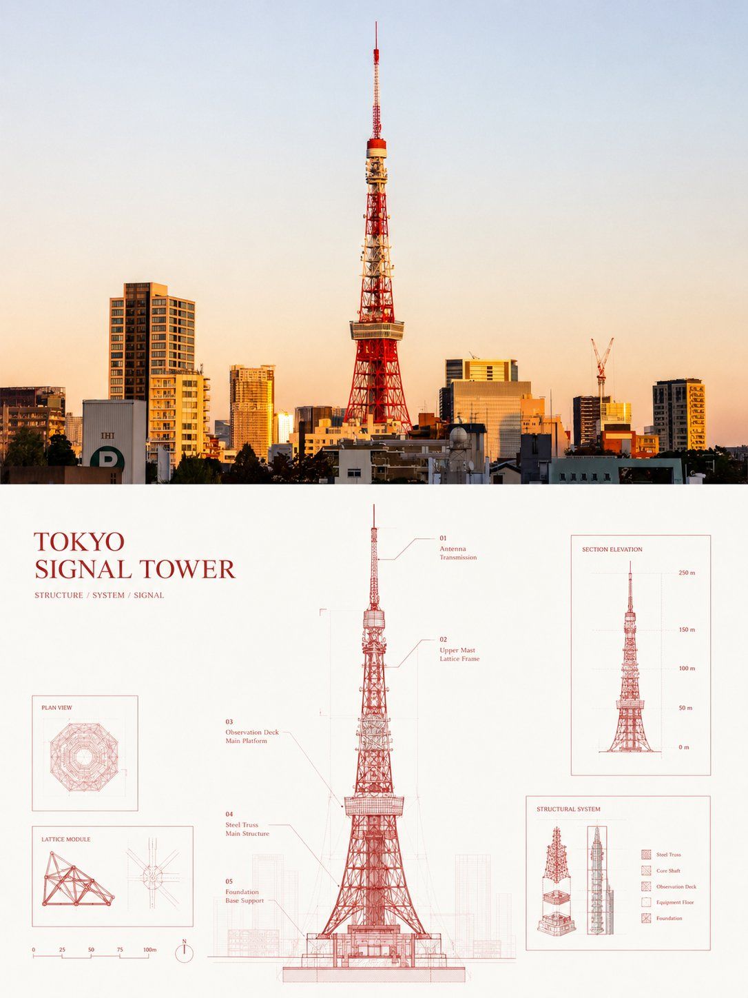
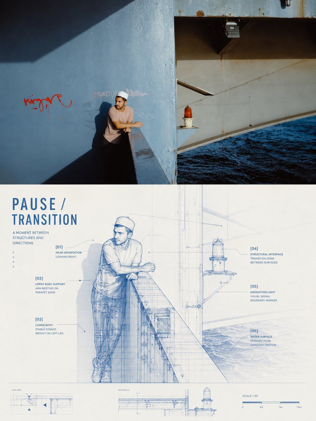
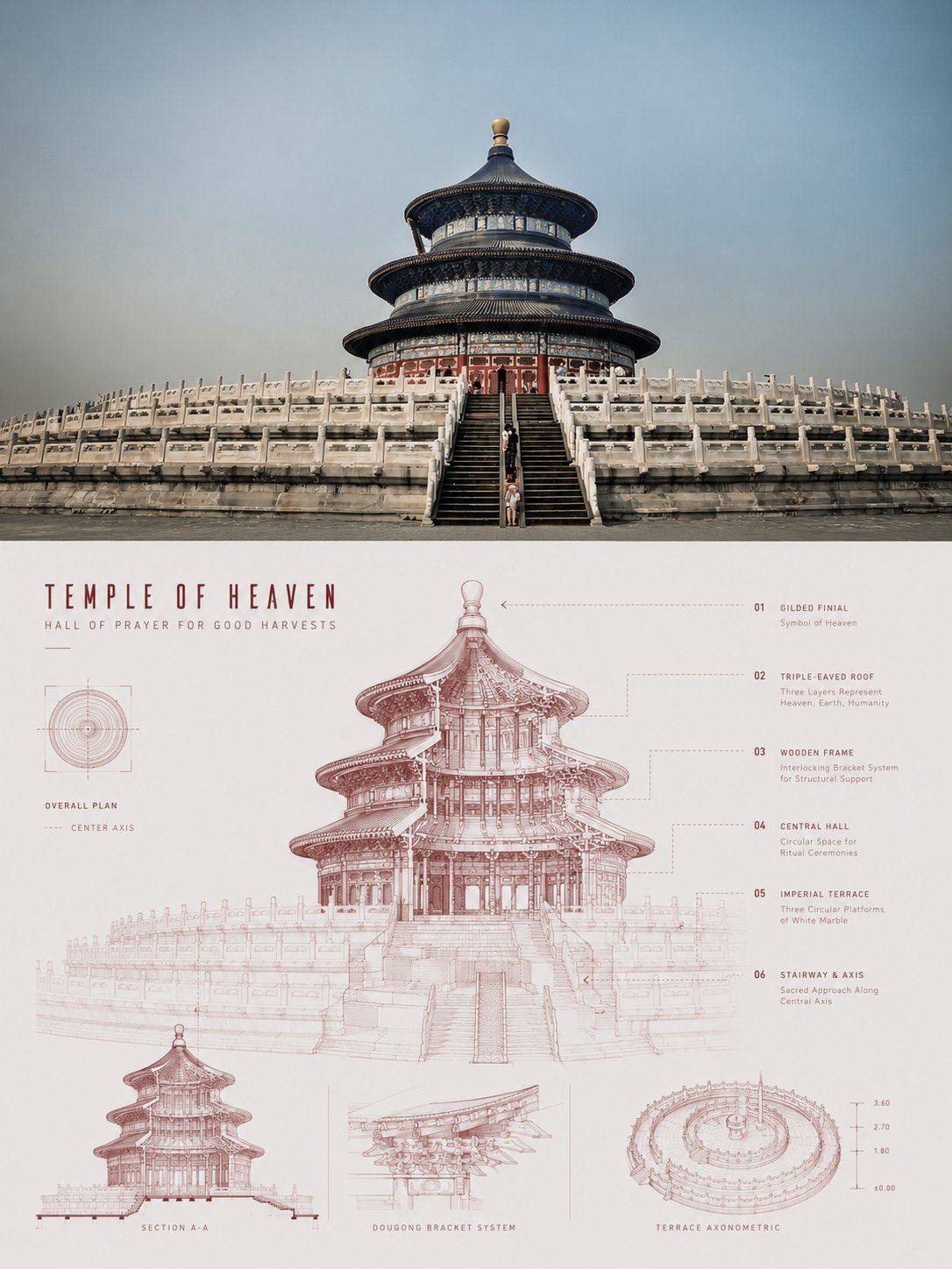
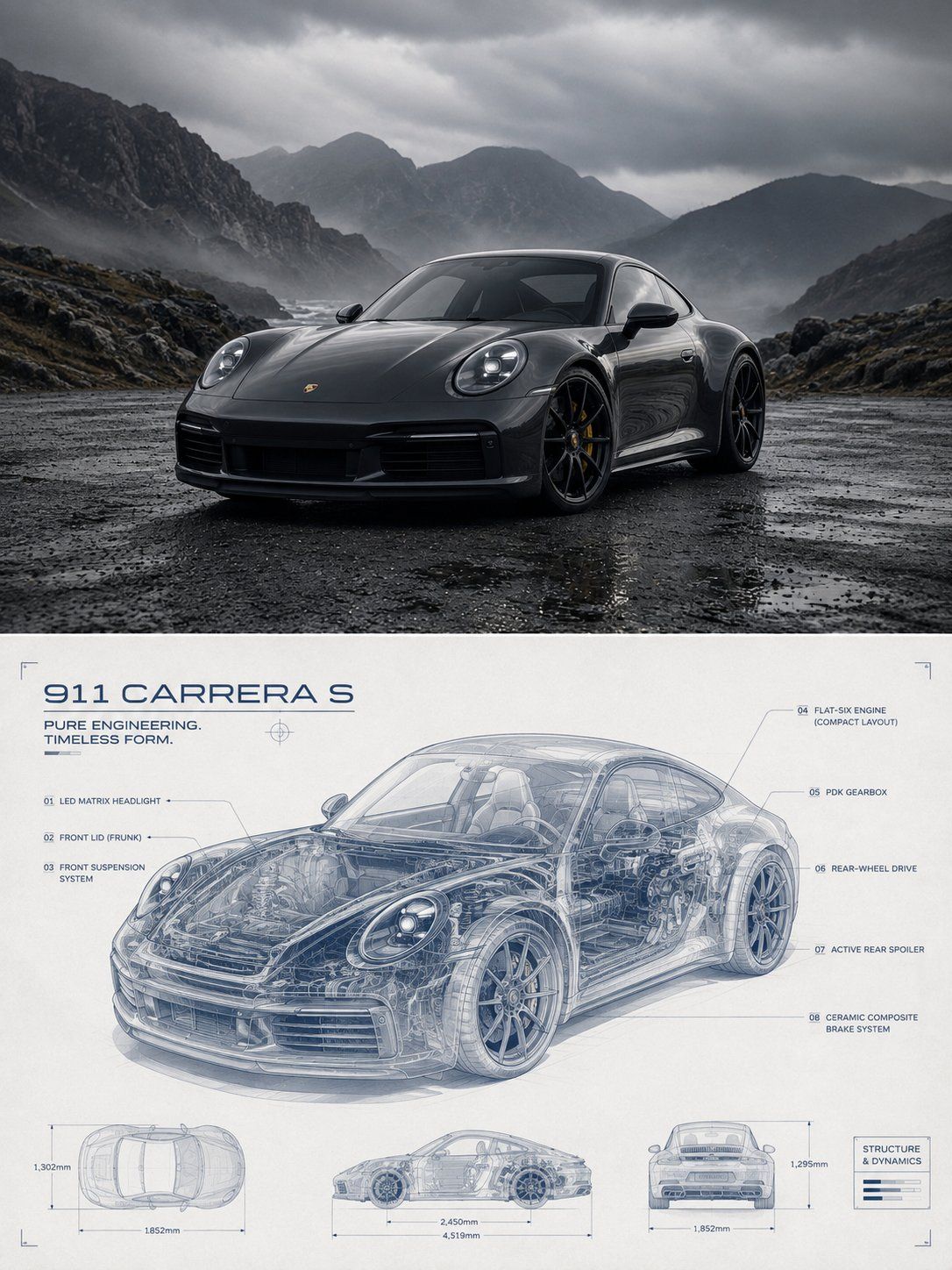
Turn each photo I upload into a separate, standalone premium design poster. Do not create a multi-image collage; output each photo individually. Use an overall 3:4 vertical composition with two strictly equal upper and lower regions, each occupying 50% of the canvas.

In the upper half, preserve the original photo's subject structure, authentic texture, natural light and shadow, and existing color atmosphere. Apply only subtle premium photographic color grading so it feels like an art magazine, independent publication, or exhibition photograph. The sky, ground, or environmental background may be extended naturally to fit the format, but do not stretch, distort, or alter the subject.

In the lower half, extract the photo's most recognizable subject, silhouette, posture, and narrative relationships, then reconstruct them as a transparent structural blueprint and refined technical diagram. Keep the subject's outer silhouette clearly recognizable while turning parts of its surface into semi-transparent, cutaway, layered, or perspective views that reveal its most representative internal structures, connections, material layers, movement paths, or spatial logic. Create a visual language somewhere between an engineering drawing, X-ray view, scientific illustration, and future archive. Do not mechanically pile up parts. Instead, decide how the “internal structure” should be interpreted according to the subject itself: show components and connections for objects; space and construction for architecture; power systems and structure for vehicles; veins and growth for plants; and pose frameworks, motion trajectories, clothing layers, or abstract structures for animals or people, avoiding flesh-and-blood anatomy.

Make the subject the composition's only focal point, using transparent overlays, localized enlargements, sectional slices, exploded views, structural leader lines, and precise labels to establish visual order. You may add hairline axes, dimension lines, node numbers, localized callout boxes, and small structural diagrams so the information unfolds naturally around the subject. Differentiate hierarchy through line weight, transparency, solid versus implied marks, and density. Preserve broad areas of clean negative space and a clear reading path; avoid complicated futuristic UI and edge-to-edge information overload.

Extract the most distinctive and spirited primary color from the upper photo and turn it into a clear, bright, businesslike monochrome blueprint system. Complete the composition with a light background, one primary line color, and a small range of lighter and darker variations. The hue may be a clean blue, green, red, orange, purple, or neutral rather than always blue. Keep the color clean, rational, and luminous, building depth through transparent layers, line density, and selective highlights. Avoid dirty gray, dim tones, neon cyber aesthetics, and complex multicolor palettes.

Turn the text into part of the technical annotation and editorial layout. Derive a short title from the photographed subject's identity, function, state, action, or symbolic meaning, then add a limited number of structural numbers, part names, status terms, scale marks, directional notes, or micro-annotations. Relate the type precisely to the subject using leader lines, rulers, arrows, localized frames, vertical setting, or edge-aligned typography, like the explanatory system of an engineering sketch. At the same time, retain the restraint and negative space of a premium magazine. Do not use a year or write long explanatory passages.

The overall image should combine transparent structures, precise linework, layered reveal effects, engineering order, and editorial aesthetics into a sophisticated visual character. Whether the subject is a person, animal, plant, building, object, vehicle, or natural form, it must be recognizable at a glance, structurally coherent, restrained in information, and clearly layered. Avoid ordinary line art, cheap science-fiction HUD graphics, excessive mechanization, complicated piles of parts, a fixed blue palette, and a template-like result.
同样处理:

请将我上传的每一张照片分别制作成一张独立的高级设计海报,不多图拼接,每张照片单独输出。整体采用3:4竖版构图,上下两个区域高度严格1:1,各占画面50%。

上半部分保留原始照片,保持主体结构、真实质感、自然光影和原有色彩氛围,仅进行轻微高级摄影调色,使其具有艺术杂志、独立出版物和展览摄影质感。为适配画幅,可自然扩展天空、地面或环境背景,但不得拉伸、扭曲或改变主体。

下半部分提取照片中最具识别性的主体、轮廓、姿态与叙事关系,重构为透明结构蓝图与高级技术图解。保留主体清晰可辨的外部轮廓,同时将部分表层转化为半透明、剖切、分层或透视状态,显露其最具代表性的内部结构、连接关系、材料层次、运动路径或空间逻辑,形成一种介于工程图纸、X-ray透视图、科学图解与未来档案之间的视觉语言。不要机械堆砌零件,而应根据主体自身属性决定“内部结构”如何被解释:器物表现组件与连接,建筑表现空间与构造,交通工具表现动力与结构,植物表现枝脉与生长,动物或人物则以姿态骨架、动作轨迹、服装层次或抽象结构表达,避免血肉化解剖。

构图以主体为唯一核心,通过透明叠层、局部放大、剖面切片、爆炸分解、结构引线和精细标注建立视觉秩序。可加入极细轴线、尺寸线、节点编号、局部框选与小型结构示意,让信息围绕主体自然展开;不同层级通过线宽、透明度、虚实与疏密区分,保持大面积干净留白和清晰阅读路径,避免复杂科技UI和满版信息堆积。

配色从上方照片中提取最具辨识度和精气神的主色,转化为清透、明亮、偏商务感的单色蓝图体系,以浅色背景、一个主线色和少量深浅变化完成整体。可以是清晰的蓝、绿、红、橙、紫或中性色系,不固定使用蓝色;颜色应干净、理性、有光感,通过透明叠层、线条密度和局部高亮建立层次,避免脏灰、暗沉、霓虹赛博和复杂多色。

文字转化为技术注释与编辑排版的一部分。从照片的主体身份、功能、状态、动作或象征意义中提炼简短标题,并搭配少量结构编号、部件名称、状态词、尺度标记、方向说明或微型注释。文字通过引线、标尺、箭头、局部框选、纵排或边缘排版与主体发生精确关系,像工程草图中的说明系统,同时保持高级杂志式的克制与留白,不使用年份,不写大段说明。

整体呈现透明结构、精密线稿、分层显影、工程秩序与编辑美学结合的高级视觉气质。无论主体是人物、动物、植物、建筑、器物、交通工具或自然对象,都应做到一眼可辨、结构有理、信息克制、层次清晰,避免普通线稿、廉价科幻HUD、过度机械化、复杂零件堆积、固定蓝色和模板感。