Same treatment:
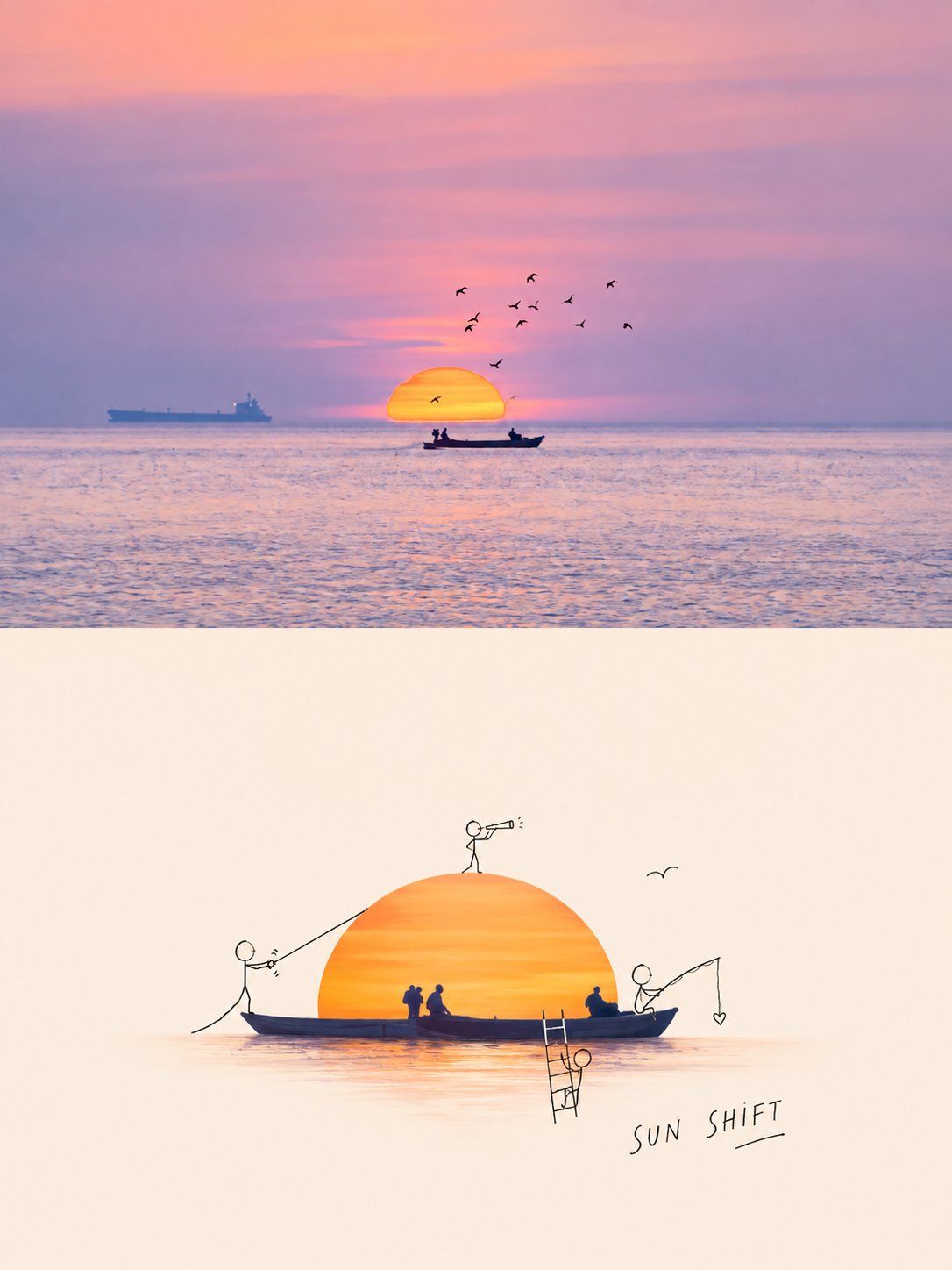
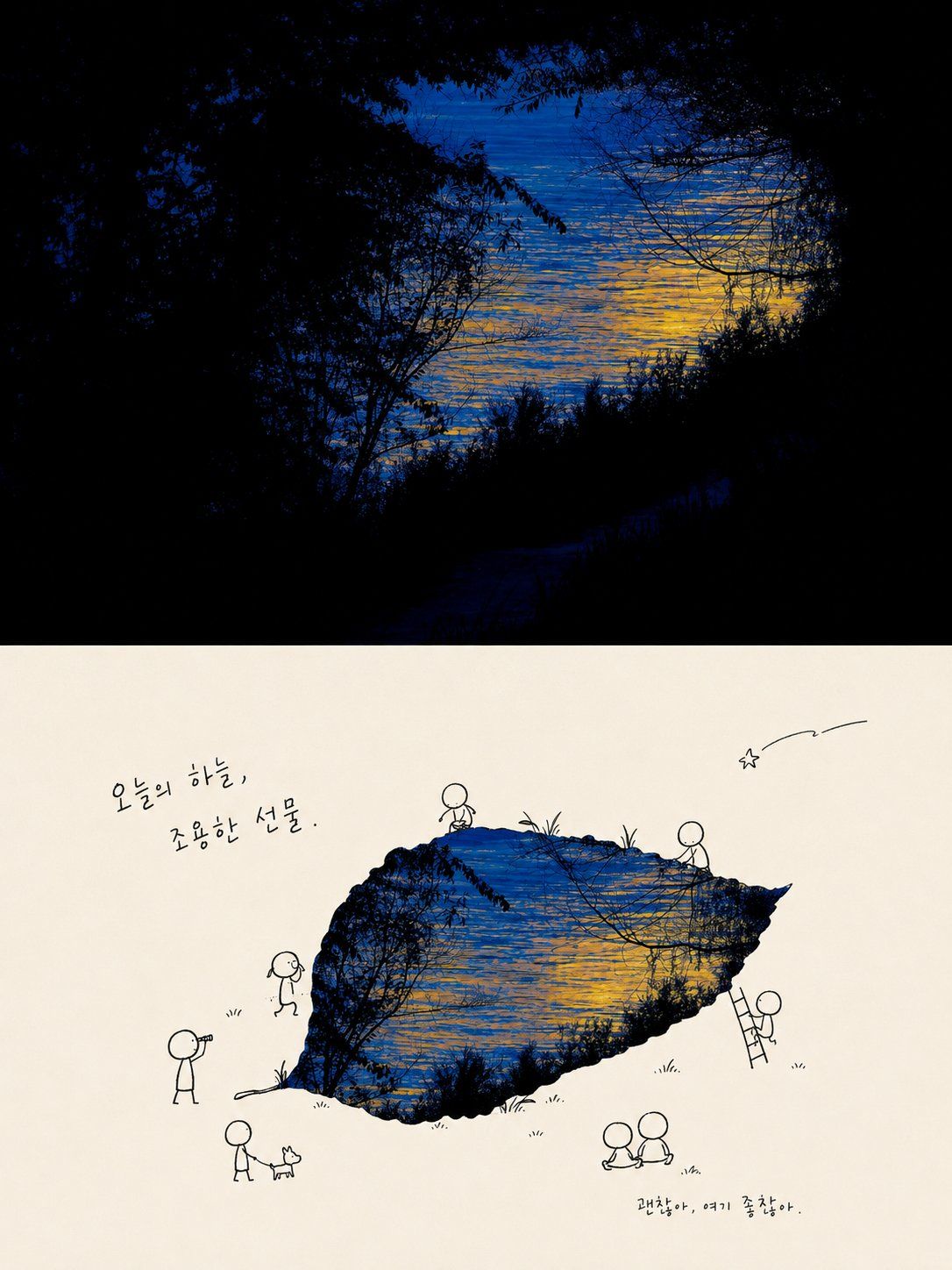
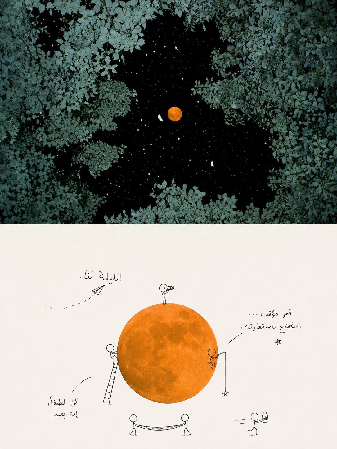
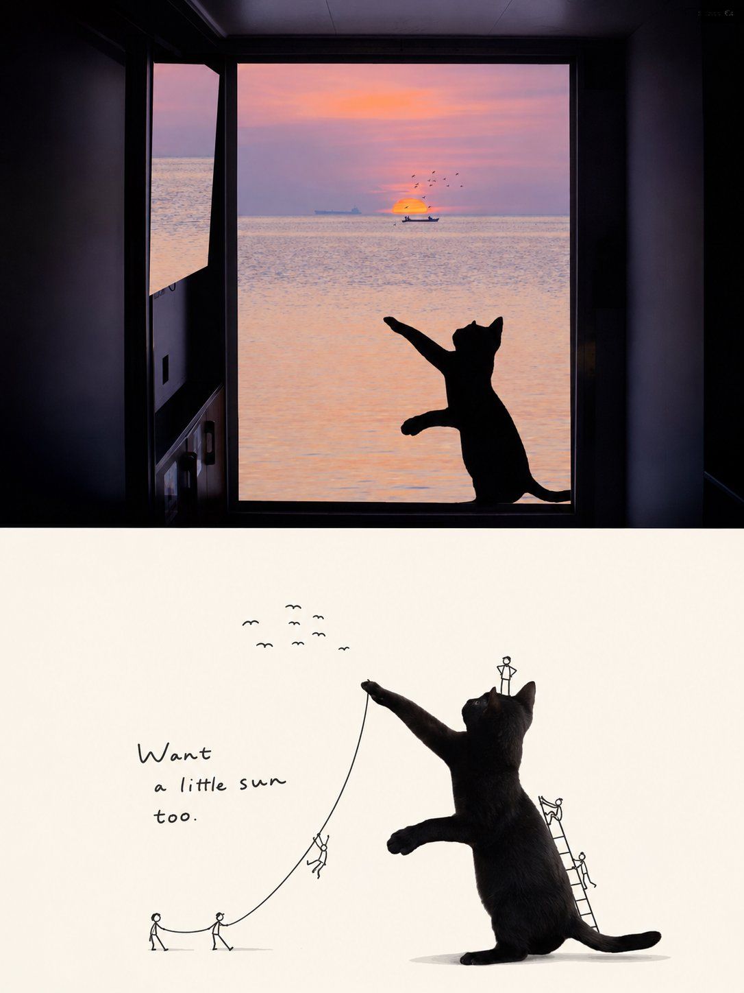
Turn each uploaded photo into a separate, standalone premium design poster. Do not create a multi-image collage; output each photo individually. Use an overall 3:4 vertical composition with two strictly equal upper and lower regions, each occupying 50% of the canvas.

In the upper half, preserve the original photo's subject structure, authentic texture, natural light and shadow, and existing color atmosphere. Apply only subtle premium photographic color grading so it feels like a lifestyle magazine, independent publication, or art photograph. The environmental background may be extended naturally to fit the format, but do not stretch, distort, or alter the subject.

For the lower half, first understand the original image's true **visual core and meaning**. Decide that what matters most is not simply “what is there,” but “what is most worth remembering”—perhaps a subject, an action, a relationship, a contrast, an emotional instant, or a symbolic idea. Extract the most recognizable **subject, silhouette, posture, spatial relationships, and narrative clues**, then reconstruct them as a playful editorial poster combining “a realistic subject + black-line doodle figures.” Do not mechanically crop out the largest object in the source image. Preserve the visual anchor that best represents the photo's spirit and story, so the lower half is instantly recognizable as corresponding to the original while also feeling like a clever reinterpretation.

Keep the realistic subject's material qualities and identity traits. You may moderately optimize its angle, proportions, lighting, and color to make its defining features clearer. Information unrelated to the meaning may be omitted, but the key relationships supporting the theme must remain. Add a small number of minimalist black-line doodle figures around the subject. Their actions, positions, and interactions should emerge naturally from the source image's form, context, and implied meaning, as though they are responding to, amplifying, or reversing the photo's original story—not performing arbitrary actions.

Derive the palette from the most distinctive and spirited colors in the upper photo; these may be moderately purified, brightened, and reorganized. Use warm white, a pale color, or the most comfortable light tone from the source as the background, with abundant negative space. Let the realistic subject carry the primary color, while the figures and text use black or dark-gray fine lines for contrast. Keep the overall result clean, light, and restrained.

Let the text also grow naturally from the source image's **core meaning, emotion, and visual relationships**. Do not directly name the objects or apply fixed copy. Turn the photo's most memorable underlying idea into extremely short, light, clever handwritten text with a touch of humor or wordplay, as if it were a note, thought, or line of voice-over left by the little figures. The text may follow the subject's contour, a person's movement, or the rhythm of the negative space, working with the figures and subject to complete the narrative rather than appearing as a title pasted on afterward.

Maintain a balance among **the realistic subject, core meaning, miniature narrative, naive linework, and abundant negative space**. Whether the source image depicts a person, animal, plant, food, building, object, vehicle, or natural scene, first identify “what this photo is truly saying” before deciding how to reconstruct it. Avoid capturing objects without their relationships, adding cute interactions without a theme, creating a cartoon-sticker look, using complex decoration, or producing a template-like result.

💣language: english
同样处理:
请将我上传的每一张照片分别制作成一张独立的高级设计海报,不多图拼接,每张照片单独输出。整体采用3:4竖版构图,上下两个区域高度严格1:1,各占画面50%。

上半部分保留原始照片,保持主体结构、真实质感、自然光影和原有色彩氛围,仅进行轻微高级摄影调色,使其具有生活方式杂志、独立出版物和艺术摄影质感。为适配画幅,可自然扩展环境背景,但不得拉伸、扭曲或改变主体。

下半部分先理解原图真正的**视觉核心与寓意**:判断画面最重要的不是“有什么”,而是“什么最值得被记住”——可能是一个主体、一种动作、一组关系、一处反差、一个情绪瞬间或某种象征意味。再从中提取最具识别性的**主体、轮廓、姿态、空间关系与叙事线索**,重构为“真实主体 + 黑线涂鸦小人”的趣味编辑海报。不要机械截取原图最大物体,而要保留最能代表照片精神和故事性的视觉锚点,使下半部分既能一眼对应原图,又像对原图进行了一次聪明的二次解读。

真实主体保持材质与身份特征,可适度优化角度、比例、光线和色彩,使核心特征更鲜明;原图中与寓意无关的信息可以舍弃,但支撑主题的关键关系必须保留。围绕主体加入少量极简黑线涂鸦小人,小人的动作、位置和互动方式完全根据原图的形态、语境与潜在寓意自然生成,让他们像在回应、放大或反转照片原本的故事,而不是随意做动作。

配色从上方照片中提取最有辨识度和精气神的颜色,可适度提纯、提亮和重新组织。背景以米白、浅色或原图中最舒适的浅色为主,保持大量留白;真实主体承担主要色彩,小人与文字以黑色或深灰细线形成对比,整体干净、轻快、克制。

文字同样从原图的**核心寓意、情绪和视觉关系**中自然生长,不直接说明物体名称,也不套固定文案。将照片最值得被记住的那层意思转化成极短、轻松、聪明、略带幽默或双关的手写文字,让它像小人留下的注释、念头或一句画外音。文字可沿主体轮廓、人物动作或留白节奏自由排布,与小人和主体共同完成叙事,而不是后期贴上的标题。

整体保持**真实主体、核心寓意、微型叙事、稚拙线条和大量留白**之间的平衡。无论原图是人物、动物、植物、食物、建筑、器物、交通工具或自然场景,都应先抓住“这张照片真正讲的是什么”,再决定如何重构,避免只抓物体不抓关系、只做可爱互动没有主题、卡通贴纸感、复杂装饰和模板感。

💣language:english