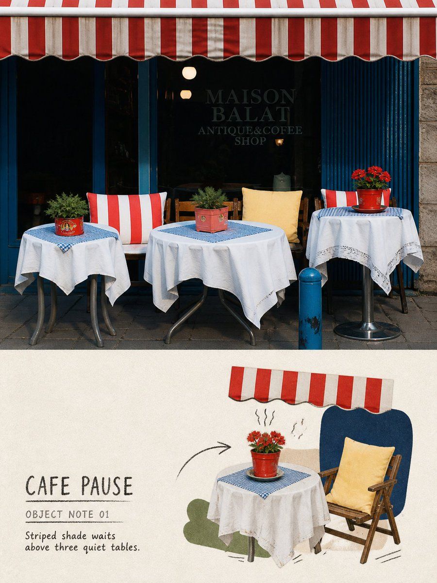
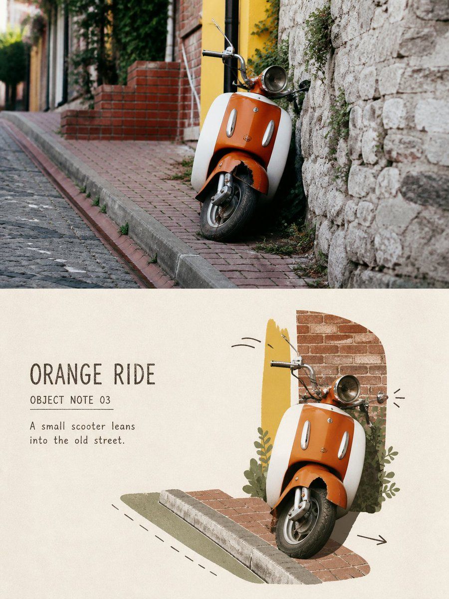
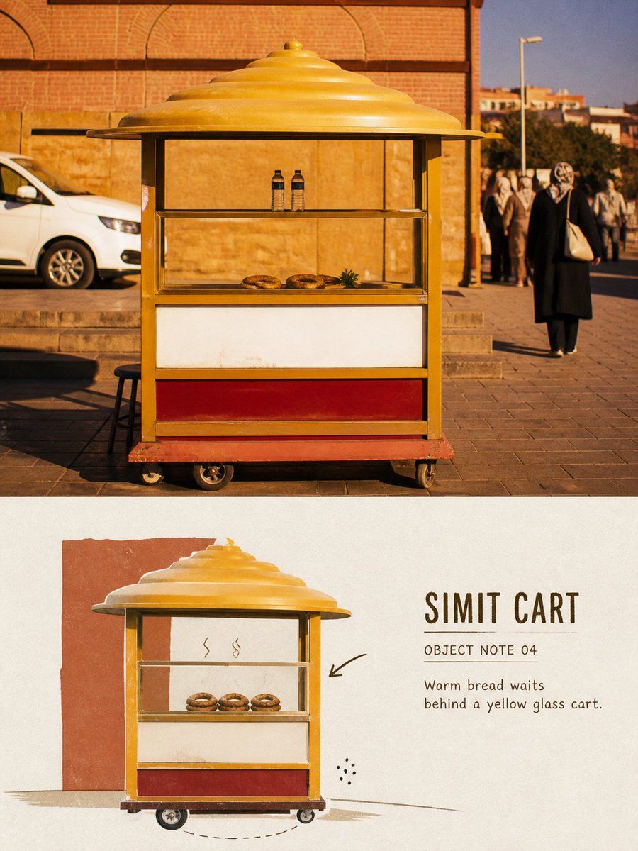
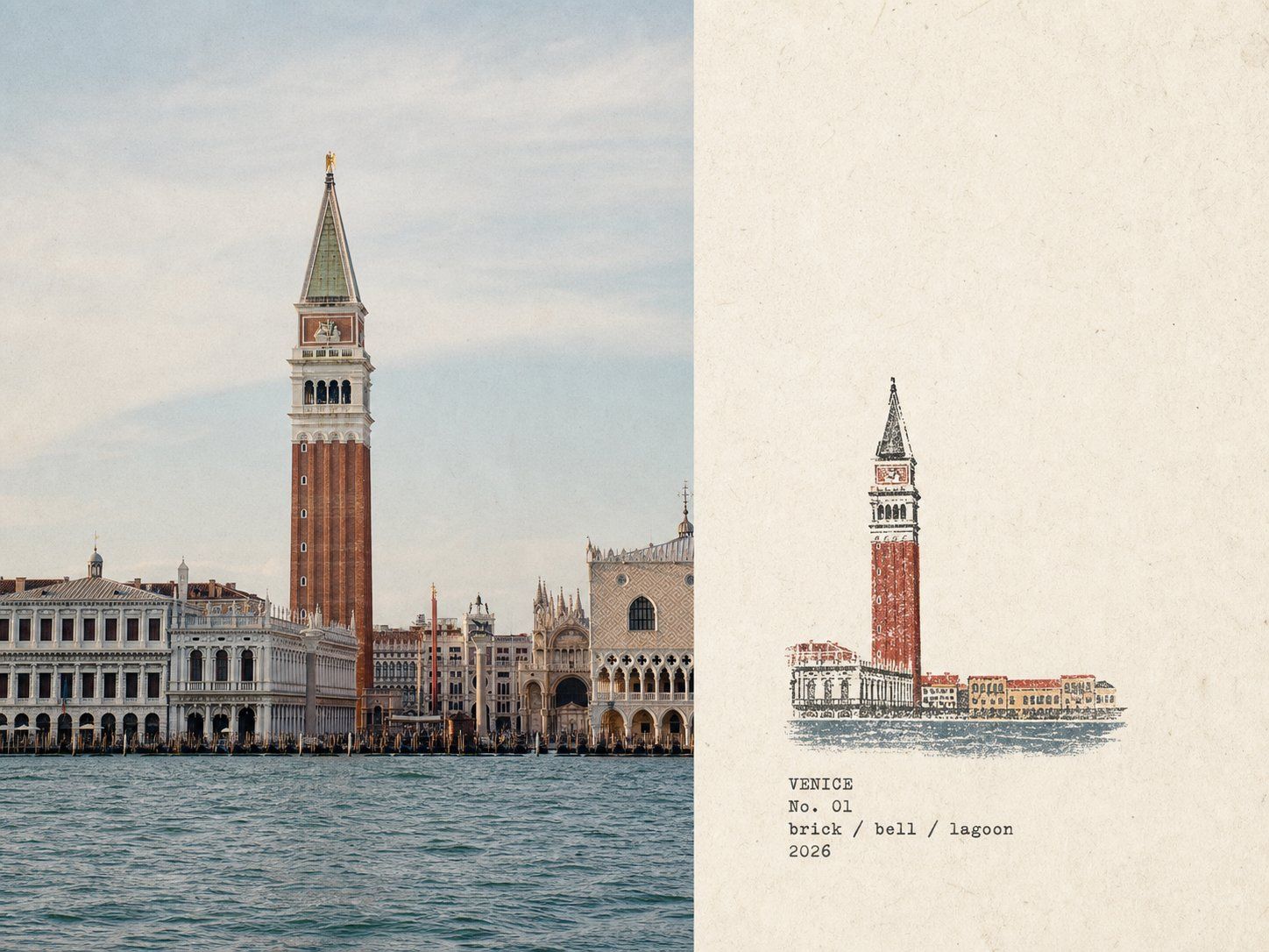
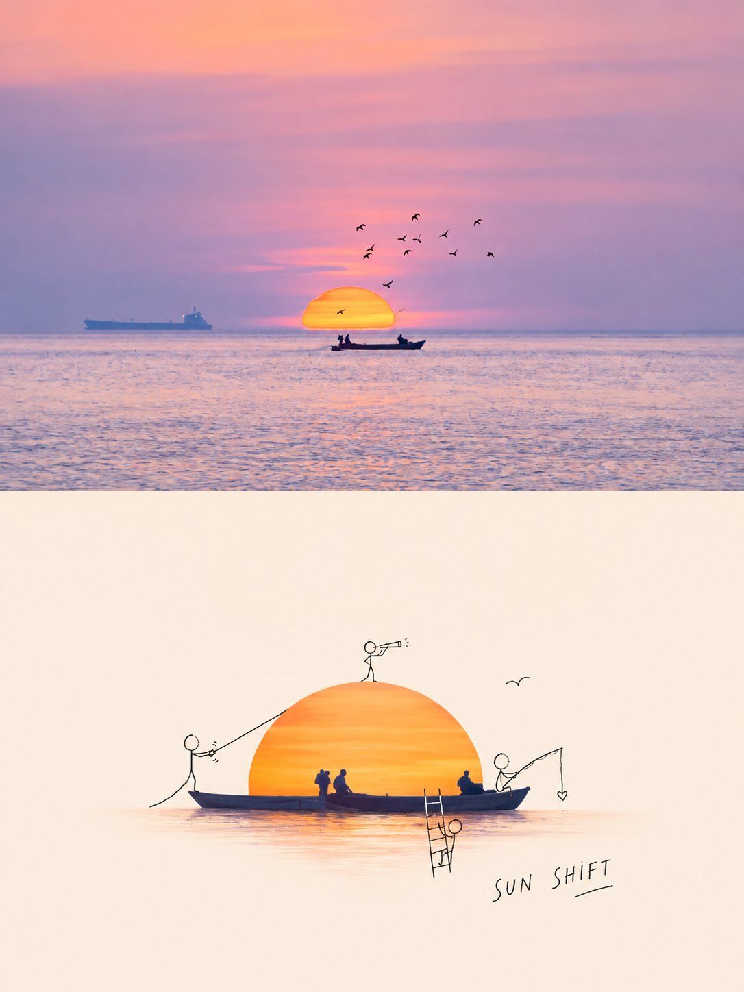
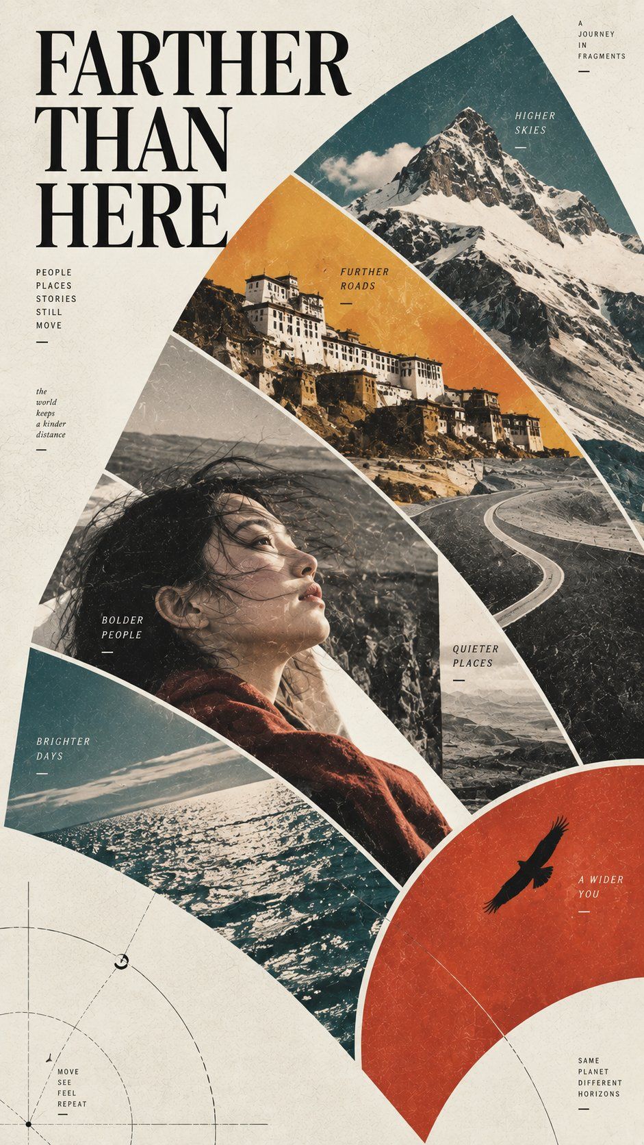
Turn each travel photo I upload into a separate, standalone premium design poster. Output each photo individually; do not create a multi-image collage.

Use an overall 3:4 vertical composition combining a clearly visible real photograph with a reinterpretation of a “photo-doodle travel object” from the same scene. The upper and lower regions should be close to a 1:1 height ratio, separated by a clear, straight, restrained horizontal boundary. Do not blur, feather, gradient-blend, or overlap images at the boundary.

## Upper Half: Real Original Photograph

Faithfully preserve the original photo's subject identities, count, poses, action directions, core objects, relationships between people, street or spatial structure, viewing angle, authentic materials, natural light and shadow, and original color atmosphere.

Apply only subtle travel-magazine, independent-publication, or photography-exhibition-grade color treatment, plus an extremely fine layer of film grain. The upper half must remain a clear, authentic photograph with substantial visual presence.

Do not redraw the photo, move people, change the identity or structure of vehicles, food, storefronts, tables, chairs, boats, or souvenirs, or add cultural symbols or travel objects that are absent from the source.

To fit the format, you may naturally extend a small amount of sky, ground, wall, or surrounding environment, but do not stretch, squeeze, mirror, duplicate, or distort the subject.

## Lower Half: Photo-Doodle Travel Object

Extract from the same photo one core travel object that is most worth remembering, such as:

- a vehicle, bicycle, motorcycle, boat, or cart;
- a coffee cup, plate, food, tableware, or tabletop arrangement;
- a chair, suitcase, road sign, umbrella, or souvenir;
- a storefront, service window, newsstand, or street stall;
- another everyday object with a clear silhouette and a strong sense of place.

People may remain, but only as supporting relationships that explain the object's action, use, or travel story; they must not take over the main visual focus.

First understand the most important object's identity, silhouette, direction, color, and usage relationship, then actively remove complex backgrounds, irrelevant passersby, repeated buildings, advertisements, dense signage, tiny decorations, and photographic noise.

Do not simply shrink the complete source photo into the lower half, and do not merely outline or cartoonize the entire image.

## Secondary Composition

Use an editorial composition based on “scaling down and distilling.”

The core object should occupy about 40%–65% of the lower half's width and 30%–58% of its height, placed centrally, low in the frame, or to one side. Adjust subject scale, crop, and spatial placement according to the photo so the lower half is clearly distinct from the photograph above.

Keep only one core object and pair it with one to three necessary scene clues, such as:

- a short stretch of road, track, or tabletop;
- a door, window, or corner of a wall;
- a hand using the object or one reduced-scale person;
- a shadow, steam, motion trail, or directional line.

The redrawn area must preserve about 35%–55% continuous warm-white paper or pale open space so the subject can breathe. Do not use template-like white sidebars, and do not fragment the negative space into many small gaps.

## Photo Fragments and Matte Color Blocks

The core object must not become an entirely conventional illustration.

Preserve a small amount of authentic texture from the source photo, using options such as:

- one to three cropped areas of photographic texture;
- the object's most recognizable real surface;
- localized photographic texture from windows, food, fabric, metal, or wood;
- irregular photo fragments shaped to suit the original object's silhouette.

Embed the photo fragments naturally within matte color blocks and hand-drawn lines. Do not place them in regular photo frames or assemble them into a dense album.

Summarize the remaining structure with four to six matte, flat-painted color blocks sampled from the source photo. Preserve one highly recognizable bright color as the visual focal point and moderately reduce the saturation of the others.

Allow slight handmade irregularities, missing paint, and paper showing through at color-block edges. Avoid smooth vector shapes and a commercial digital-illustration feel.

## Narrative Doodles

Add only a very small number of hand-drawn doodles related to the real scene around the core object.

Choose according to the photo's content:

- arrows indicating an action or direction of travel;
- motion trails for vehicles, boats, or people;
- steam lines above food or drinks;
- subtle sound symbols, vibration lines, or waiting marks;
- arcs connecting people and objects;
- circles, underlines, or short observational annotations;
- one or two extremely simple small symbols.

The doodles must explain the object's action, use, or travel mood rather than serving as pure decoration.

Draw them in black, dark brown, or one dark color from the photo, using loose marker, crayon, oil pen, or pencil lines. The lines may be broken, retraced, slightly overshoot contours, and show uneven ink.

Keep the doodles restrained, typically using only three to seven small groups of lines or symbols. Do not turn the entire image into a children's doodle book, comic sequence, or dense sticker page.

## Text

Before generating, determine and accurately render the following text from objects, places, actions, or atmosphere genuinely visible in the photo:

1. A main title of one to three English words;
2. The label “OBJECT NOTE 01”;
3. One observational sentence of five to twelve English words.

The title may be the object's name or a short travel impression, for example:

- “YELLOW TRAM”
- “LATE LUNCH”
- “CORNER TABLE”
- “SMALL FERRY”
- “STREET CART”
- “RAINY RIDE”

The observation must describe only colors, actions, positions, and object relationships that truly exist in the photo. Do not invent brands, places, dates, or stories.

Place the text together in an area of continuous negative space, forming one clear editorial caption group with the core object and doodles. The main title must remain clearly readable at chat-preview size; supporting text must not shrink into illegible decorative gray lines.

Use loose handwriting, small vintage-print lettering, or a narrow typeface with a marker-like feel. Letter edges may show slight missing ink, retracing, and paper friction, as if written onto the page together with the doodles. Do not use smooth, floating digital typography.

Do not copy advertising, signage, or brand text from the source photo. Do not include an author name, signature, social handle, logo, URL, QR code, fake Chinese, gibberish, or meaningless numbering.

## Overall Character

It should feel like selecting the small thing in a travel photo that you most hate to forget, then preserving it once more with photo fragments, matte colors, and a few casually drawn notes.

Keep it relaxed, intelligent, observant, lightly humorous, and full of everyday life while maintaining the restrained layout of an independent travel magazine or art publication.

Strictly avoid: full-photo cartoon filter, same-crop same-scale redraw, complete realistic lower background, dense doodles, childish cartoon page, comic panel, generic travel stickers, copied signage, invented brand, excessive arrows, excessive symbols, multiple competing objects, glossy 3D, smooth vector shapes, digital gradients, oversaturated colors, tiny decorative source photo, missing source-photo comparison, fake text, author signature, watermark.
请将我上传的每一张旅行照片分别制作成一张独立的高级设计海报。每张照片单独输出,禁止多图拼接。

整体采用3:4竖版构图,由清楚可见的真实照片与同场景“照片涂鸦旅行物件”转绘组成。上下区域高度接近1:1,使用清楚、平直、克制的水平分界,不要在分界处进行模糊、羽化、渐融或图像重叠。

## 上半部分:真实原始照片

忠实保留原始照片中的主体身份、数量、姿态、动作方向、核心物件、人物关系、街道或空间结构、观察角度、真实材质、自然光影和原有色彩氛围。

只进行轻微的旅行杂志、独立出版物或摄影展级调色,并加入极薄的胶片颗粒。上半部分必须仍然是一张清楚、真实、具有实质面积的摄影作品。

不得重新绘制照片,不得移动人物,不得改变车辆、食物、店铺、桌椅、船只或纪念品的身份和结构,不得增添照片中不存在的文化符号与旅行物件。

为适应画幅,可以自然延展少量天空、地面、墙面或周边环境,但不得拉伸、挤压、镜像、复制或扭曲主体。

## 下半部分:照片涂鸦旅行物件

从同一张照片中提取一个最值得被记住的核心旅行物件,例如:

- 车辆、单车、摩托车、船只或推车;
- 咖啡杯、餐盘、食物、餐具或桌面组合;
- 椅子、行李箱、路牌、雨伞或纪念品;
- 店铺门面、售货窗口、报刊亭或街头摊位;
- 其他轮廓清楚、具有地点气息的日常物件。

人物可以保留,但只作为物件动作、使用方式和旅行故事的辅助关系,不得抢走主要视觉中心。

首先理解照片中最重要的物件身份、轮廓、方向、颜色和使用关系,然后主动删除复杂背景、无关路人、重复建筑、广告、密集招牌、细小装饰和摄影噪声。

不要把原照片完整缩小后放进下半部分,也不要将整张照片简单描边或卡通化。

## 二次构图

采用“缩小提炼”的编辑构图。

核心物件占下半部分宽度约40%–65%、高度约30%–58%,放置在中央、偏下或一侧。根据照片内容改变主体尺度、裁切方式和空间位置,使下半部分明显区别于上方照片。

只保留一个核心物件,并搭配一至三条必要的场景线索,例如:

- 一小段道路、轨道或桌面;
- 一扇门、一个窗口或一角墙面;
- 一只使用物件的手或一位缩小人物;
- 一道影子、蒸汽、运动轨迹或方向线。

转绘区域必须保留约35%–55%的连续暖白纸面或浅色空场,让主体周围能够呼吸。不要使用模板式白色边栏,也不要把空白切碎成许多小缝隙。

## 照片切片与哑光色块

核心物件不能完全变成普通插画。

保留少量来自原照片的真实质感,可以使用:

- 一至三块经过裁切的照片质感区域;
- 物件最有识别度的真实表面;
- 车窗、食物、织物、金属或木材的局部摄影纹理;
- 与原物轮廓相适应的不规则照片切片。

照片切片应自然嵌入哑光色块和手绘线条中,不要出现规则照片框,不要拼成密集相册。

其余结构使用从照片中提取的4–6种哑光平涂色块重新概括。保留一处最有辨识度的鲜明颜色作为视觉焦点,其余颜色适度降低饱和度。

色块边缘允许轻微手工偏差、颜料缺口和纸张透底,避免光滑矢量形状和商业数字插画质感。

## 叙事涂鸦

在核心物件周围加入极少量与真实场景有关的手绘涂鸦。

可以根据照片内容选择:

- 指示动作或行进方向的箭头;
- 车辆、船只或人物的运动轨迹;
- 食物与饮品上方的蒸汽线;
- 轻微声音符号、震动线或等待标记;
- 连接人物与物件的弧线;
- 圈点、下划线或简短观察标记;
- 一两个非常简单的小型符号。

涂鸦必须解释物件的动作、使用方式或旅行情绪,而不是纯粹装饰。

使用黑色、深褐色或照片中的一种深色,以松动马克笔、蜡笔、油性笔或铅笔线表现。线条可以有断裂、重画、轻微越线和不均匀墨迹。

涂鸦数量保持克制,通常只使用3–7组小型线条或符号。不要让整个画面变成儿童涂鸦本、漫画分镜或密集贴纸页。

## 文字

在生成前,根据照片中真实可见的物件、地点、动作或气氛,确定并准确渲染以下文字:

1. 一个1–3个英文单词的主标题;
2. 字段:“OBJECT NOTE 01”;
3. 一行5–12个英文单词的观察句。

标题可以是物件名称或简短旅行感受,例如:

- “YELLOW TRAM”
- “LATE LUNCH”
- “CORNER TABLE”
- “SMALL FERRY”
- “STREET CART”
- “RAINY RIDE”

观察句只描述照片中真实存在的颜色、动作、位置和物件关系,不得虚构品牌、地点、日期或故事。

文字集中放置在连续留白区域,与核心物件和涂鸦形成一组明确的编辑题签。主标题在聊天预览尺寸下必须清楚可读,辅助文字不能缩成无法辨认的装饰灰线。

字体使用松动手写体、旧印刷小字或带有马克笔质感的窄体字。文字边缘可以有轻微缺墨、重复描写和纸张摩擦感,像画者与涂鸦一起写在纸面上,不要使用光滑悬浮的数字排版。

禁止复制原照片中的广告、招牌和品牌文字。禁止作者名、签名、社交账号、Logo、网址、二维码、假中文、乱码和无意义编号。

## 整体气质

像从一张旅行照片里挑出最舍不得忘记的小东西,再用照片残片、哑光颜色和几笔随手画下的注释,把它重新保存一次。

轻松、聪明、有观察感、略带幽默和生活气息,同时保持独立旅行杂志与艺术出版物的克制版式。

强制避免:full-photo cartoon filter, same-crop same-scale redraw, complete realistic lower background, dense doodles, childish cartoon page, comic panel, generic travel stickers, copied signage, invented brand, excessive arrows, excessive symbols, multiple competing objects, glossy 3D, smooth vector shapes, digital gradients, oversaturated colors, tiny decorative source photo, missing source-photo comparison, fake text, author signature, watermark.