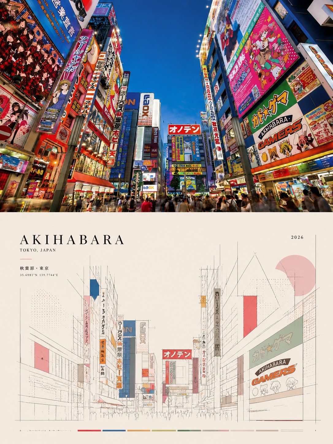
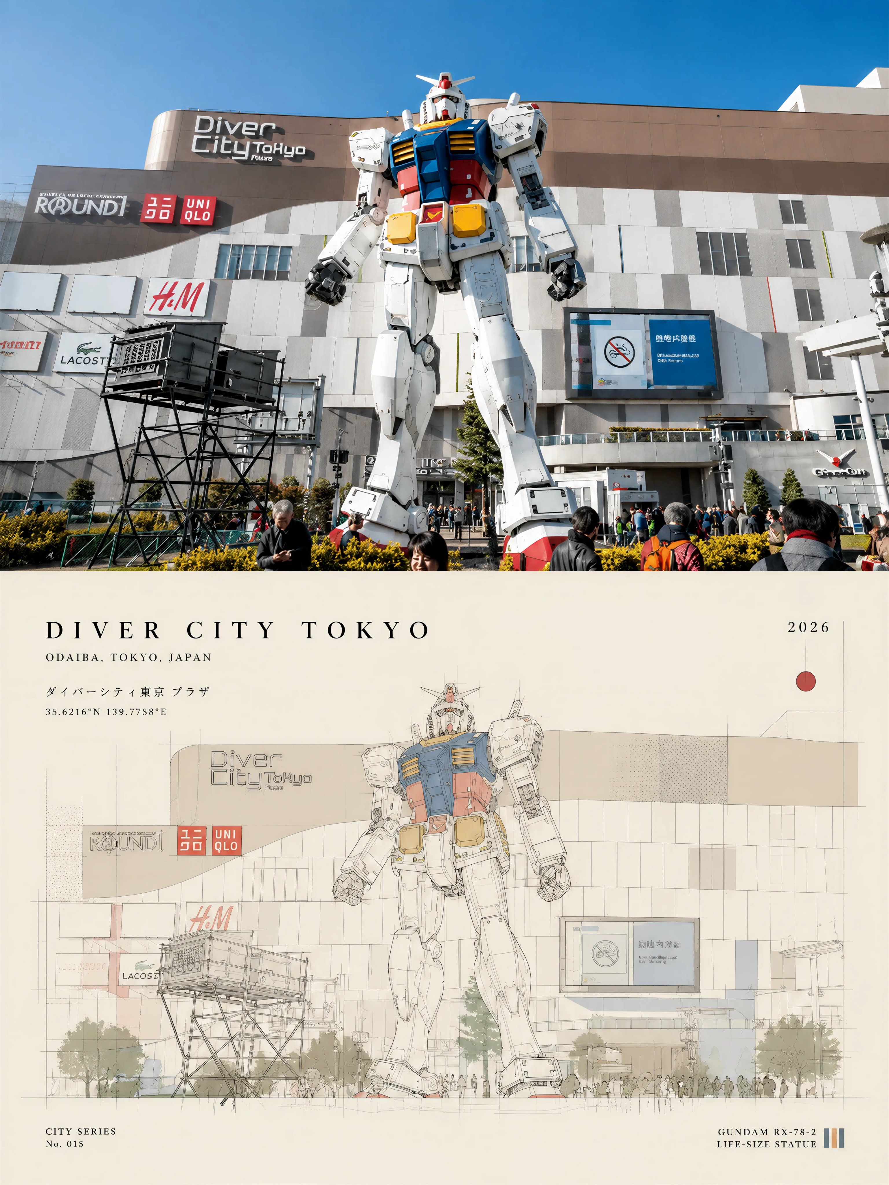
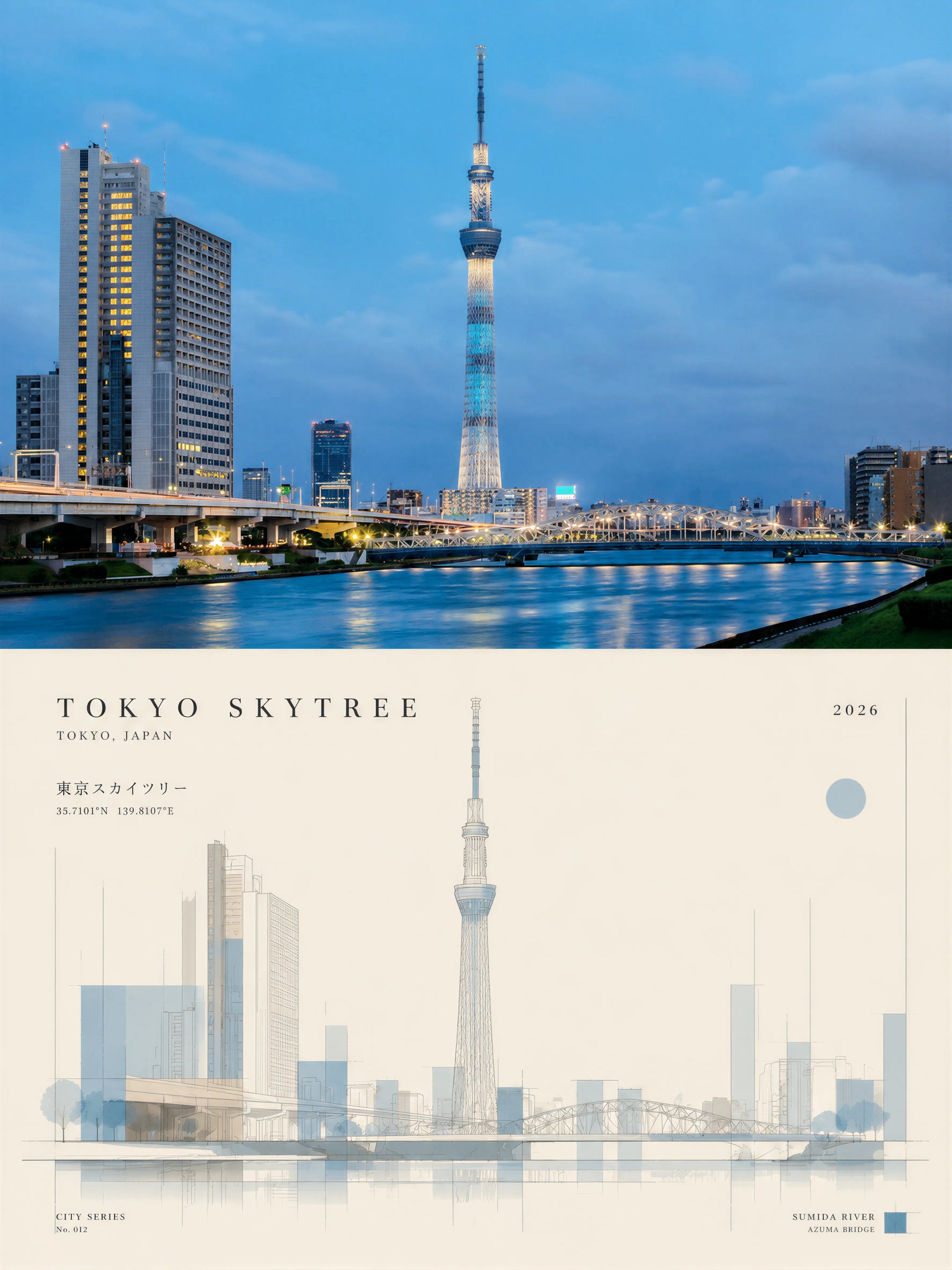
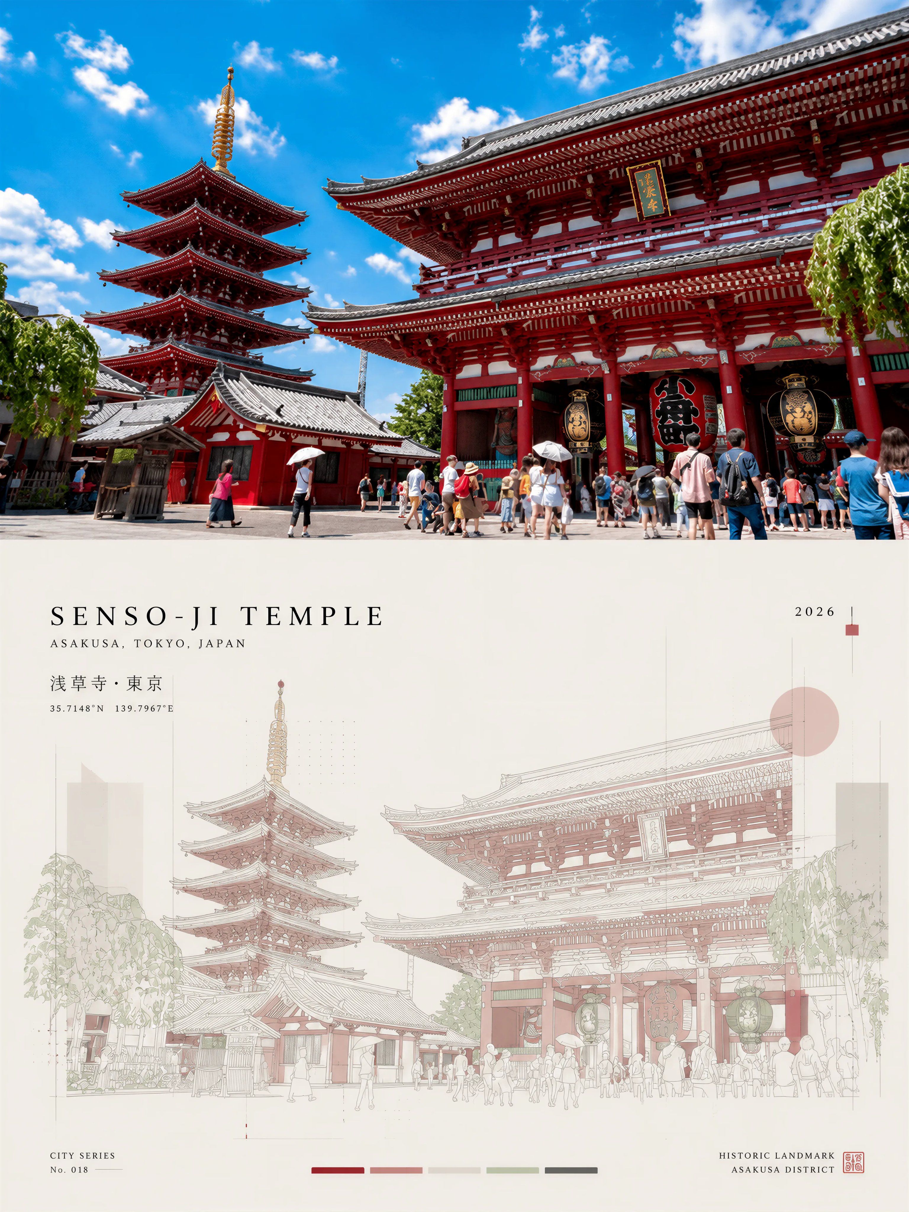
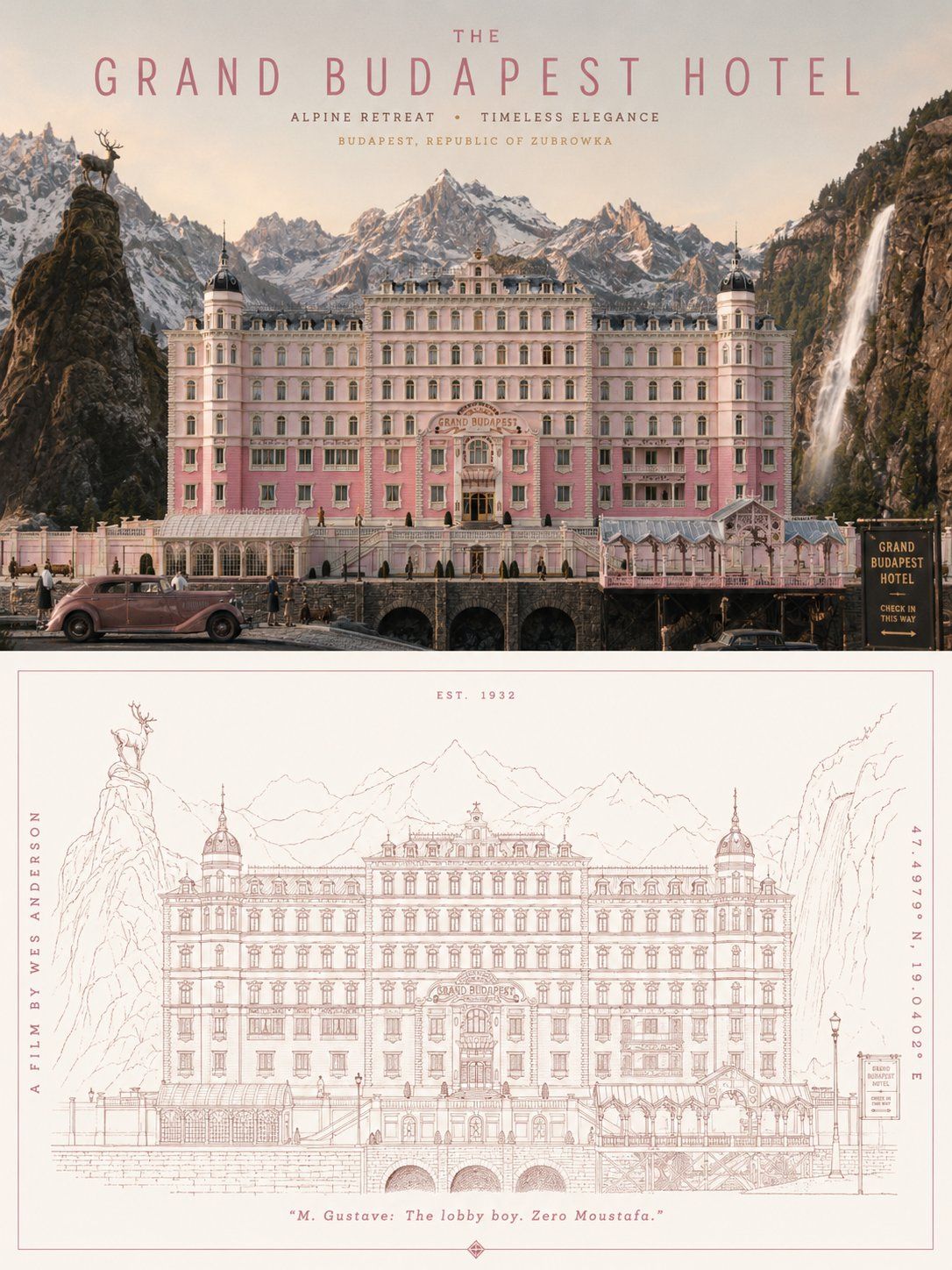
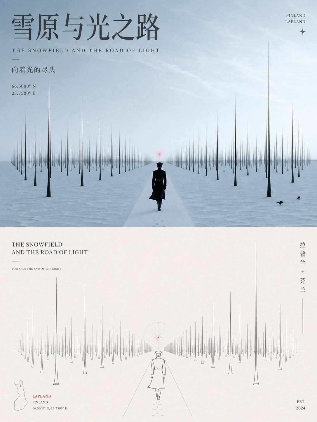
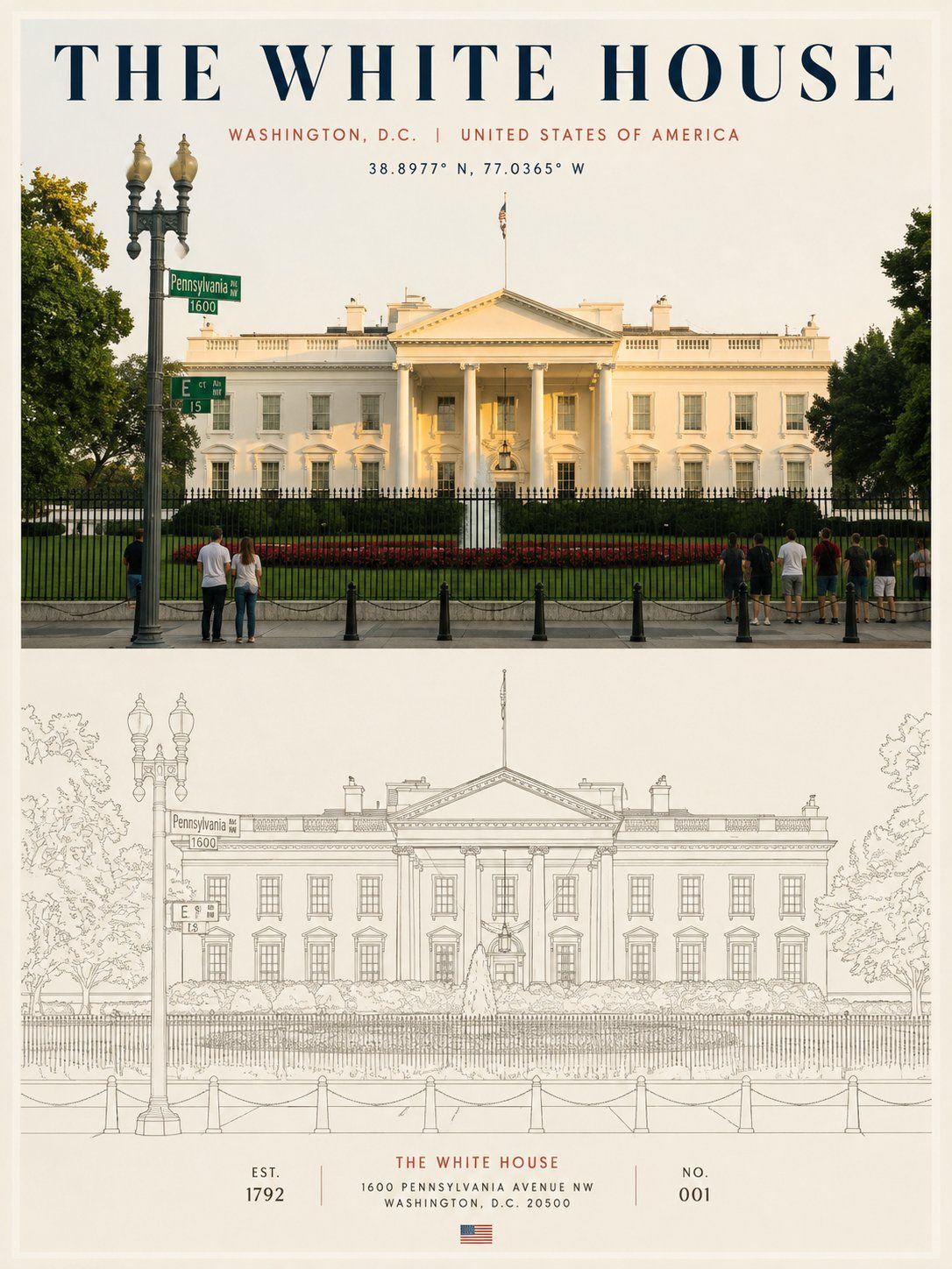
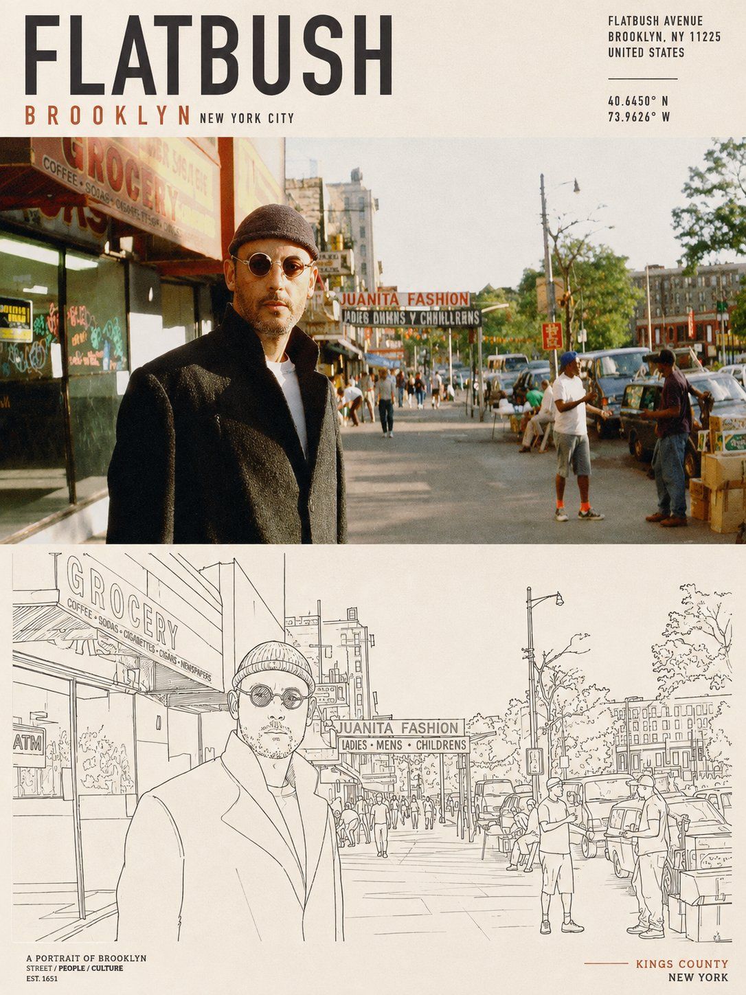
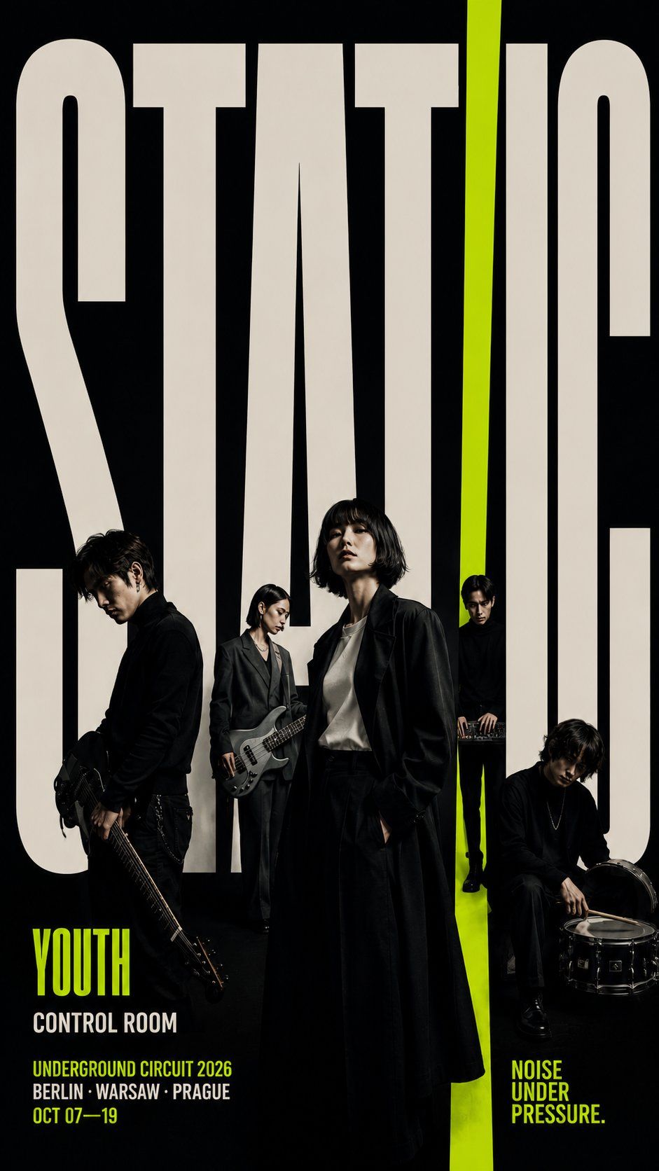
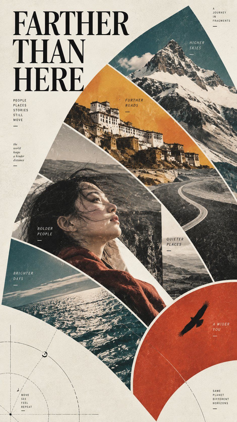
Create an ultra-high-resolution, print-ready editorial poster based on the final subject provided.

FORMAT & MASTER COMPOSITION
- Vertical 3:4 aspect ratio.
- Divide the poster horizontally into exactly two equal sections.
- TOP = exactly 50% of the canvas.
- BOTTOM = exactly 50% of the canvas.
- The dividing line must sit precisely at the vertical midpoint.
- The two sections must feel like two interpretations of the SAME subject:
  REALITY above / GRAPHIC ESSENCE below.
- This is one coherent poster, not a collage and not two unrelated artworks.

TOP HALF — THE REAL WORLD

Create one complete, coherent, believable and visually rich scene based on the subject.

The image should feel observed rather than staged: authentic, lived-in, culturally specific, atmospheric and grounded in real spatial relationships.

If the subject is a CITY:
First understand its visual identity and cultural character. Draw selectively from:
- urban landscape
- architecture
- street life
- local commerce
- food culture
- transportation
- signage
- historical layers
- neighborhood character
- everyday human rhythm

Integrate these elements naturally into ONE believable urban scene.

Do NOT create a collage of famous attractions.
Do NOT assemble disconnected landmarks.
Do NOT create a generic tourism advertisement.

The result should feel like a sophisticated photographic observation of the city at a meaningful everyday moment.

If the subject is a SPECIFIC STREET, DISTRICT, LANDMARK, COMMERCIAL AREA, SHOP, BUILDING OR LOCATION:
Prioritize geographical and architectural authenticity.

Preserve or accurately interpret:
- street geometry
- architectural proportions
- building façades
- storefront relationships
- signage systems
- transportation infrastructure
- street furniture
- pedestrian behavior
- local materials
- vegetation
- surrounding spatial context
- distinctive local visual characteristics

The landmark should belong naturally to its environment rather than appearing artificially enlarged or isolated.

If an ADDRESS, COORDINATE or REFERENCE IMAGE is supplied:
Treat it as primary visual evidence.

Do not invent unrelated architecture.
Do not substitute generic scenery.
Do not relocate distinctive features.
Do not redesign recognizable structures without reason.

REFERENCE IMAGE RULE:
When a reference photograph is provided, preserve its essential spatial logic, subject identity, architecture, perspective and recognizable relationships. You may intelligently extend sky, ground, water or environmental background when necessary to adapt the composition, but never stretch, warp or arbitrarily redesign the principal subject.

VISUAL TREATMENT:
Premium editorial photography.
Museum-catalog sophistication.
Natural light.
Refined tonal control.
Subtle cinematic depth.
Realistic materials.
Believable human activity.
Restrained saturation.
No exaggerated HDR.
No fantasy tourism aesthetic.
No postcard cliché.
No cheap travel-advertising look.

The top half should feel like a photograph worthy of an international architecture, travel or cultural magazine.

BOTTOM HALF — GRAPHIC ABSTRACTION

Translate the TOP scene into a highly refined minimalist graphic interpretation.

IMPORTANT:
The lower artwork must clearly derive from the scene directly above it.

A viewer should immediately recognize:
“These are two representations of the same place, object or subject.”

Identify and preserve the most recognizable:
- silhouette
- proportions
- spatial hierarchy
- architecture
- structural relationships
- gestures
- rhythm
- perspective
- narrative relationships
- visual landmarks

Do NOT mechanically trace the photograph.

Instead, REDESIGN its visual essence using:
- extremely fine linework
- precise single-line drawing
- simplified geometric planes
- controlled architectural perspective
- restrained flat shapes
- subtle overlapping forms
- elegant negative space
- selective abstraction
- disciplined visual rhythm

For CITY or LOCATION subjects, prioritize:
- skyline
- street profile
- major façades
- architectural masses
- signage rhythm
- transportation elements
- storefront relationships
- characteristic vegetation
- pedestrian rhythm
- major geographic forms

For NON-URBAN subjects:
Extract the strongest identity markers, silhouette language, proportions, structural relationships and memorable visual characteristics.

The abstraction must remain immediately recognizable while becoming quieter, cleaner and more sophisticated.

OPTIONAL GRAPHIC ELEMENTS:
Use sparingly:
- thin horizontal rules
- vertical construction lines
- architectural drafting marks
- translucent geometric blocks
- subtle grids
- alignment lines
- small abstract circles or arcs
- restrained reflection lines
- measured areas of empty space

These elements must support the composition rather than decorate it.

The lower half should resemble the work of an elite international architecture or graphic-design studio — not a vector filter, cartoon, tracing effect or stock illustration.

COLOR SYSTEM

DO NOT apply a predetermined palette.

First analyze the subject itself:
- climate
- season
- natural light
- time of day
- architecture
- building materials
- landscape
- vegetation
- historical character
- commercial atmosphere
- food culture
- emotional tone

Then derive a unique palette specifically from that subject.

The lower graphic section should inherit its visual DNA from the upper scene.

Prefer:
- one dominant tonal family
- a restrained secondary family
- one or two carefully controlled accents
- warm ivory, gallery white or another contextually appropriate paper tone when suitable

Color should feel curated rather than colorful for its own sake.

A monochromatic or near-monochromatic print aesthetic is welcome when appropriate.

Create richness through:
- line density
- tonal hierarchy
- transparency
- overlapping planes
- selective visual weight
- negative space
- subtle changes in value

Avoid flat, repetitive template palettes.

TYPOGRAPHIC SYSTEM

Typography must be treated as part of the architecture of the poster.

Use a restrained international editorial system influenced by:
- Swiss graphic design
- Japanese editorial design
- architecture exhibition catalogs
- museum publications
- premium cultural branding

Include only a small amount of text.

Possible hierarchy:
PRIMARY TITLE
SUBTITLE / LOCAL NAME
LOCATION
ADDRESS OR COORDINATES
CATALOG NUMBER
YEAR
SHORT DESCRIPTOR

The main title should be confident but elegant.

Secondary information should be substantially smaller and precisely aligned.

Generous letter spacing and careful typographic hierarchy are encouraged.

Typography should occupy relatively little visual space.

If the scene contains real street signs, storefront names or location information, reproduce them clearly and plausibly.

NO gibberish.
NO random pseudo-language.
NO misspelled place names.
NO meaningless decorative typography.

Do not scatter unnecessary text throughout the poster.

LAYOUT & NEGATIVE SPACE

Use generous negative space.

The composition should feel:
balanced,
quiet,
precise,
restrained,
contemporary,
collectible.

Avoid filling every empty area.

Empty space is an intentional design element.

The lower section may use a warm ivory or subtle gallery-paper background when appropriate.

Maintain strong alignment between:
photography,
graphic abstraction,
typography,
and the overall grid.

FINAL ART DIRECTION

The finished image should feel like a collectible cultural poster produced by a world-class international design studio.

Visual references:
premium architecture exhibition poster,
Japanese art-book design,
Swiss editorial graphics,
museum catalog,
contemporary cultural branding,
luxury travel editorial,
architectural visualization.

The final result must be:
ultra-refined,
highly legible,
quietly expressive,
visually intelligent,
modern,
precise,
elegant,
print-worthy,
and unmistakably specific to the chosen subject.

CRITICAL:
The poster must NEVER feel like a generic template with a different city or subject inserted into it.

Every decision — composition, palette, abstraction, typography, line language and atmosphere — must feel specifically designed for THIS subject.

AVOID:
collage layouts,
multiple unrelated photographs,
generic landmarks,
tourism-ad clichés,
postcard aesthetics,
cartoon rendering,
comic-book styling,
cheap vector art,
heavy outlines,
overly detailed tracing,
random decorative geometry,
excessive typography,
fake signage,
garbled text,
oversaturated HDR,
glossy commercial advertising,
generic AI aesthetics,
template-like composition,
watermarks,
logos unless explicitly requested.