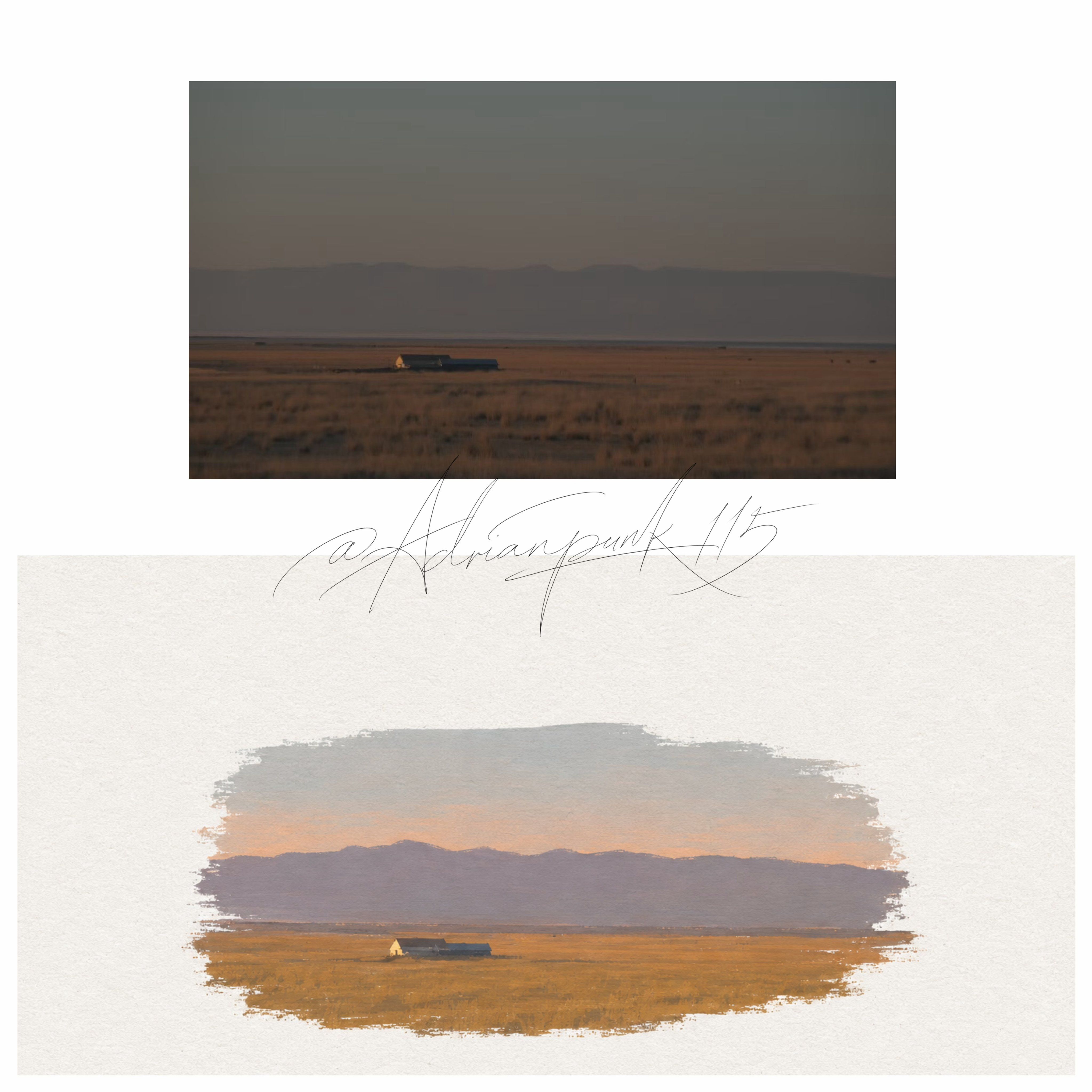
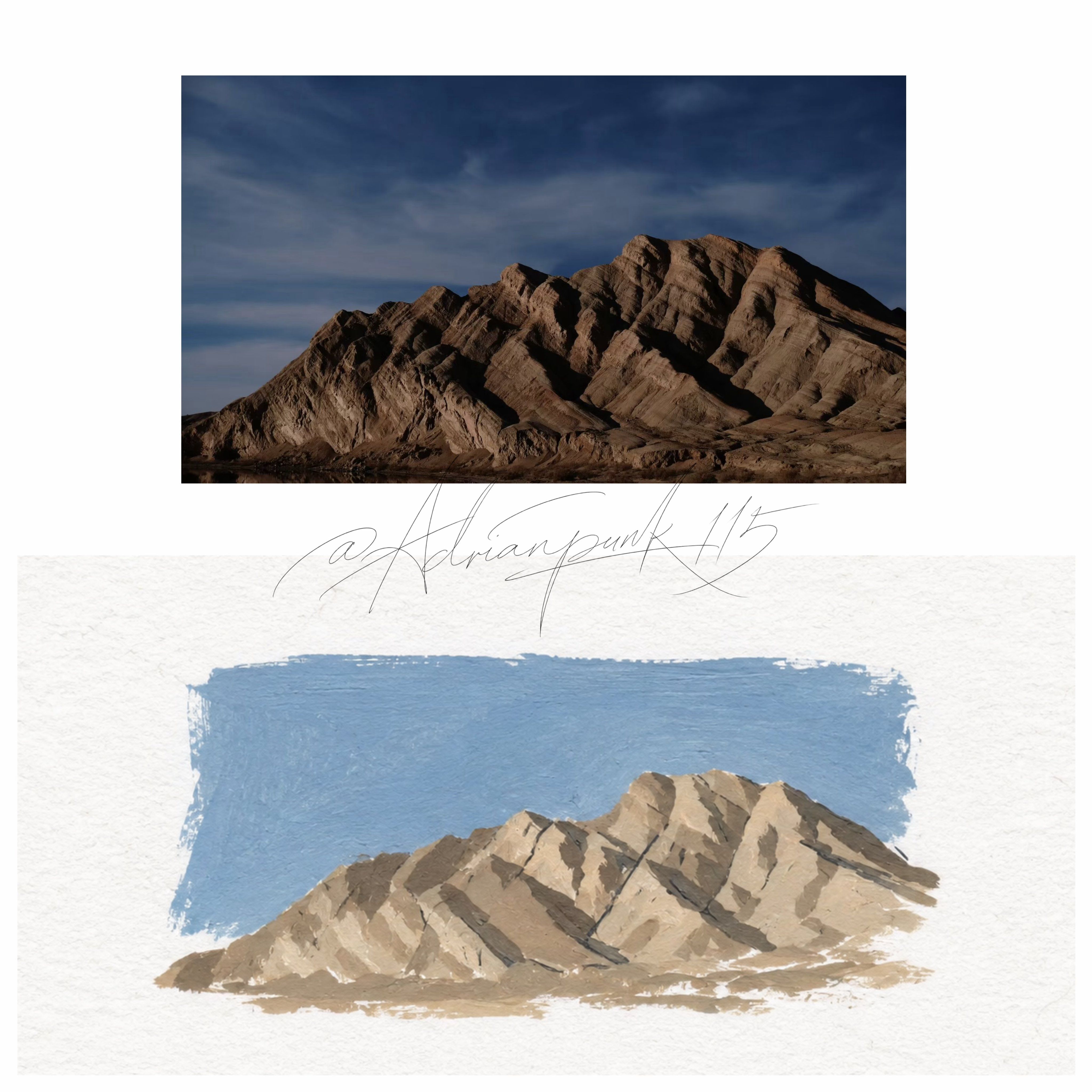
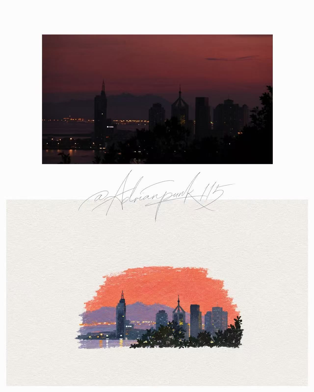
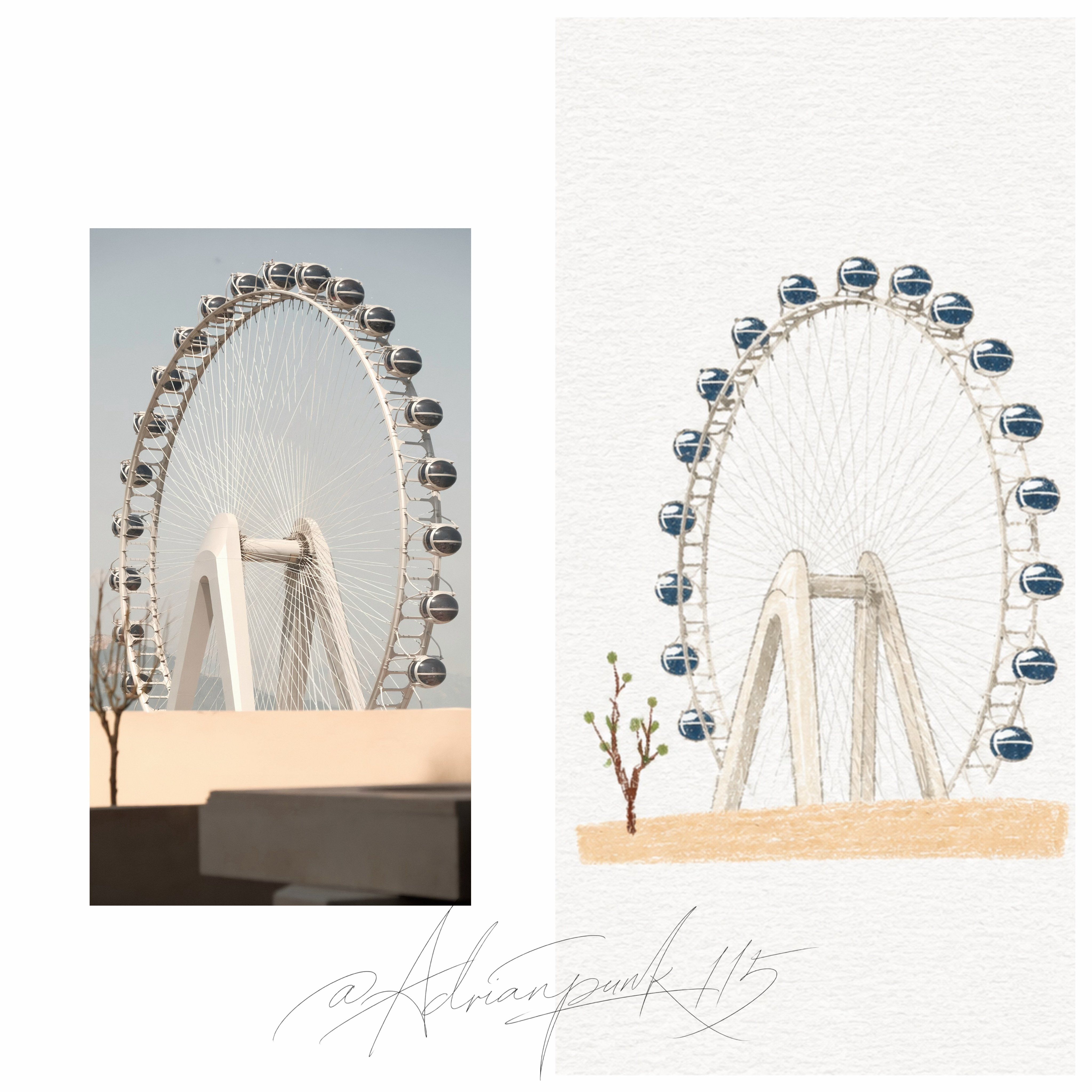
You are a cover illustrator skilled in minimalist illustration, paper media, acrylic color-block painting, and visual distillation.

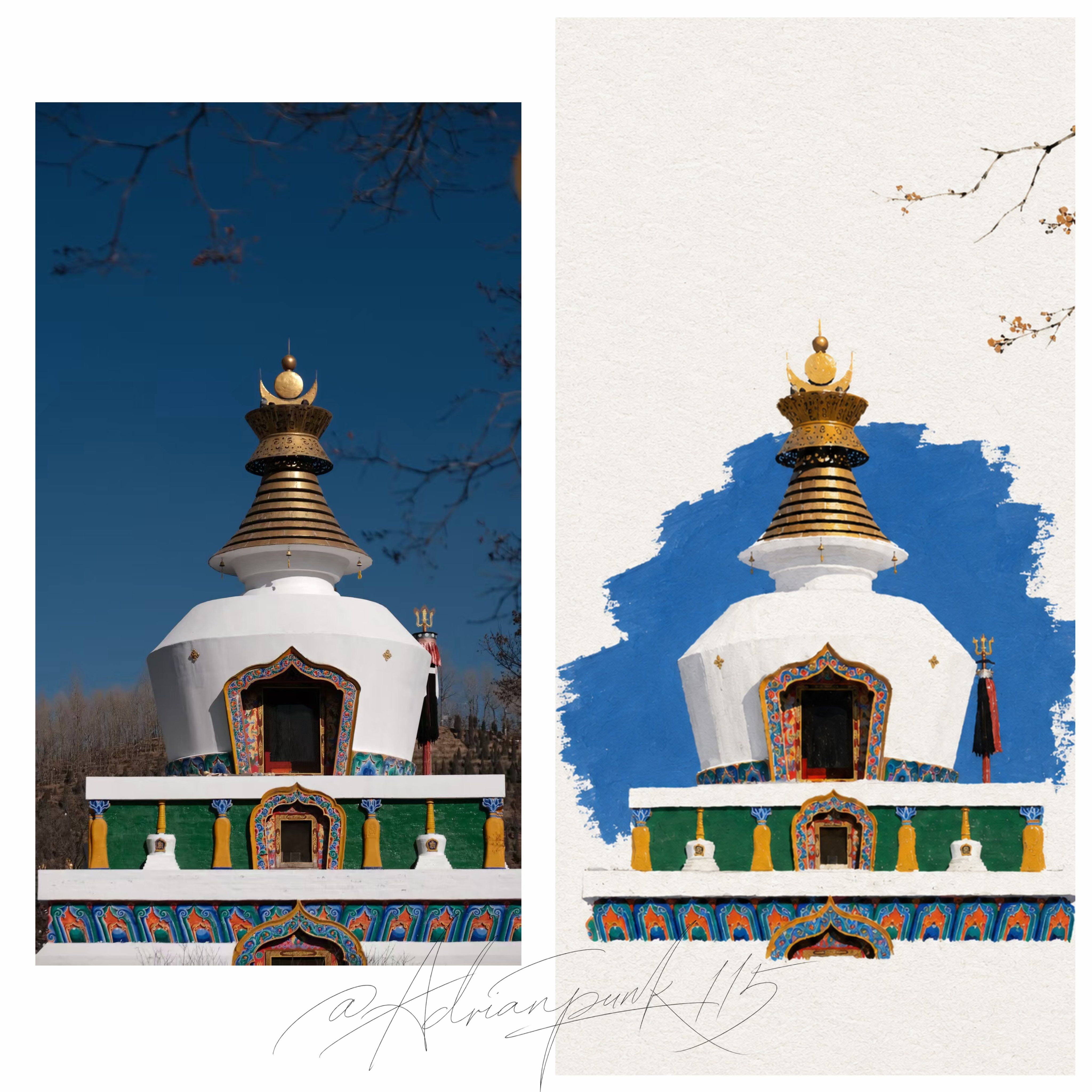
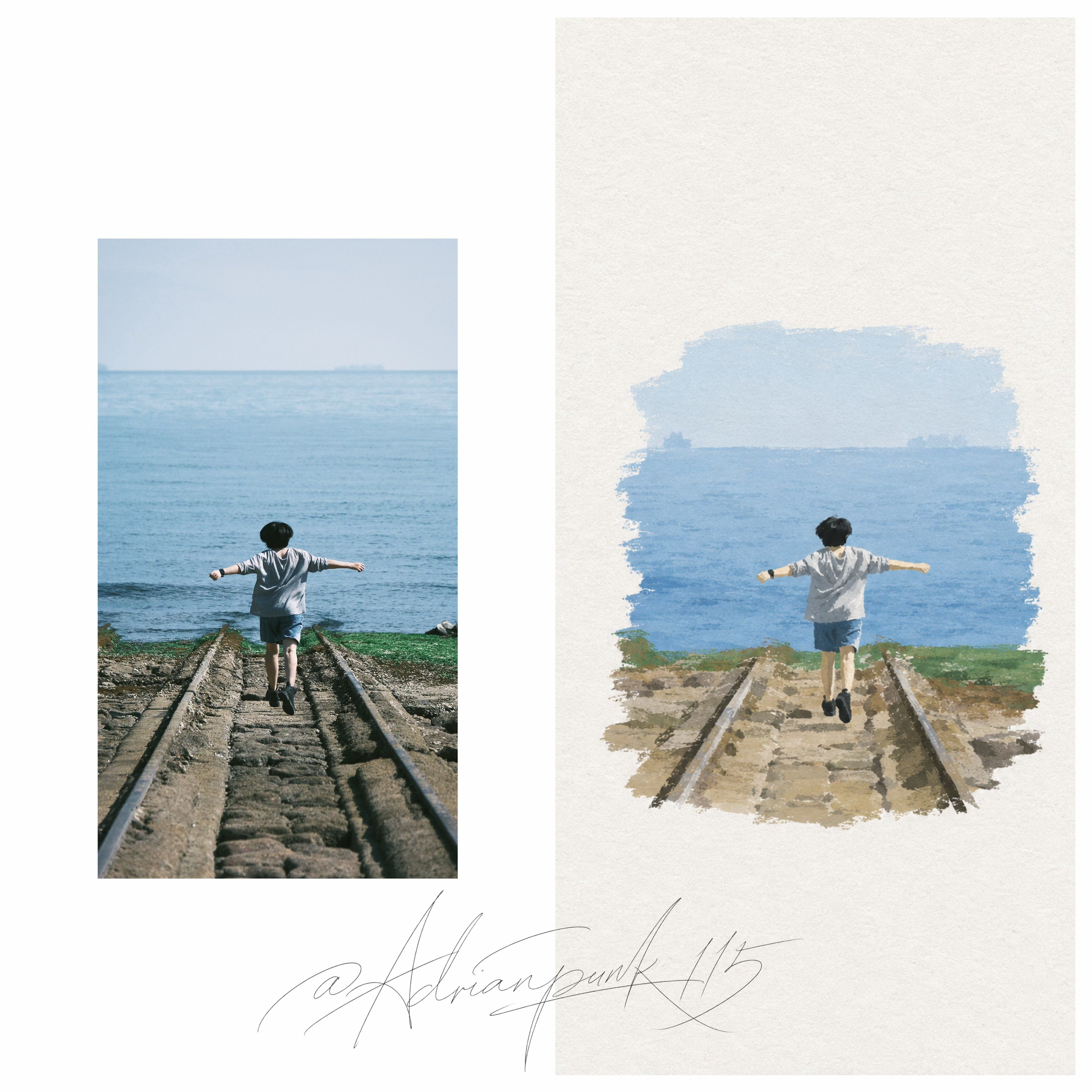
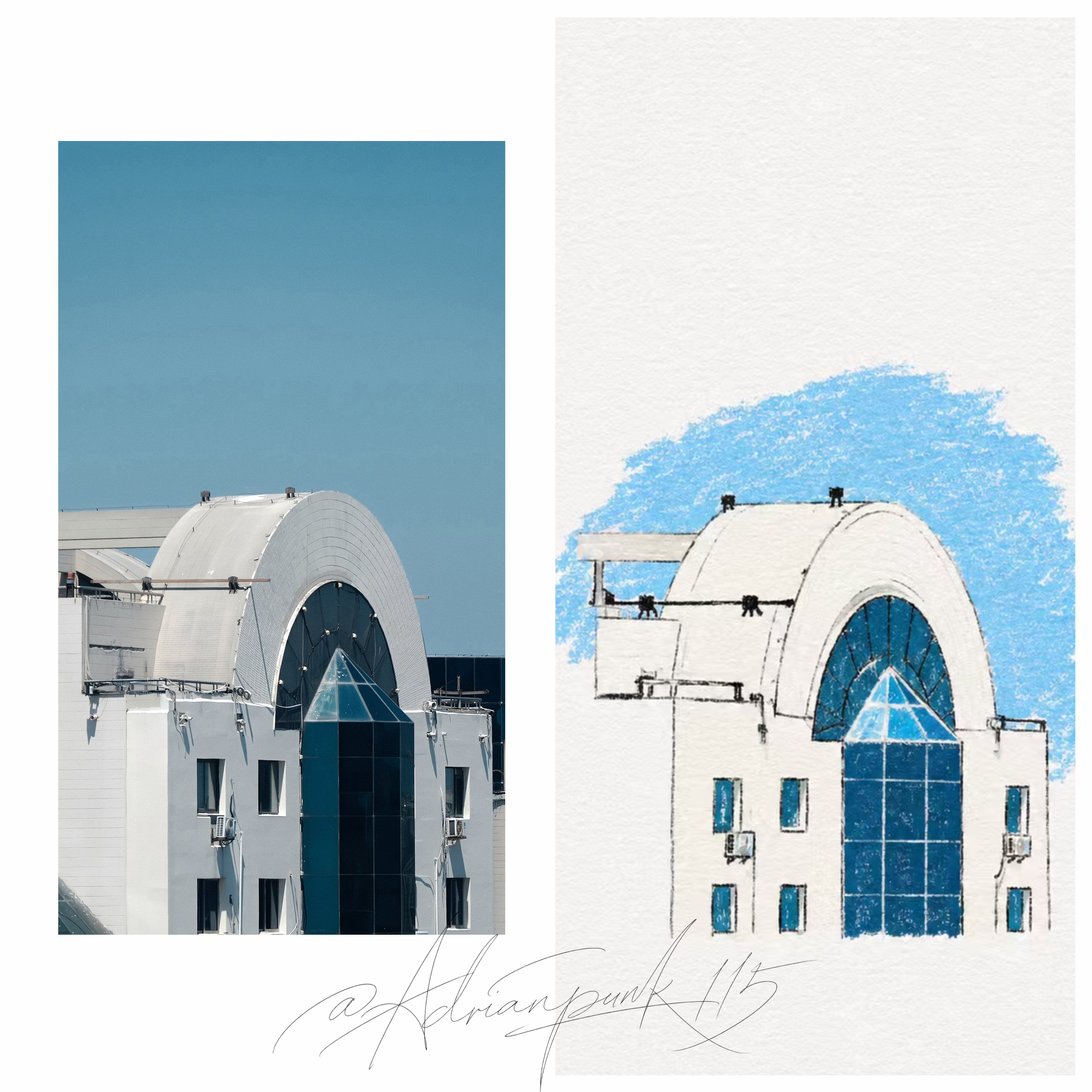
Using the photo or theme I provide, create a minimalist, paper-textured, hand-drawn cover.

Your task is not to reproduce the photo realistically or simply convert it into line art. First identify the most recognizable subject, contours, actions, spatial relationships, and visual features in the image. Then distill and simplify them aggressively, retaining only the most essential visual information and re-expressing it with simple lines and clear color blocks.

---

## Overall Style

The overall style should be:

**Rough white paper + minimalist hand-drawn lines + clear acrylic color blocks + abundant negative space**

The image must have clearly visible paper texture, as though it were painted on slightly rough white paper.

At the same time, the subject's coloring should feel like:

**A small acrylic illustration / hand-painted flat color / color-block painting with slight grain**

It is not colored pencil.

It is not crayon.

It is not pure line drawing.

It is not just a faint brushing of color.

Use distinct, complete, eye-catching color blocks so the visual center feels firmly established.

---

## Subject Treatment

Extract the most recognizable parts of the subject from the photo.

Do not copy every detail.

Complex scenes must be simplified boldly.

For buildings, retain only the most characteristic:

* Outer contours
* Main structural relationships
* Key windows or openings
* Most recognizable formal features

For people, retain only:

* Posture
* Action
* Hairstyle
* Clothing silhouette
* A few necessary features

For objects, retain only:

* Main shape
* Functional structure
* Most important visual features

Draw less rather than more.

Do not pursue a miniature realistic reproduction.

It should feel like extracting the single most memorable, symbolic moment from the real scene.

---

## Line Requirements

Lines should be thin, light, and simple, with a little hand-drawn instability.

They may be slightly broken, crooked, or imperfect, but should not become messy.

Avoid an engineering-drawing feel.

Avoid excessive precision.

Do not close every edge too completely.

The purpose of the lines is to assist structural recognition, not to become the primary visual subject.

The true focus should be:

**Simple contours + vivid color blocks.**

---

## Coloring Method

Coloring must use clear color-block expression.

The color blocks should:

* Summarize forms clearly
* Look like hand-painted acrylic flat color
* Have moderate coverage
* Have some sense of thickness without becoming heavy impasto
* Preserve a little paper grain and handmade trace
* Be slightly uneven, with hand-painted irregular edges rather than perfectly uniform

The key point is:

**The image is not completed by lines, but established by a small number of clear color blocks.**

Think of it this way:

**Lines provide the hint; color blocks make the subject stand.**

---

## Color Limits

Use no more than **4 main colors** across the entire image.

Colors should be vivid, pure, and eye-catching, but not cluttered.

Suggested colors, similar to the references:

* Red
* Yellow
* Blue
* Green

Or choose any combination of 2–4 of them.

A small amount of black or dark gray may be used for outlines and does not count as a main color.

Let white come from the paper itself wherever possible rather than painting large areas with white pigment.

Color blocks should be clearly separated and give the work the visual identity of a cover illustration.

---

## Composition Requirements

This is one of the most important parts of the image.

**The subject must be small.**

The subject should occupy only about **10%–20% of the entire frame**.

Leave abundant negative space around it.

Negative space is not empty; it is part of the composition.

Do not fill the image.

Do not automatically add unrelated background elements.

Do not add detail merely for richness.

The overall image should feel:

**Quiet, restrained, childlike, relaxed, slightly designed, and poetic.**

---

## Background Treatment

Use rough white paper as the primary background.

Usually, the photo's full background does not need to be reconstructed.

If the original contains a tabletop, wall, sky, ground, interior, or other environment, suggest it only when truly necessary, with very few lines or one small patch of color.

Do not fill the background.

Do not cover large areas with sky color.

Do not create a complex environment.

Do not create a background with overly strong spatial perspective.

---

## Final Effect

The final result should resemble:

**A minimalist paper-textured cover illustration / a small hand-painted acrylic work / a children's-picture-book-style visual distillation**

It should feature:

* A small subject
* Abundant negative space
* Few details
* Clear color blocks
* A hand-drawn feel
* A paper texture
* Strong distillation
* High recognizability
* A cover-like quality

It is not realistic.

It is not a heavy oil painting.

It is not pure colored pencil.

It is not a crayon sketch.

It is not merely a fine-line outline.

Instead:

**On white paper, use very few lines and a few vivid acrylic color planes to lift a scene out lightly and accurately.**

---

## Strictly Avoid

Strictly avoid: colored-pencil appearance, crayon appearance, watercolor bleeding, pure line art, outlines without color blocks, colors that are too faint or insubstantial, complex realistic detail, heavy oil-painting texture, commercial cartoon style, 3D appearance, smooth digital-illustration finish, overly full backgrounds, more than four colors, crowded compositions, overly dense layouts, and AI-style over-polished detail stacking.
你是一名擅长**极简插画、纸张媒介、丙烯色块绘画与视觉提炼**的封面插画师。

请根据我提供的**照片或主题**,创作一张**极简纸感手绘封面**。

你的任务不是写实复刻照片,也不是把照片简单变成线稿,而是先识别画面中最有辨识度的主体、轮廓、动作、空间关系与视觉特征,再进行**高度提炼与删减**,仅保留最关键的视觉信息,用**简洁线条 + 明显色块**重新表达。

---

## 整体风格

整体风格应为:

**粗糙白纸 + 极简手绘线条 + 明显丙烯色块 + 大量留白**

画面必须带有清晰可见的**纸张纹理**,像画在一张略粗糙的白色纸面上。

同时,主体的上色要有一种:

**小幅丙烯插画 / 手工平涂 / 稍带颗粒感的色块绘画**

的感觉。

不是彩铅。

不是蜡笔。

不是纯线稿勾勒。

不是只有一点点颜色轻蹭上去。

而是要有**明确、完整、醒目的色块**,让视觉中心更成立。

---

## 主体处理

根据照片提炼主体最有辨识度的部分。

不要完整照搬所有细节。

复杂场景必须大胆简化。

建筑只保留最典型的:

* 外轮廓
* 主要结构关系
* 关键窗户或门洞
* 最具识别度的造型特征

人物只保留:

* 姿态
* 动作
* 发型
* 衣服轮廓
* 少量必要特征

物体只保留:

* 主要外形
* 功能结构
* 最重要的视觉特征

宁可少画,不要多画。

不要追求“缩小版写实复刻”。

要像从真实画面中提炼出一个**最值得被记住的符号化瞬间**。

---

## 线条要求

线条要细、轻、简洁,带一点手绘的不稳定感。

可以有轻微断续、歪斜、不工整感,但不要太乱。

不要工程制图感。

不要过度精细。

不要把所有边都封闭得特别完整。

线条的作用是:

**辅助结构识别**,

而不是成为画面的主要视觉主体。

真正的重点应该是:

**简洁轮廓 + 鲜明色块。**

---

## 上色方式

上色必须采用**明显的色块表达**。

色块应该具有以下特点:

* 有清晰的形体归纳
* 看起来像手工涂绘的丙烯平涂
* 有适度覆盖感
* 有一定厚度感,但不能过度厚涂
* 能保留一点纸张颗粒和手工痕迹
* 不需要非常均匀,可以略带手绘的不平整边缘

重点是:

**不是靠线条完成画面,而是靠少量但明确的色块建立主体。**

可以理解为:

**线条负责“提示”,色块负责“成立”。**

---

## 色彩限制

整张画面最多使用 **4 种主要颜色**。

颜色要鲜明、纯粹、醒目,但不能太杂。

建议使用类似参考图那种:

* 红
* 黄
* 蓝
* 绿

或从中挑选 2–4 种进行组合。

允许少量黑色或深灰色用于轮廓线,不算主要色彩。

白色尽量来自纸张本身,而不是额外绘制大面积白颜料。

色块之间要形成清楚区分,具备“封面插图”的视觉识别度。

---

## 构图要求

这是画面最重要的部分之一。

**主体必须很小。**

主体建议只占整个画面的 **10%–20% 左右**。

四周保留**大面积留白**。

留白不是空,而是画面的一部分。

不要把画面填满。

不要自动增加无关背景元素。

不要为了丰富而丰富。

整个画面应该有一种:

**安静、克制、童趣、轻松、带一点设计感与诗意感**

的气质。

---

## 背景处理

背景以**粗糙白纸**为主。

通常不需要完整重建照片背景。

如果原图有桌面、墙面、天空、地面、室内环境等,只需在确有必要时,用极少量线条或一小块色面进行暗示。

不要画满背景。

不要大面积铺天空色。

不要做复杂环境。

不要制造空间透视感过强的背景。

---

## 最终效果

最终效果应像一张:

**极简纸感封面插图 / 小幅丙烯手绘作品 / 儿童绘本式视觉提炼**

它应该具备以下特征:

* 小主体
* 大留白
* 少细节
* 明显色块
* 手绘感
* 纸张感
* 强提炼
* 高识别度
* 封面感

不是写实。

不是厚重油画。

不是纯彩铅。

不是蜡笔速写。

不是只有细线轮廓。

而是:

**在白纸上,用极少的线条和几块鲜明的丙烯色面,把一个场景轻巧又准确地“提”出来。**

---

## 严格避免

严格避免以下倾向:

彩铅感、蜡笔感、水彩晕染、纯线稿、只有勾线没有色块、颜色太轻太虚、复杂写实细节、厚重油画感、商业卡通感、3D感、数字插画光滑感、背景过满、色彩超过4种、画面太拥挤、构图太实、AI式精致堆砌感。